Would like to contribute to a successful session.
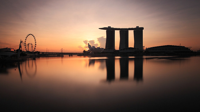
The reason why I have not chosed to shoot MBS from the left side ever since the museum took shape is because the design and proportion of it is totally detached from the rest of the buildings in the MBS cluster. Hence placing the museum closer to the frame actually amplifies this uncomfortable fit and obstructs the first tower from full view. I feel that the rythem of the 3 towers is being distrupted unnecessarily. Further, the low-rise convention centre at the extreme right occupies a much bigger(longer) piece of the cluster. With a view from the left, you'd be left with too much space on the right of the photo. The composition becomes unbalanced. MBS was designed to be a cluster of buildings, hence the challenge is to photograph it in a way which reveals this design intention. This is directed to the 1st photo.
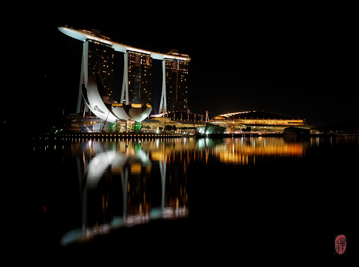
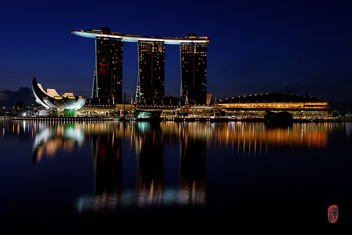
2nd and 3rd photo are slightly better where composition is concerned because the clearer separation of the buildings represents the design intentions. However, the problem with too much space over the low-rise convention centre which results in unbalanced compositions still persists. The 3rd photo is slightly more balanced with the Flyer but buildings on the extreme left start creeping in. This should be avoided.
Personally, I would still have gone for a head-on shot of this MBS from somewhere in front of One Fullerton, which is much further right of where these photos were taken to get a clearer separation between the buildings and obtain more balanced compositions. If I need to take the MBS from an alternate perspective, I will choose to take it from the Promontory. Placing the convention centre closer to you is better than having the museum in the foreground.