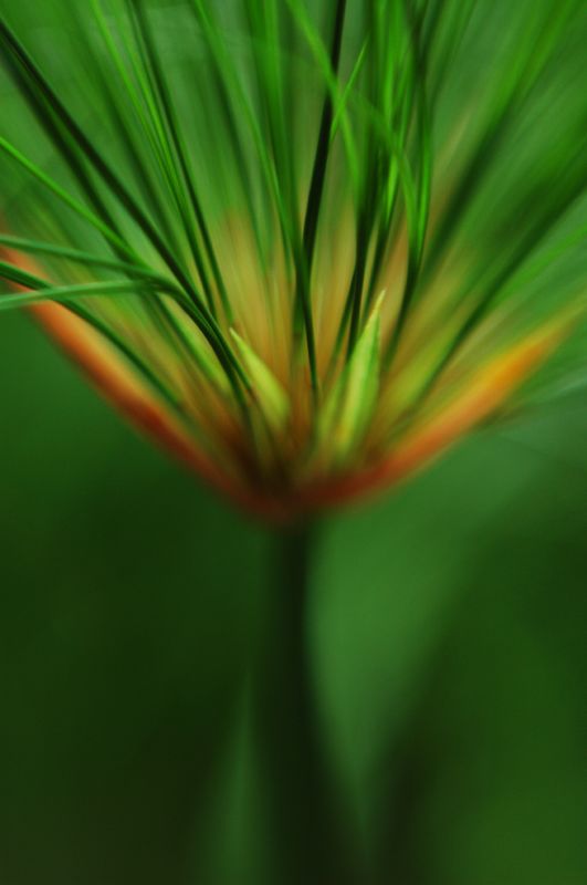
I think the idea is there but it's a little bit too messy to be visually appealing for me. I think something graphic of this nature will gain more impact if it's clean and simple. the top is ok except for this stray strand that cuts across many others on the top right. The cutting across removes a lot of impact. I'd prefer the bottom to have less variations in tone as well, rather than a range of tones.

") ).
).