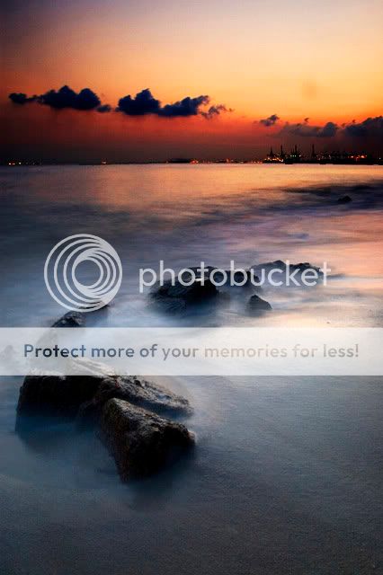
Labrador Sunset, please comment


Status
Not open for further replies.
zoossh said:
this is my edited version. sorry for some noise as it is edited off the picture which is small and after correction of the horizon, i chop off too much on the left leading to an imbalanced edge. i dun go for too strong a saturation, and dun always push the contrast as it takes away details. i prefer the softer approach which i think is quite reverse of what most of yours prefer, so dun :kok: me too much, ok? :sweat:

tryout_2.jpg


Now can see already. Nice looking, especially after adding some words on it.

Although the colour tone doesn't give a strong sunset feel, it does give a scene of serenity, peace and quiet, far removed from the hustle and bustle of the city.
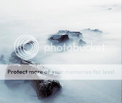
 

dcubes said:
Hi,

Looking at this picture, it reminds me of the cover of this book..
"Creative Nature & Outdoor Photography" by Brenda Tharp.

Anyway, that got me intrigued and I was playing with the image
and did some post processing.. hope you dun mind

labradorparkedited_01.jpg

Of course i dont mind. However, i find that the sky is much overexposed for your edited version. Too much contrast applied?
 

zoossh said:
this is my edited version. sorry for some noise as it is edited off the picture which is small and after correction of the horizon, i chop off too much on the left leading to an imbalanced edge. i dun go for too strong a saturation, and dun always push the contrast as it takes away details. i prefer the softer approach which i think is quite reverse of what most of yours prefer, so dun :kok: me too much, ok? :sweat:

tryout_2.jpg

The pic looks better with the wordings but still too plain for my taste. Been trying to comprehend what Eikin and Clockunder mentioned.

I find that taking sunset/sunrise is no easy task cos the light is changing so rapidly and you have to take into account composition, exposure etc etc.
 

philip827 said:
Personally, i find that the colors in this image lack that 'punch', when compared to many great photos posted here. I am not sure whether it is because of my photoshop skills, or the lack of filters or the photo just cannot make it to begin with. Pic 1 is the edited version. Feel free to edit my original photo. I hope i can learn from your comments. Thank you.

Hi, since you said that feel free to edit your pic. I really very free now. Haha.

Does this add the "punch" that you wanted to your pic?


Maybe it's the scene that's not good enough? The chinese saying goes, even the cleverest wife cannot make congee without rice.

In the old days, on film, people did not have PS to increase saturation or boost contrast, the best they could do was use a film like Velvia and/or use a grad tobacco filter, but there is nothing else you could do after a slide was processed. Either the slide was good, or the photographer had to try again another day.

PS is not a substitute for a photogenic scene to begin with.

The other part of it is you need to have patience. People whose pictures get published in National Geographic have spent years and years in photography and they understand light and film extremely well. No amateur can hope to produce a picture like theirs immediately upon buying a DSLR.

philip827 said:
Dear fellow photographers,

I have a photo here that i hope can be commented on.

Personally, i find that the colors in this image lack that 'punch', when compared to many great photos posted here. I am not sure whether it is because of my photoshop skills, or the lack of filters or the photo just cannot make it to begin with. Pic 1 is the edited version. Feel free to edit my original photo. I hope i can learn from your comments. Thank you.

In photoshop, i increased contrast and saturation. Sharpened.
 

zoossh said:
this is my edited version. sorry for some noise as it is edited off the picture which is small and after correction of the horizon, i chop off too much on the left leading to an imbalanced edge. i dun go for too strong a saturation, and dun always push the contrast as it takes away details. i prefer the softer approach which i think is quite reverse of what most of yours prefer, so dun :kok: me too much, ok? :sweat:

tryout_2.jpg

This is beautiful, very romantic. :thumbsup: :thumbsup:
 

Nice landscape:) Wonder how you get the water to look like clouds ? Didi you use a low shutter speed?
 

philip827 said:
The pic looks better with the wordings but still too plain for my taste. Been trying to comprehend what Eikin and Clockunder mentioned.

I find that taking sunset/sunrise is no easy task cos the light is changing so rapidly and you have to take into account composition, exposure etc etc.

go back to the fundamental question, what do you want to show? define that 'punch' you're looking for, if you can't put it down in words, you won't be able to produce it.

what's about the colour that you want to emphasize? the light in the environment?
labradorA.jpg


or is it instead the forms that take importance?
labradorB.jpg
 

eikin said:
go back to the fundamental question, what do you want to show? define that 'punch' you're looking for, if you can't put it down in words, you won't be able to produce it.

Hi,

i hope to produce photos of similiar texture to these, the colors are smooth and doesn't look forced out from photoshop.
http://photo.net/photodb/member-photos?include=all&user_id=264657

Another example is photo #4 taken by Knoxknocks, i feel this is the best labrador photo.
http://forums.clubsnap.org/showthread.php?t=180922&highlight=labrador

The colors in these photos look so much better, are there filters involved?
 

philip827 said:
Hi,

i hope to produce photos of similiar texture to these, the colors are smooth and doesn't look forced out from photoshop.
http://photo.net/photodb/member-photos?include=all&user_id=264657

Another example is photo #4 taken by Knoxknocks, i feel this is the best labrador photo.
http://forums.clubsnap.org/showthread.php?t=180922&highlight=labrador

The colors in these photos look so much better, are there filters involved?

your picture lacks the details

what's attractive about the pictures are the details, complemented by the colours. not the other way round.
 

Wisp said:

too little space around the rocks would exaggerate the flaw when only the rocks are shown. and i think when the rocks are isolated, it became quite abstract - it can be rocks in snow, or a mountain amidst the clouds.
 

zoossh said:
too little space around the rocks would exaggerate the flaw when only the rocks are shown. and i think when the rocks are isolated, it became quite abstract - it can be rocks in snow, or a mountain amidst the clouds.
Let's get not too profound..I'm not exactly the brightest.

Could you simplify it?
 

Wisp said:
Let's get not too profound..I'm not exactly the brightest.

Could you simplify it?

i think the picture could be shot with a framing more to the left and bottom of the rocks so that we can show more of the sea water around that piece of rock. pictures tend to look better with items within the main area rather than sticking too near the edges. when there are both the sea and the sky, the shipyard in the distance, that flaw may not be so prominent, and also the shipyard leaning to the right side balanced off the rocks leaning to the left side. however, when we just cropped to the rocks, it becomes more prominent.

also when we have the sea and sky crossed by the horizon with the shipyard, we know what we are looking at, and also with a sense of scale and perspective, we thus know that is the sea, and what is in front are rocks in the sea nearer to you. but when we isolate the rocks, we lost the sense of scale, and it can look like what is taken from the aeroplane down on the mountains that is surrounded by the clouds. and even at the same scale, becos the color of the sea is quite white, without the shipyard in the background, it can also resemble snow instead of water.
 

Status
Not open for further replies.