Blossom


jeffzhen

New Member
Mar 23, 2010
27
0
0
40
Singapore CCK
Blossom.jpg


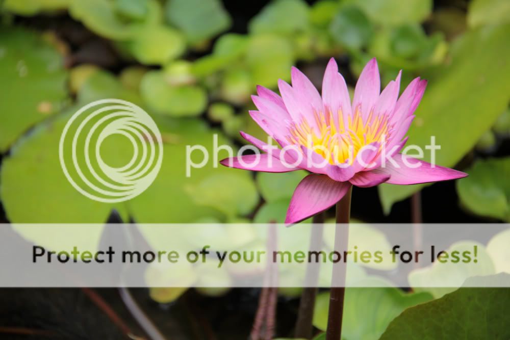
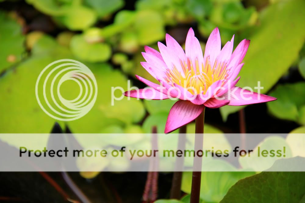
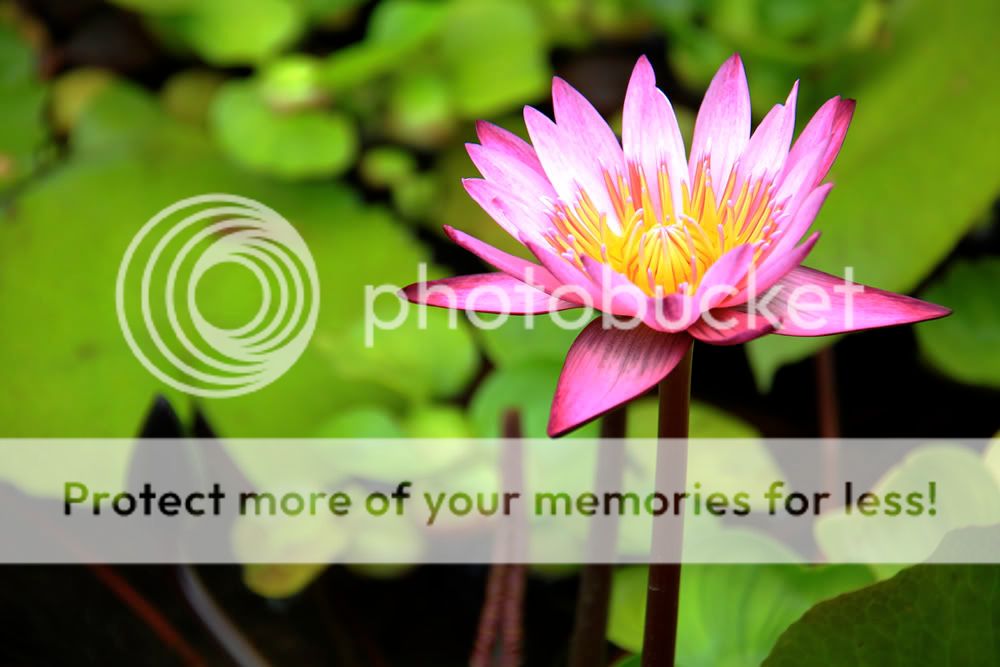
1. in what area is critique to be sought?
Composition, PP (how much PP is too much PP, in this case I tried to bring out the vibrant hues of this picture to create contrast, did I go too far, too little or just right?)

2. what one hopes to achieve with the piece of work?
Capture the beauty of that blossoming water lily

3. under what circumstance is the picture taken? (physical conditions/emotions)
Overcast day. Shutter 1/40, F5.6, ISO 100, 145mm, with EF15-200, 550D

4. what the critique seeker personally thinks of the picture
I like the original shot, but thought it was a little bland in the color and thought I should do some post processing to it. Otherwise I like the sharpness and contrast of foreground and background, the only thing i doubt is whether I overdid the PP. Other CC's are welcome.
 

Last edited:
Its just a personal thing... but i like my flowers as close to natural as possible. The greens in the background are over saturated and rather distracting.

Its still a nice flower pic though....

Keep shooting :D
 

Thanks for your comment driveanegg, personally I like my flowers to look vibrant and lively, but perhaps it is a little over saturated.
 

hi jeffzhen,

love the colours on the flower! I think the hues are nice, striking. ;) regarding saturation, i think its okay, personally i would prefer something more natural and less dynamic, just in case it looks a bit flat with the strong contrast -- personal preference though!

hmm..and if i had to nitpick, the green leaf at the bottom right of the frame, it seems a little more in focus than the background. not sure if you are alright with it. :D

btw, was this taken at botanic gardens? hehe

cheers,
char
 

Nicely composed. Just that it's a little oversaturated. Personnaly I felt that contrast and sharpenning is a little too strong. These caused the picture looks a little unnatural.
 

Thanks for the comments everyone. It seems like natural is the way to go for shots like these considering the comments given so far. Anyway to compare the shots, here are the originals I took before PP and cropping.

This one is taken in "faithful" settings
Blossomfaithful.jpg


and this one is taken with "landscape" settings
Blossomlandscape.jpg


I personally thought the one with faithful settings, though a natural color, was a little bland, and the picture wasn't as sharp, however for the landscape settings, I found the leaves too yellow and decided to alter it a little and even more distracting than it is. At this point in time, would it have been better to leave it as it is, be it the faithful and landscape settings? What should I do to improve the shot with post processing?
 

hi jeffzhen,

love the colours on the flower! I think the hues are nice, striking. ;) regarding saturation, i think its okay, personally i would prefer something more natural and less dynamic, just in case it looks a bit flat with the strong contrast -- personal preference though!

hmm..and if i had to nitpick, the green leaf at the bottom right of the frame, it seems a little more in focus than the background. not sure if you are alright with it. :D

btw, was this taken at botanic gardens? hehe

cheers,
char


Hey Charmaine, haha yes, I'm actually ok with the leaf on the bottom right. No this picture was not taken in botanical gardens. It was actually taken on the roof garden of orchard central. They have a little pond where I found this beautifully blossoming flower!