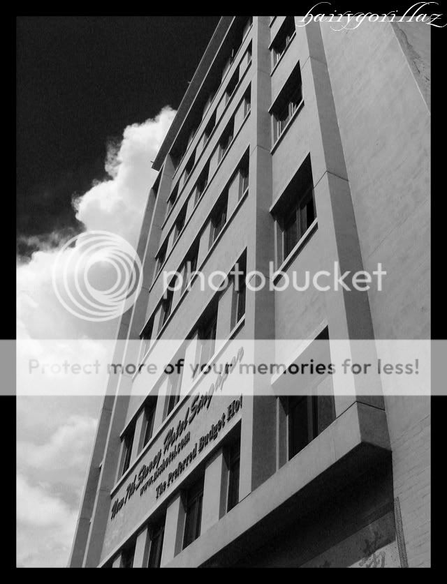
This is a picture of "The New 7th Story Hotel" I converted it to black and white and used PS to "simulate" a red filter to darken the sky. But i feel that there is something lacking in composition. Any tips or comments?
The wordings are very difficult to read....I cannot make out if the wordings are OFF or simply because they are too cramped....why not face the build more on the front as that the wording can be spread out for ease of reading? Just my opinion.
In this instance, you've moved too close to the building. The crop is too tight for viewers to appreciate its architecture but not tight enough to isolate any interesting details. Looking at the sky and clouds, I can't imagine a photo to be more contrasty than what you have now so its definitely not about that.
Taking the shot at an angle where the signage are more legible will definitely help. I'm sure you've taken more than 1 shot of this?

")