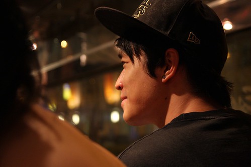
#1, the "thing" in the foreground is quite distracting... it would be better not to have tat in the pic. The space to the left of the subject is good, since the guy is looking towards the left.
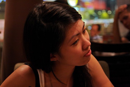
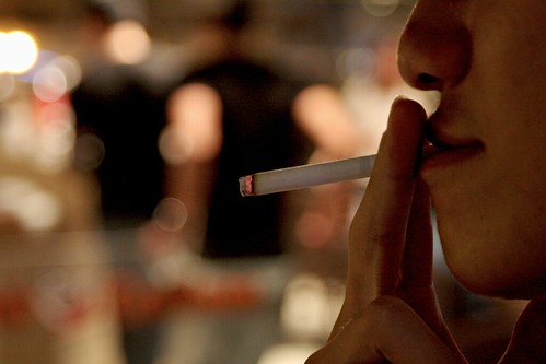
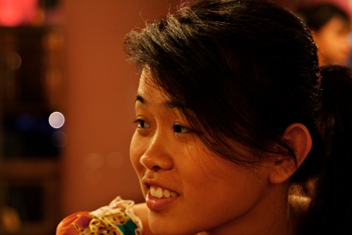
i would suggest using a little fill flash for pic #2,#3 and #5 and increase the exposure for #4.
#6 and #7 i feel would have a better effect if u could zoom in more and focus on the infant, tighter crop
Ur subjects are abit too centralised (except for 4), would suggest u use the rule of thirds to improve composition.
just my 2 cents...
")