Wedding Pictures


Status
Not open for further replies.

Poledra

New Member
Sep 7, 2002
557
0
0
39
Near the Clouds
Visit site
Took these last month and I haven't got the courage to post them up until now. And until Witness bothered me to do this.
Here are some of the better shots I took in the wedding.

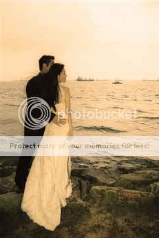
#1: Does this look better in sepia or b+w?
F1020014-sepia.jpg


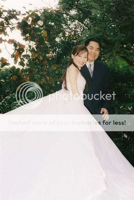
#2:
F1030018.jpg


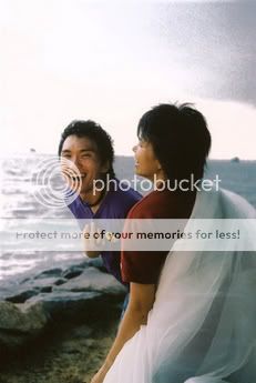
#3: The Bride's Helpers being mad.
F1020011.jpg


I don't have many good shots of that event.
I wait humbly for your criticism. This is, after all, my first wedding shoot.
Am I in the right forum?
 

Yes, you are in the right forum. :)

The 1st shot works well for me. the 3rd shot's spot on with the expression and moment captured. I'm caught in 2 mind for the 2nd shot tho...

The converging lines of the skirt leads nicely to the subject but it's blown out and it's the dominant part of the shot... Compared against the 1st & 3rd shot, i would think this onepales in comparison.

But hey, don't let it worry you 'cause if the bride & groom love your shots, then it's alright. ;) If the client is pleased, then nothing else matters but of course, you would have to strive not to do it again. ;)
 

Definitely #1 and 3... :thumbsup: for #3, very fun expressions! good job for a first-timer!
 

First image works.

2nd image crop off the right side nearer to the groom to right position the couple, note that the overexposure of the gown loses details, which I feel it's rather important :)

3rd Image, nothing doing, can be done without.
 

Why are you laughing???
:(
Cannot tell UL now since he's buried somewhere in work.
I'm more or less on my own.

... Oei. Stop that!

Thank you everyone else for your comments. :D
Will try to panic less during big event shoots like this.
 

A good effort for a first timer. :)

Here are my more detailed comments:

1st shot --

a) The colour's quite weird. It's more of a colour cast to me than sepia.

b) Part of the bride's face can be seen from her side profile, that's ok. But the groom...!!! His face has been hidden which cuts off the whole meaning of the pic. Is he there as an extra or do you want to show the closeness of the couple? I think it's the latter. Then you'd do want to show his face too.

c) The burnt highlight from the sky is distracting.

d) It'd be good to show what the couple is looking at. Otherwise, this shot looks like the couples are simply static 2 people objects placed to the side of the pic.

2nd shot --

a) Nice expressions from the couple. Unfortunately, the gown of the bride has taken up too much of the pic and I feel the remaining parts seem to be vying space in the pic. Sort of disproportionate in terms of composition.

b) The bride's right hand seems to disappear in her gown because her white gloves blend into the white gown, like she's putting it in a side pocket or chopped off! Not flattering at all. A simple way out could have been to ask her to place it on her husband's chest. There should be good contrast then between the white and black.

3rd shot --

Not much to comment here as it looks like a casual grab shot than anything intentional. Nice candid expression on the gentleman in blue. Otherwise, as in previous shot, the burnt out sky is distracting.

Guess giving genuine advice and opinions in CS can be a dangerous thing as there's a likelihood of flaming. :p So here's the disclaimer: I'd say I've given my frank opinion as a viewer and a photographer rather than pretend to be diplomatic. Others' views may differ. That's ok.

It's a good (or brave!) start nevertheless. Everyone has to start from somewhere.... :)
 

Poledra said:
Why are you laughing???
:(
Cannot tell UL now since he's buried somewhere in work.
I'm more or less on my own.

... Oei. Stop that!

Thank you everyone else for your comments. :D
Will try to panic less during big event shoots like this.


heheh... not laughing at your work lah... just that it's so long then you start posting... should have posted long time ago so you can pick it up fast on her actual day
 

David said:
A good effort for a first timer. :)

Here are my more detailed comments:

1st shot --

a) The colour's quite weird. It's more of a colour cast to me than sepia.

b) Part of the bride's face can be seen from her side profile, that's ok. But the groom...!!! His face has been hidden which cuts off the whole meaning of the pic. Is he there as an extra or do you want to show the closeness of the couple? I think it's the latter. Then you'd do want to show his face too.

c) The burnt highlight from the sky is distracting.

d) It'd be good to show what the couple is looking at. Otherwise, this shot looks like the couples are simply static 2 people objects placed to the side of the pic.

2nd shot --

a) Nice expressions from the couple. Unfortunately, the gown of the bride has taken up too much of the pic and I feel the remaining parts seem to be vying space in the pic. Sort of disproportionate in terms of composition.

b) The bride's right hand seems to disappear in her gown because her white gloves blend into the white gown, like she's putting it in a side pocket or chopped off! Not flattering at all. A simple way out could have been to ask her to place it on her husband's chest. There should be good contrast then between the white and black.

3rd shot --

Not much to comment here as it looks like a casual grab shot than anything intentional. Nice candid expression on the gentleman in blue. Otherwise, as in previous shot, the burnt out sky is distracting.

Guess giving genuine advice and opinions in CS can be a dangerous thing as there's a likelihood of flaming. :p So here's the disclaimer: I'd say I've given my frank opinion as a viewer and a photographer rather than pretend to be diplomatic. Others' views may differ. That's ok.

It's a good (or brave!) start nevertheless. Everyone has to start from somewhere.... :)
My first reaction was to feel defensive.
Then I realised it was my Photoshop skills at fault. The 1st and 3rd shots have been slightly PS-ed.
You're right about the fake sepia colour of the 1st shot. I used the sepia filter thing Photoshop provided.
The sky were pretty dark in Shots 1 and 3, so I adjusted the curves, the wrong way, it would seem.

The reason why you have more of the bride's face rather than the groom's is because I like the bride better and the groom is camera shy, plus the main photographer was freaking the groom out.

Thank you for your comments. I will work on my photoshop skills more. :)

P.S: 2nd shot was not posed. I didn't dare, since the groom's smile is quite fragile.
 

on second viewing(after one day) of 1st shot, the groom's face should be visible. horizon is way too high.
 

Dear fellow folks

How to make a picture turn sepia using photoshop?
 

Status
Not open for further replies.