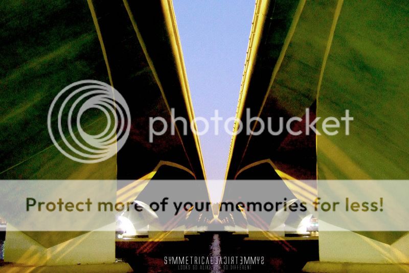
I think you might have pushed the curves too much and the weird colours don't work well for me at all here. Composition is ok, but may I draw your attention to the bottom edges; it's not symmetrical! Also, be careful of highlights, as they can be potentially distracting. The highlights here attract too much attention due to their positioning, i believe unintentionally? If it was intentional, it doesn't quite work.
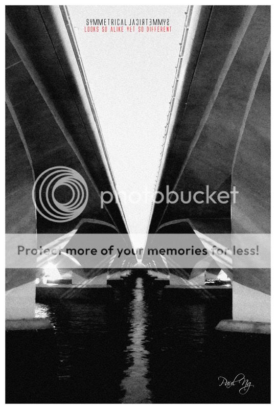
The composition for the second is far better and is more balanced, albeit still a little unbalanced(see top corners). Unfortunately you still have the annoying light sources in the image at really unfortunate positions.
Keep trying
")