sunset


Status
Not open for further replies.

ozawa

Deregistered
Mar 20, 2006
272
0
0
cck
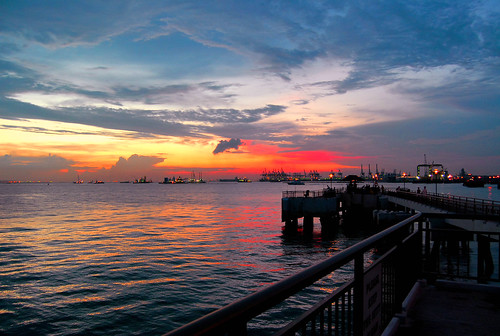
hi, first attempt in capturing sunset at Labrador park, although i 've started dslr for 1.5years already, still considered as a newbie, coz shoot very little
p/s: slightly ps :D
2999201315_bc3bc5f69d.jpg


I am willing to learn more about shooting angle, framing for this kind of shot, how to make the colour looks better?
though other comments on technical issues also welcome.
The shot was taken using d200 + 18-55 kit lens, with no tripod, around 7pm, at 18mm.
 

Last edited:
Hi there,

My 2 cents. I like the colours - very vibrant - however, I feel that it was PSed a little too much, so much so it looked a little unnatural.

Maybe less contrast could have been better? My 2 cents :)

cheers
 

however, I feel that it was PSed a little too much, so much so it looked a little unnatural.

Maybe less contrast could have been better? My 2 cents :)

cheers
Agree to that too.
Perhaps not contrast, and a bit of too much colour stauration. I know you're excited with the orange colours, and may try to increase the saturation, but you could have used f8-f11 instead.

I would not be standing there; cos the railings are disturbing, a bit messy too. It may have been a leading line towards the horizon / sunset, but being in part silhouette part shadow, its just messy la.
 

thanks all for the prompt comments :D, yes, i do feel the orange is a bit too much, what i did was applying some kind of color filter in ps (still noob at this :) )
@cheguthamrin: the railings are not nice at all, but i think if just take pic of the horizon/sunset, is it too simple? just my feeling :D
another approach
3003034242_f0aa89521c.jpg
 

TS i get what you are directing at. 1) on your orange filter you applied to the image, did you set it on a different layer? If not set it to be on a different layer, followed by adjusting the opacity. It would aid you in getting a lighter tone of it. 2) Agreed the railings are boring and not interesting, and understand that you wanted to have it to add more spice in the image, however the idea is there, in leading the eyes to the sunset, what you might be able to do is to have them in shiloutte, yet still able to make shape out of the railings. Oh, try shifting your angle a bit to the right as well. This will have a more acute angle of the railings and empty space there that will lead to the sunset. Just my 2cents.
 

just take pic of the horizon/sunset, is it too simple?
The cloud formation is alerady so great, plus the moment of the sunset, plus the activities at the horizon.... that'll be enough for me :)
 

Hm I think a little toning down on the red should help.
 

1) nice sky

2) way overdone colors

3) good try in leading lines, if you did. but could be more effective, for example, shifting yourself to the right. however, i also agree with chegu, unless you happen to have a huge ladder here, your jetty will be one big mess. simplify. sometimes, less is more.

4) the later picture is better, but has lost the color impact.

5) no, there is nothing wrong with sky only, so long as you think it's good enough to stand on its own. throwing in the jetty subtracts from the image, rather than adds to it.
 

Last edited:
The color saturation works for me, I like it and don't think its excessive.

I like surreal pics.

Just to give you a different voice.

And take a look at this guy's pics here, none look natural, but all impressed me.
 

wow, thanks all for the replies, long time i though no more comment :D
@sjackal: pics in your link are quite nice, mine still have a long distance....:(
thanks for nice comment anyway
@PyeeL : thanks
@nightmare86: next time will try the sky only, now too busy for any more shooting, now i really how messy the jetty is, haha
 

The pictures that sjackal linked to are definitely not overdone. I would say that's walking the fine line between tasteful saturation boosting and oversaturation, and they were achieved with Cokin tobacco filters, mostly.

In the initial image, you'll notice that the reds at the center are clipped such that they no longer look red - they look slightly pinkish.
 

Status
Not open for further replies.