
Hi guys,
I'm a newbie trying to take good photography. Recently, I took a picture at the construction site near bugis. I wanted people to notice the architecture of the scaffoldings and the stop sign. However, I juz feel that something is not quite right about this photo but yet i can't seem to pin-point the problem. Is it because of the colour composition? What can i do to make this look better? Any comments is seriously welcomed. Thank you")
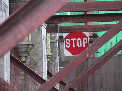
I'm a newbie trying to take good photography. Recently, I took a picture at the construction site near bugis. I wanted people to notice the architecture of the scaffoldings and the stop sign. However, I juz feel that something is not quite right about this photo but yet i can't seem to pin-point the problem. Is it because of the colour composition? What can i do to make this look better? Any comments is seriously welcomed. Thank you
