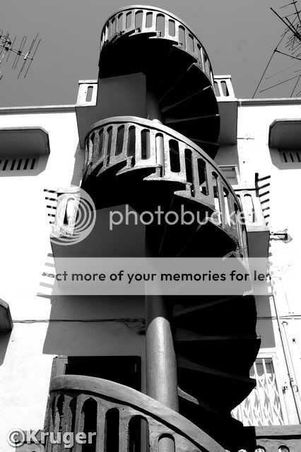
I think balance could be better on the first one. The slanted vertical doesn't work for me. At least make sure that the verticals converge towards the center, and don't slant off one way.
Make it a habit to watch your horizontal/vertical lines, depending on what you intend to convey. In the case of #1, watching the horizontal would make the photo seem less 'disoriented'.