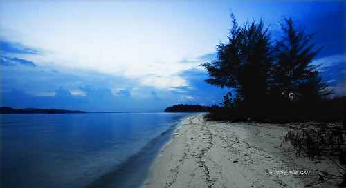
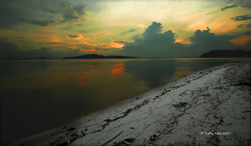
actually at first glance, i like both. but at scrutiny, i hope there is more range of hues retained in the first picture, as the strong blue overall hue does not match well with the clean neutral (or a little desaturated) sand color. maybe there is a need to introduce a cold color temperature to the sand, or somehow there needs to be a gradient between the two, somewhat technically difficult to me.

")