Portrait of Her
Model : Dian Anggraini (Graphic Desiger)
Location : Fort Canning Park, Singapore
Gear : Sony Alpha 900 + CZ 16-35 mm F/2.8 + Sony Flash HVL 58 + Omni Bounce + ND Filter 4 Cokins
Creative Tool : Adobe Photoshop CS 2
Thanks for visiting, C & C are welcome, cheer ;p
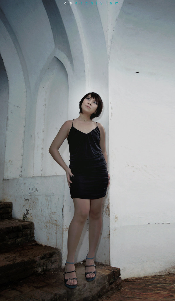
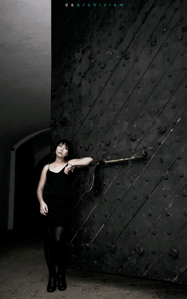
# 1 Portrait of Her 01
http://www.flickr.com/photos/27143060@N08/3713198746/sizes/l/
# 2 Portrait of Her 02
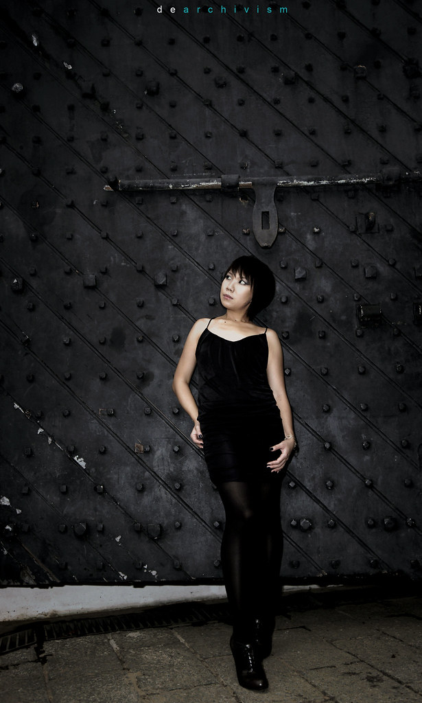
http://www.flickr.com/photos/27143060@N08/3713472652/sizes/l/
Model : Dian Anggraini (Graphic Desiger)
Location : Fort Canning Park, Singapore
Gear : Sony Alpha 900 + CZ 16-35 mm F/2.8 + Sony Flash HVL 58 + Omni Bounce + ND Filter 4 Cokins
Creative Tool : Adobe Photoshop CS 2
Thanks for visiting, C & C are welcome, cheer ;p
# 1 Portrait of Her 01
http://www.flickr.com/photos/27143060@N08/3713198746/sizes/l/
# 2 Portrait of Her 02
http://www.flickr.com/photos/27143060@N08/3713472652/sizes/l/
Last edited:
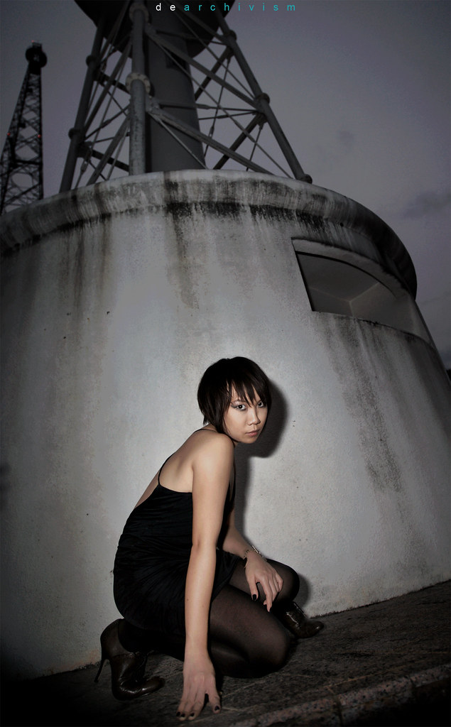
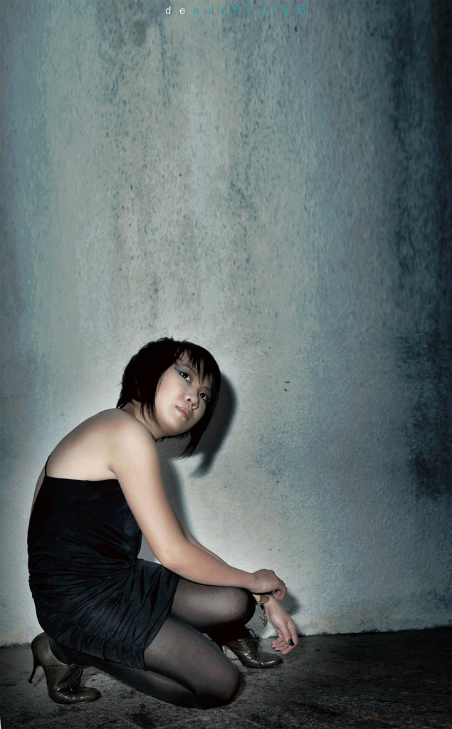
 . Should pay more attention on the contrast of the outfit and the background. 4th picture model too close to the white wall which causes a harsh shadow. Try keeping her out away from the wall a feet or 2. Keep it up!!!:thumbsup: