icemangrafx
New Member
Continuation
6#

7#

8#

9#

10#

6#
7#
8#
9#
10#


It is a nice shot,but why is the sky so grey?Cloudy day?What was ur ISO setting?It looks abit dark
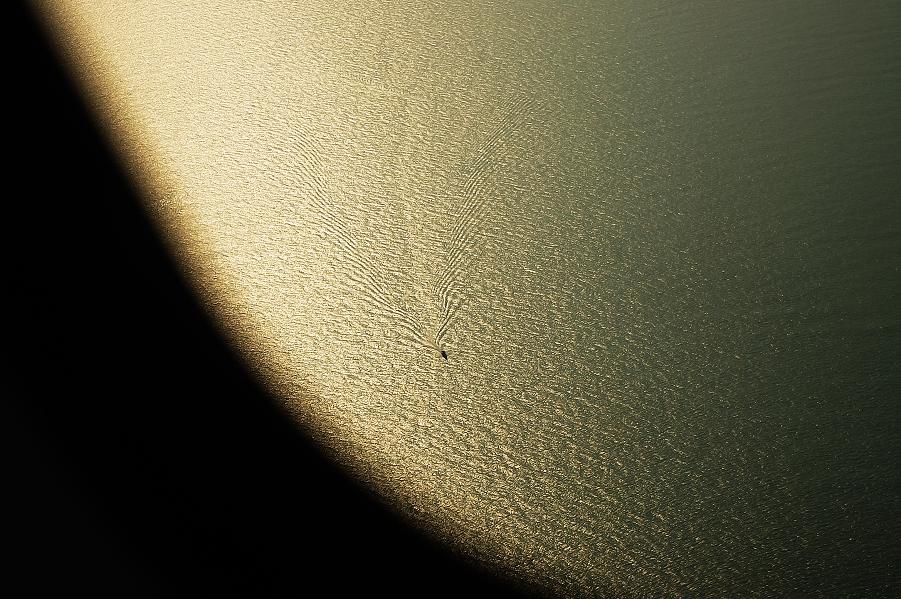
ripples
Kx DAL18-55mm
Last but not least...
16#
Greatly appreciated all comments & crictics...
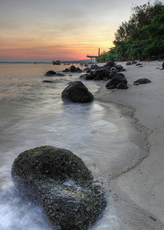
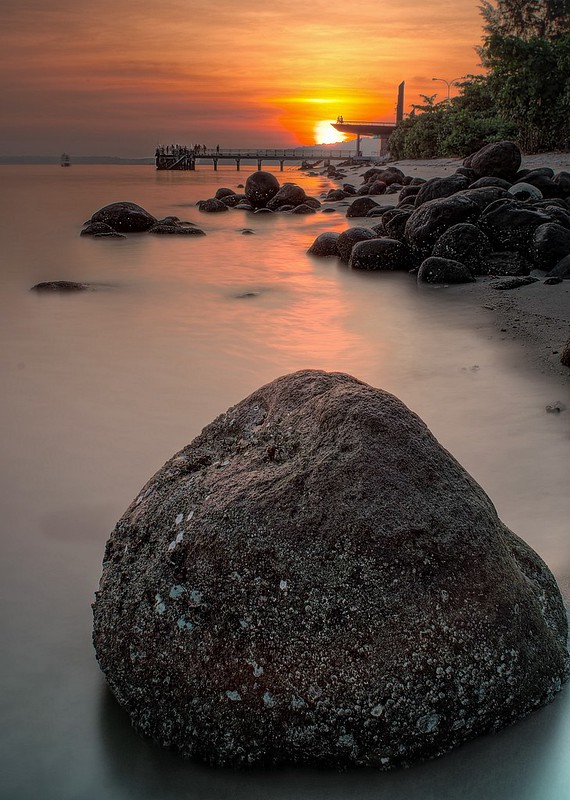
#1
K5, DA15ltd
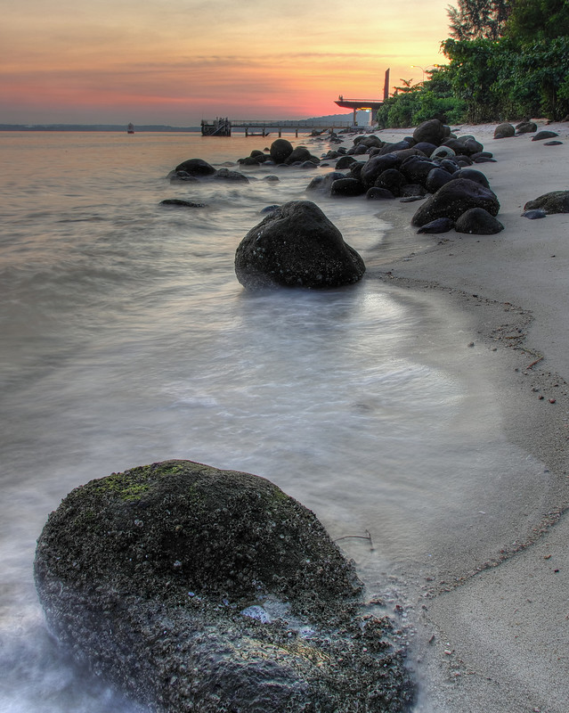
#2
I need some opinions here.
Its supposed to be a leading shot.
However, I find that my choice of composition as well as focal length has resulted in the foremost rock being a bit too distant from the next linking rock and to the rest of the elements in the photo.
The FL exaggerates the distance between this rock and the others even more.
So I find that I prefer shot#2 (cropped), which pulls it in a bit.
What do you guys think?
Or is it my preference for more compression that is skewing my impression of shot#1
Thx in advance for inputs
")

Supersimon27 said:I prefer #1 . I do agreed that for #2 it seem that Distant of the front rock and the background element is nearer , but I don't like the rock to be crop the way . It look incomplete , same as the background tree on the top right .
#1 give me a more spacious feel and not so tight , but maybe it's just me I always like photo which feel more spacious .
To overcome this problem , maybe u can try to use a longer FL and move a few step behind to compress the perspective . I do face the similar problem sometime , and I still yet to find a good solution . As by moving backward some unwanted element will be included and somehow my 16mm end still doesn't compress the perspective enough . Got to try and try I guess
Hope the above point help
Nevertheless it's still a great picture for #1 regardless the distant of the background. I like it
machiavellian said:here's another one!
k-x, DA15
I like your recent shots that have a warm look to it.
Keep it up man!
#1
K5, DA15ltd
#2
I need some opinions here.
Its supposed to be a leading shot.
However, I find that my choice of composition as well as focal length has resulted in the foremost rock being a bit too distant from the next linking rock and to the rest of the elements in the photo.
The FL exaggerates the distance between this rock and the others even more.
So I find that I prefer shot#2 (cropped), which pulls it in a bit.
What do you guys think?
Or is it my preference for more compression that is skewing my impression of shot#1
Thx in advance for inputs
I prefer #1 . I do agreed that for #2 it seem that Distant of the front rock and the background element is nearer , but I don't like the rock to be crop the way . It look incomplete , same as the background tree on the top right .
#1 give me a more spacious feel and not so tight , but maybe it's just me I always like photo which feel more spacious .
To overcome this problem , maybe u can try to use a longer FL and move a few step behind to compress the perspective . I do face the similar problem sometime , and I still yet to find a good solution . As by moving backward some unwanted element will be included and somehow my 16mm end still doesn't compress the perspective enough . Got to try and try I guess
Hope the above point help
Nevertheless it's still a great picture for #1 regardless the distant of the background. I like it
I too prefer #1 simply becos of the extra breathing space all around the frame. #2 is too tight for my liking... Punggol beach @ sunrise is tricky becos of the pier in the BG. Using a longer FL the compress the perspective may result in all the elements in the middle clustering around the horizon,, which to me is the greater evil.
All things considered I think it's a nice shot. Well done!
Preferred the #1 shot..Looks better.

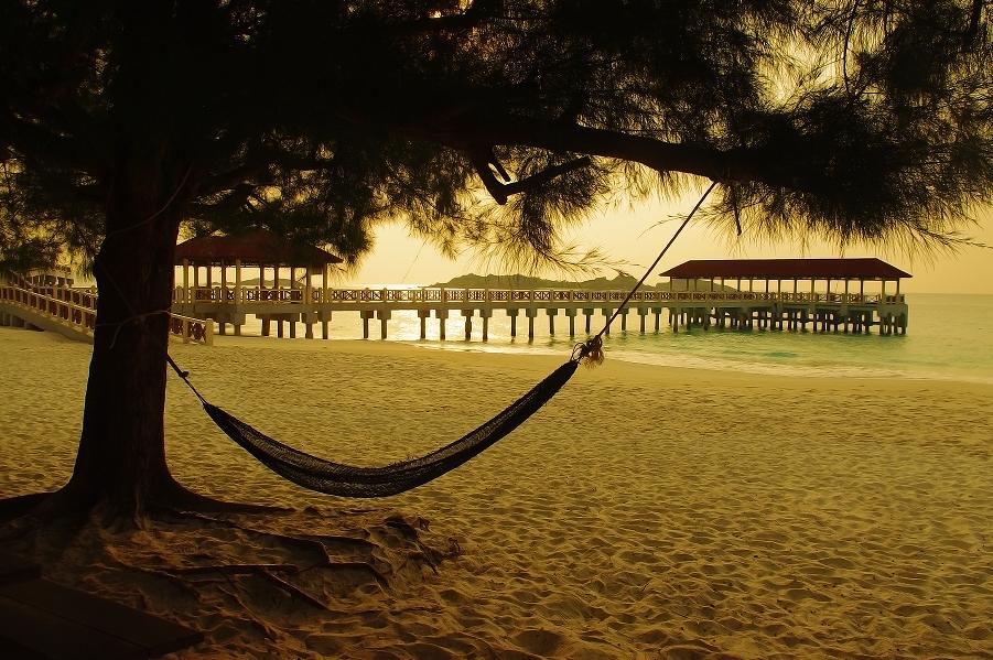
twilight hammock
mutiara resorts, pulau redang
