
1.in what area is critique to be sought?
I would like to have comments on these areas.
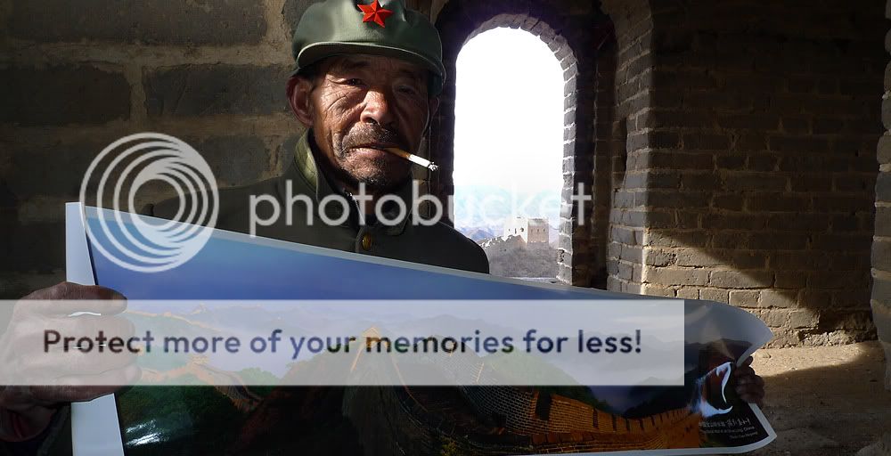
- Lighting...... is the overblown sky outside an image-breaker?
2.what one hopes to achieve with the piece of work?
I want to depict my visit to the Great Wall in a way that is different from most Great Wall images but yet add a stronger human element within it
3.under what circumstance is the picture taken? (physical conditions/emotions)
Image was executed around lunchtime indoors (inside one of the watch towers) next to a window
Subject about 1+m away from camera
Spot-Metered off the lit corner of wall in background (did not want to spook the old fella with a cam taking meter readings off his face)
in-camera Fill-flash used at -1 to -1.333 EV (cant remember)
Cropped a TINY bit off the bottom of image
Panasonic LX-3 @ 24mm at 16:9 frame format
4.what the critique seeker personally thinks of the picture
I like the image personally and have my opinions on what needs to be done....want to hear other advise and opinions too
I would like to have comments on these areas.
- Lighting...... is the overblown sky outside an image-breaker?
2.what one hopes to achieve with the piece of work?
I want to depict my visit to the Great Wall in a way that is different from most Great Wall images but yet add a stronger human element within it
3.under what circumstance is the picture taken? (physical conditions/emotions)
Image was executed around lunchtime indoors (inside one of the watch towers) next to a window
Subject about 1+m away from camera
Spot-Metered off the lit corner of wall in background (did not want to spook the old fella with a cam taking meter readings off his face)
in-camera Fill-flash used at -1 to -1.333 EV (cant remember)
Cropped a TINY bit off the bottom of image
Panasonic LX-3 @ 24mm at 16:9 frame format
4.what the critique seeker personally thinks of the picture
I like the image personally and have my opinions on what needs to be done....want to hear other advise and opinions too
Last edited:
")