How do you Colour your IR photos?


limwhow

Senior Member
Jun 9, 2009
7,035
0
36
Life revolves arOnd East Coast
IR Photos

IR photography is, in my opinion, a very unique form of art.
And like any other art form, there are various ways of looking at them, and appreciating them.
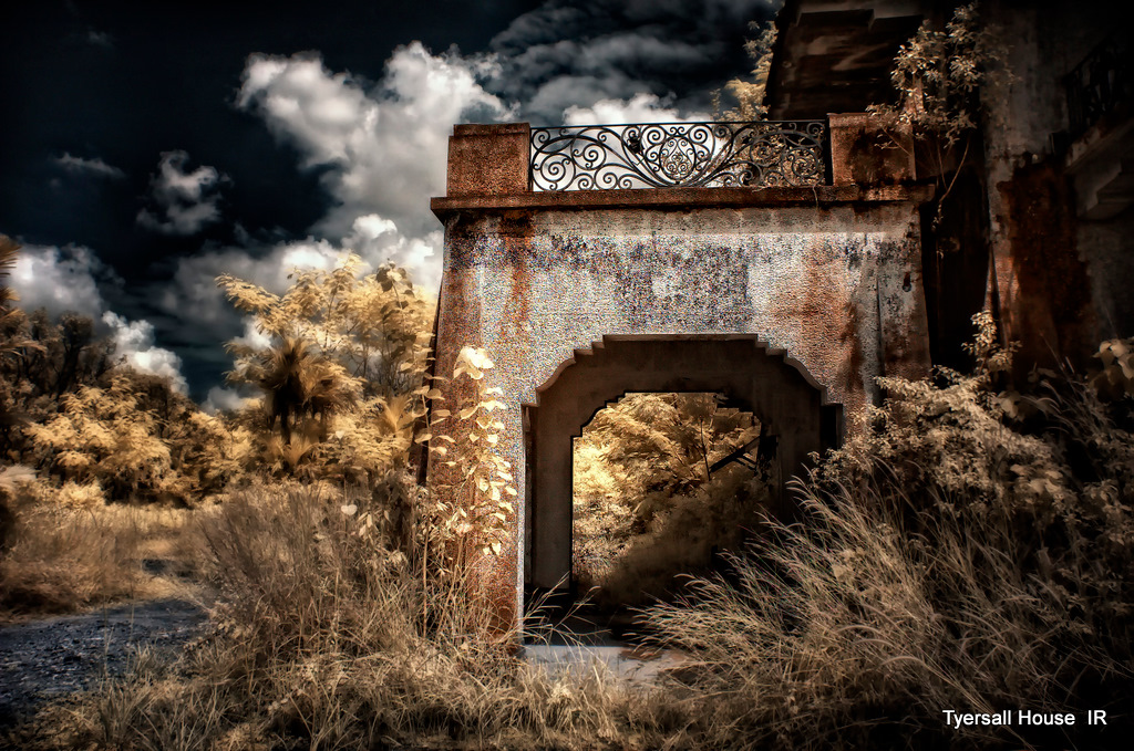
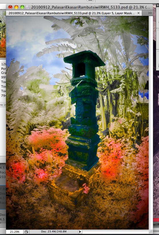
The rendition of the final product can range from a pure Black and White IR photo,
through a range of Multi-Tone picture and pictures with minimal colours,
all the way to a dramatic highly-coloured one.

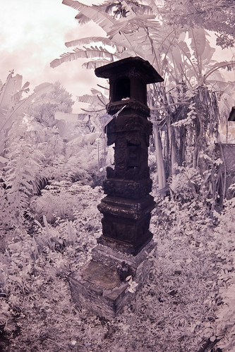
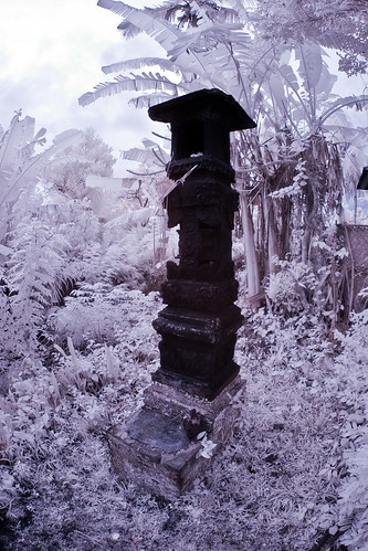
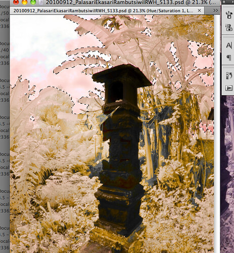
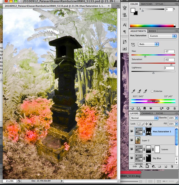
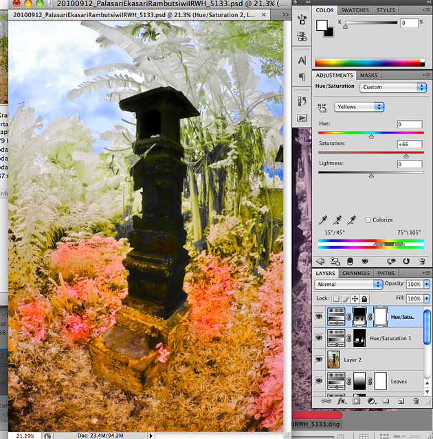
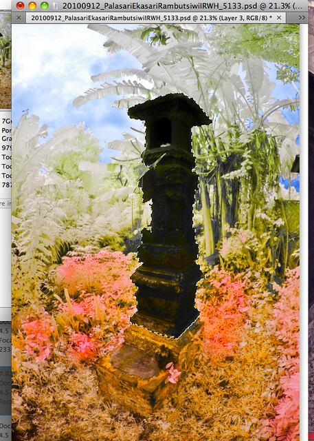
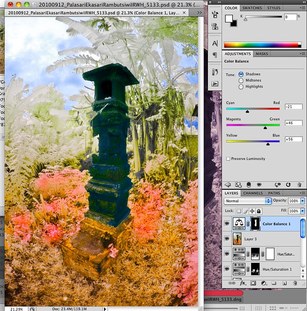
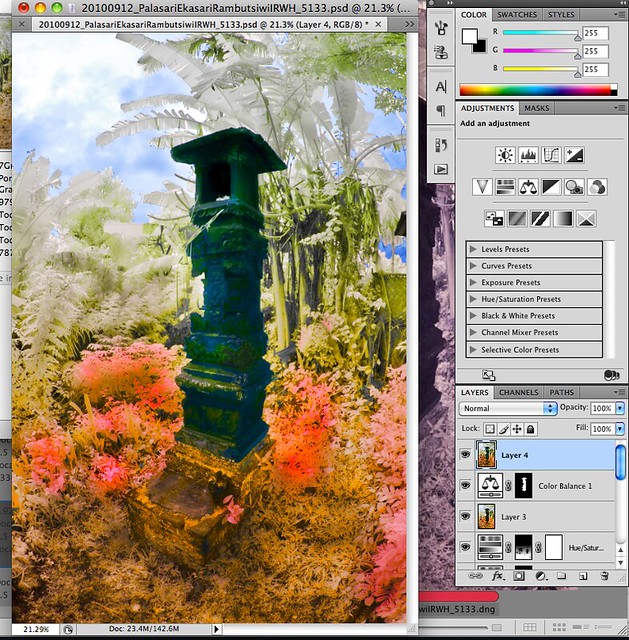
After the Channel Swap...

I have always wanted to ask all our fellow IR shooters this question.
Granted, there are those who prefer their IR photos monochromatic and others who like theirs coloured.
And there are so many ways of going about colouring your IR photos.
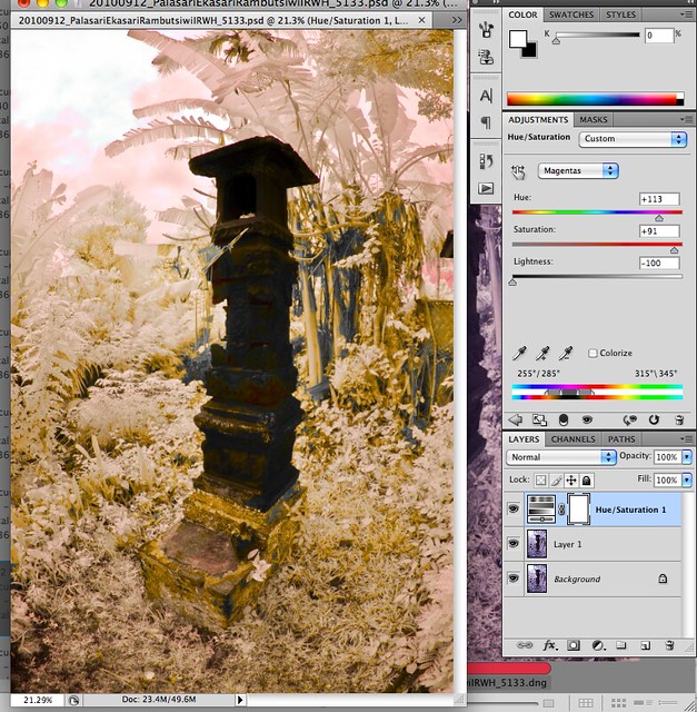
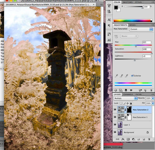
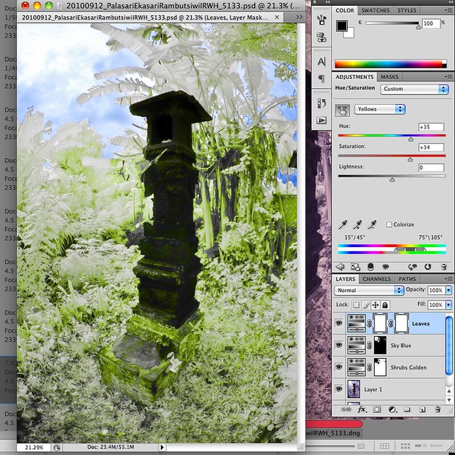
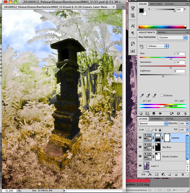
Most of us would use Channel swap as our first step as post processing (some may not even swap!).
The difference comes after the Channel swapping... how each shooter PP their photos from there.

So, how would you go about Colouring your IR photos?

Thus I would like to ask everyone - both experienced and new IR shooters alike -
how do you go about colouring your IR photos after the Channel Swap
(be it Hue & Saturation, Selective Colouring, Colour Balance, Duotone...)?

Let's share...

There is no right or wrong answer.
Just to gather opinions and share workflows.

What I have come to realise is that here in our ClubSNAP's IR subforum,
all the members are very helpful and very friendly. And I think it is great to perpetuate this culture.
I am sure all of you have your own style of PP-ing colours into your IR shots.
And I'd love to have your input.
It could be a few pointers, or a whole few pages of workflow.
Whatever it is, I'm sure everyone would like to know.

I thank everyone in advance.

So here goes...
 

Let mi start off first,

As everyone should koe by now I am using Nik plug in to PP my IR photos.

Did the usual channel swap:

- Adjust level.

In Nik software:

- Under Portrait column Do a tonal contrast -
tat to bring up detail in Highlight, Midtone and shadow.

- Under Landscape: Do a Skylight filter
Tat to bring up colors- sometime u need to repeat a few time.

PS - Filter sharpen according to ur pleasure.

Lastly do a surface blur 3-6. it will remove noise also smoothen the surrounding.

This is the very basic of wat I usual do. sorie for the my broken english... :sweat:
 

Thank you, Ah Chua.
I got a few questions to ask you, Ah Chua:

  1. Do you do masking to isolate certain subjects in your photo?
  2. Do you use Hue & Saturation to change colours in your photos? You use ELP, right?
Now I understand why your IR photos have a dreamy look to them.
It's because of your Surface blur. That's something good for me to learn.
For me, I Unsharp Mask as a last process, and I usually don't apply any Blur.
Thus my pictures usually appear rigid and sharp.

Yes I did, also in the Nik software there is also a funtion of darken/lighten function. Just like burning and dodgeing. But some time u need to repeat a few time.

No I dont use the Hue & Saturation, I will just use the Skylight filter, repeat a few time to get the color rite.

In order to get "3D" effect. there must be sharp and blur also the high light and shadow. Tat was taught to mi by Bro Lowslight. Usual after sharpen I will mask the "unwanted sharpness" away so My photo wont be all sharp sharp.

1 tin i learn from my Lx3 photo is tat eveything too sharp it will become very fiat. Thus I will alway try to have both sharpness and blurness in my photo.

Cheers

PS: In Nik - let ur Imagination go wild....")

Take this photo for example- Sorie Not say I am gd in anyway. Just wan to point my point.

5025923002_d30b92d265_b.jpg


The main subject tat will be the building will stay sharp, the background will be blurrer than the foreground.
 

Last edited:
Yes I did, also in the Nik software there is also a funtion of darken/lighten function. Just like burning and dodgeing. But some time u need to repeat a few time.

No I dont use the Hue & Saturation, I will just use the Skylight filter, repeat a few time to get the color rite.

In order to get "3D" effect. there must be sharp and blur also the high light and shadow. Tat was taught to mi by Bro Lowslight. Usual after sharpen I will mask the "unwanted sharpness" away so My photo wont be all sharp sharp.

1 tin i learn from my Lx3 photo is tat eveything too sharp it will become very fiat. Thus I will alway try to have both sharpness and blurness in my photo.

Cheers

PS: In Nik - let ur Imagination go wild....")

This is something new for me.
And yes, after you say this, it becomes clearer to me.
So in order to have depth and 3D effect, not only must we have Dark and Bright areas,
but also we must have Sharp and Blurred areas!
Very true, Ah Chua!
See, I just started this thread and now I am beginning to learn something already.
 

Ah Chua, your workflow is easy and streamline.
Very good for developing IR photos that are dramatic and has lots of depth.
Unfortunately for me, I am not well-versed in the Nik software.
My PP are all done in Photoshop with its intrinsic functions.
The most I would find myself using is Topaz Labs Remask function for masking more complex subjects.
 

My Workflow is like this:

  1. I will (almost) always do a Channel Swap and Auto-Levelling.
  2. Then I look at the picture and decide which parts I want to change to which colour.
  3. Then I will open up a Hue and Saturation layer and adjust that particular colour of that subject that I want to change. Sometimes, if need be I will mask out the surrounding so that only that isolated subject will be affected.
  4. I often open many layers of Hue and Saturation. Each layer for one single subject, or part of the photo. This ensures that I can always just delete this layer without affecting the others.
  5. Also, I use a lot of Colour Balance layer to add in more solid/dramatic colours to subjects which I find hard to change their colours.
  6. I also use a fair bit of Gradient Tool to graduate the colour changes from one part to another.
  7. then I will usually do a vignetting to complete the whole picture. I know vignetting is not everyone's cup of coffee. Some people love it. Others do not really prefer it.
 

Actually I started this thread with the intention of making it a sharing thread where everyone can contribute.
(Not workshop where one person talk, the others listen... hahaha...)
This is because there are quite a number of members who have just taken the first step into IR photography and they are,
like myself when I first started, thinking of how to PP their IR photos.
Thus this thread would hopefully be of some help to our fellow shooters who are new.
Thus I hope everyone can share and discuss.

I will certainly make some mistakes here and there. And there will be things which can be done in a better way from what I did.
So do feel free to point out to me.

My Workflow

1. Channel Swap

I will almost always do a channel swap, followed by Auto-Level to give it some contrast.
Before Channel Swap and After Channel Swap.
5035866620_1a9be0a06b.jpg
5035247811_737b161715.jpg

After Channel swap, I will always find my pictures with a bluish tint.
Not nice. I don't like it this way.
At this stage, I will start to think and plan what colours I would like to inject into which parts.

1. Hue and Saturation Layers

So I will always open up a Hue and Saturation layer.
Here I selected Magenta and moved the slider until the shrubs and foliage turn golden yellow.
5035240397_bda8021480_z.jpg

This would be the foundation for my further adjustments.

3. Masking

There will be different parts that needs to be masked for different types of photos, depending on what I want to achieve.
Here, I wanted the sky to remain blue.
Thus I selected the sky with 'Quick Selection' tool in Photoshop.
5035240887_4e717a8970.jpg


After that, I will use this selection to create masks so that whatever I adjust in the Hue and Saturation will not affect the sky.
Here, I created another Hue and Saturation layer with the mask as seen on the layer panel,
to push the slider on Blue further to further enhance the sky colour, without affecting the other areas.
5035860874_44cf1365c1_z.jpg


4. Desaturating the Palm leaves and foliages

I have, right at the beginning, decided that I wanted the palm leaves and those leaves on the
upper half of the photo to be desaturated so that the IR-ness of the photo will be recognizable.
So I open yet another Hue and Saturation layer, select the Magenta and drag the slider all the way to the left to desaturate.
But by doing so, almost everything becomes desaturated.
Here in this illustration, the Slider was at Yellow. This was done after desaturation of the Magenta as I needed to adjust the Yellow a little bit.
5035242413_85041c90ee_z.jpg


So what I did was, I opened another mask on this Hue and Saturation layer, and used the Gradient Tool to create a graduated mask.
This resulted in the top half of the foliage being desaturated still,
and the foliage on the bottom half of the picture reverted back to the golden yellow of the layer below.
5035862376_6edf403c4f_z.jpg


I personally find this Gradient Tool pretty useful.

5. Adding more colours


I am not entirely satisfied with this colour scheme because I like more colours.
Thus what I will always open up another Hue and Saturation layer.
But this time round, I have filled up the mask on its right side with black.
I selected the Red and push the slider until the foliage turned red from the original golden yellow.
Then using the paint brush (with soft edges) I painted (using white) onto the mask so that those area I want to be reddened will show up.
(see the topmost layer and the small little rectangular mask on the right side.
It corresponds with the areas of reddening.)

5035863112_81aafb3b98_z.jpg


Somehow after all these adjustment, I will often find my some colours not exactly what I want them to be.
Here I open up yet another Hue and Saturation layer to re-adjust the Yellow so that it becomes Golden Yellow again.
5035244377_725d0a2183_z.jpg
 

Last edited:
6. Masking the Subject

Finally, after I have settled the foliage, I will turn my attention to the subject.
In this case it would be the Pallingih - the Balinese shrine.
I again use the 'Quick Selection' tool to select the Shrine, taking care to make sure my selection is as accurate as possible. (as shown below)
5035864324_90ce848472_z.jpg


7. Colouring the Subject (with Colour Balance Layer)

Next, I excitedly look forward to experimenting with the colours of the subject.
Here I open up a Colour Balance layer using the selection of the shrine such that the surrounding is masked off (as in the picture below).

I like Colour Balance layer because it allows me to change the colour of the subject more effectively.
And I can make use of the Shadow, Midtone and Highlight colours to adjust the colouration so that it appears more balanced and more realistic.
5035245711_70ba6845d5_z.jpg


8. Dodge and Burn


As many of the IR shooters in this forum have mentioned, depth is often lacking in IR photos.
Thus I usually would use Dodge and Burn to try to recreate that shadow effect.
At this stage, i will always open up a new layer with 'Shift-Option-Command-E'.
Then I will dodge and burn.
The trick about Burning is we need to look out for the naturally existing shadow lines in the foliage, and follow these lines to burn.
This will then create a more natural shadow effect.
Same goes to Dodging. Look for naturally occuring bright areas and dodge them to enhance the brightness.
5035865686_b8716cbb6c_z.jpg


Compare this picture with the previous one above it and we can see that a little more depth has been created.
 

9. Vignetting

I usually like to create a vignetting effect to isolate the central subject and give it a pop-up effect.
This is a very controversial subject.
There are photographers who love to vignette and there are photographers who are not for the idea.
But this issue is not within this scope of discussion.
For me, I always Duplicate another layer by 'Command-J' and use Filter-Distort-Lens Correction to add that vignetting.
In the Lens Correction dialog box, I would push the slider on Vignetting amount all the way to the left to give it maximum vignetting.
Here is how it looks.
5035247069_9fdab06360_b.jpg


10. Summary

Thus with my series of layering and adjustment, I create this final picture that is not exactly that similar to its original form.
This image is simply used as an example to illustrate how I go about PP-ing the colours.
It is not really that good a photo in terms of composition and such.
So kindly pardon me for that.

I hope all who read these few humble workflow steps of mine, would be able to give me your views and opinons.
And give me your criticism to improve, because I am sure there are some points that I have done that are not too correct.


And Ladies and Gentlemen, do continue to share all your workflows and experience here in this thread for the benefits of everyone.
 

Last edited:
Thanks for sharing guys. Great Job :thumbsup: :thumbsup: :thumbsup:

Thread will be Stickied.
 

Last edited:
HUH i thought color IR the color isnt painted on one o.o i always thought when u channel swap, the colors automatically change...

something impt learnt
 

Thanks for sharing guys. Great Job :thumbsup: :thumbsup: :thumbsup:

I'll Sticky This Thread tomorrow to allow time for more member to know about it.

Wah... Teerex, haha... I think both Lx3ChuA and I were just fishing for more input and opinions from all the experienced shooters here leh...
Hahaha... pai seh...
Thank you very much!

HUH i thought color IR the color isnt painted on one o.o i always thought when u channel swap, the colors automatically change...

something impt learnt
allenleonhart, that depends on what filter one uses.
If you are using an ELP filter or a Goldie filter, you would have loads and loads of colour.
This will make PP-ing a lot easier.
I have an R72 filter, which has significantly lesser colours.
But still, actually, if you look at the PP steps, you would realised that I 'added' in colours only for the subject (the shrine).
This is because the shrine is very dark and I couldn't pull much colour out of it.
But for the rest of the other colours I derived them purely from the intrinsic colours of the picture. No colours added/painted in.
 

Finally ..

But hey like that how to conduct class and collect money ... hahahah

Great Works .. between the 2 of you (limwhow and Ah Chua) .. nothing much to add liao

But for newbie .. this is the usual nonsense from me .. all the coloring is great by if Composition is out .. NO amount of ps is going to save the shot ..

Cheers
 

You see bro Lim is more hardcore in term of pp.. For mi I just click a few button... I super lazy compare to our bro LimWhow. You are the man.... :thumbsup:
 

Bro Lim, hold the workshop is better for the layman.
 

Wow, very useful for first time IR newbies
Many tks bros
 

Hope to learn more about IR too ! :) Keep this thread alive! :)