Ferrari's Technology


Status
Not open for further replies.

tanjunjie

New Member
Feb 8, 2010
3
0
0
4338725117_6e2a907ccb.jpg


1. in what area is critique to be sought?
exposure, colour contrast, lighting

2. what one hopes to achieve with the piece of work?
ferrari's powerful branding image

3. under what circumstance is the picture taken? (physical conditions/emotions)
bright sunny day at F1 pit building, calm environment

4. what the critique seeker personally thinks of the picture
good shot of the engine, can improve on focus of logo
 

Last edited:
The Ferrari engine block has a very distinct Scuderia Red on it, so is there a reason why you chosed to present this in B&W especially if your objective is to emphasize on the branding? The lighting is not great either. The reflection (and shallow DOF) makes it very difficult to see the emblems clearly. This might be noth within your control but the dirt on the engine is less than desirable when its meant to be a product shot. In all, it appeared to be a rather ordinary shot and not a well executed one which can represent Ferrari's image.
 

sorry i dont see much of ferrari technology. i was expecting to see some really hard-core engine stuff.

if you are just want to focus on the branding, i will zoom in on the logo with a nice bokeh. as kit mentioned, color red is part of ferrari's branding image.
 

The words 'Ferrari' themselves are impossible to make out. Perhaps shooting from a slightly higher angle would have worked better. Also, the tight crop of just the engine cover doesn't say anything that ties in with your title "Ferrari's TECHNOLOGY".

I think this is some carbon fibre cover though, and hence the cover is really this colour and not the usual Ferrari red ("rosso corsa").
 

yes you are right, i didnt shoot it in B&W. thats the original colour on the car's engine.

i guess i shouldnt have used this title, sorry for the bad choice.

mmmm maybe more tips on how to improve would be be beneficial ? :think:

thanks!
 

perhaps a different angle will help like directly above the car wherein your camera's plane will be parallel with the engine. by that,you'll have ehe full "Ferrari" in focus.
 

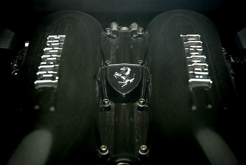
The shot is trite and boring, sorry but I do not mince my words with snapshot level images.

Firstly it lacks a central focus or theme. As others have rightly pointed out this shot would work considerably better if taken from a higher vantage point, also increase the aperture at least 4-5 stops to bring the entire rocker cover area in to sharp focus.

Shoot it in colour, again for the reasons stated above.

Now for the niggling bits.
* The Carbon Fibre shroud is dirty. With engine shots like this the unit should be detailed (cleaned) to look it's best.
* Use a diffused bounce flash to illuminate the entire region with sufficeint light to produce a quality image, if necessary line the top of the engine compartment with white cardboard to produce a more even and colour temperature flash burst.
* Look for more interesting angles, this can be very difficult for newbies and those unfamiliar with the correct proceedures. But you will be rewarded if you attempt to think about your composition.

Good luck.
 

oh man.. looks like ive got much more to learn..

thanks anyway guys
 

one thing you can work on here is symmetry, but i see that you have put little effort into even achieving that.

when symmetry is introduced as a compositional tool, best to make it perfect, or near perfect.
 

Status
Not open for further replies.