Hello! Glad to see another old face posting again (KAE just made a comeback, hopefully this will last).
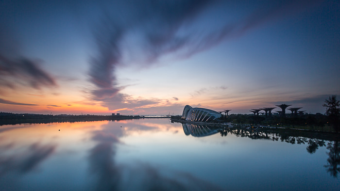
For the first shot, I don't quite like the comp. At this angle the supertrees look like a mess of things as the silhouettes are just not distinct enough (not having sufficient weight in the picture). They end up grabbing some amount of attention from the observatories which don't stand out much in the first place. The clouds, reflections and colors are fabulous which is a pity. It may have been better to just stick to the usual angle which excludes the supertrees while stretching out the observatories. By the way, your sky looks darker than the reflection - is that deliberate?
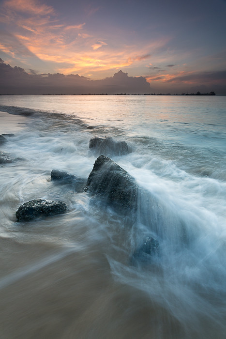
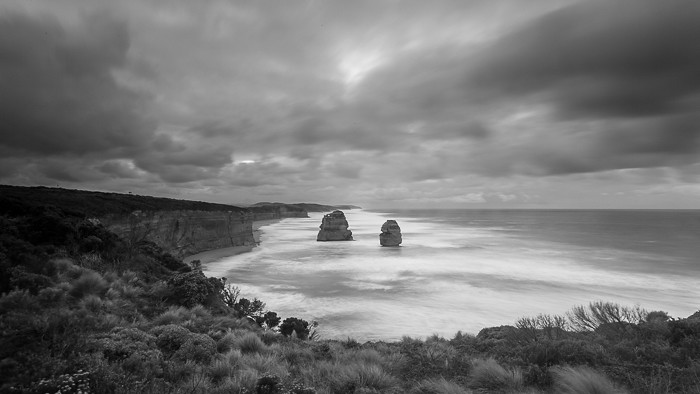
I like the wave motion and skies in the second- though the space doesn't seem to be used optimally, especially at the bottom. Maybe going a little closer to fill up that space there, and layering a few wave shots to capture the "parts" of the waves that you want would work well here. You can use the wave motion to obscure the leftmost rocks above the anchor, for example.
Welcome back, btw!
")