
If I can afford to, I always try to spend time in shops where I know there is a good selection of photo books. The books offer me inspiration for my photographs as well as the way I present my own work in printed publications.
A few books will stand out from the rest based on the quality of the work, the quality of the design and print techniques, or ideally a combination of both. One of these books that especially stood out to me was a large hardback compilation of work from dozens of outstanding photographers both historic and contemporary.
I would often leaf through the display copy I had access to until one day it vanished during a shop-floor rearrangement — hopefully it ended up in a good home. Not long after this, I found a brand new copy at a great price and bought it, but when I received it I encountered an aspect of the book I had never considered with the display copy: the double-page spread.
The presentation of the images is very simple — mostly landscape-oriented images at classic 3:2 aspect ratio, with only a few portrait, Polaroid, and square format images interspersed throughout. The majority of landscape images lie true to their original framing across the double-page spread throughout the majority of the book. It doesn’t look like they were adjusted to accommodate any of the physical aspects of the binding of the book, which means that many suffer greatly as a result, far from the ideal presentation.
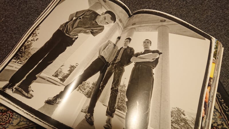
Embarrassing presentation of an otherwise superb portrait. The central fold element goes straight through the subject and distorts the rest of his face.
The reason I didn’t pick up on this with the initial display copy was that it had been opened out many times, and lay flatter, something that my copy will hopefully do. Even so, there will still be noticeable aspects of some truly incredible images lost to the central gutter.
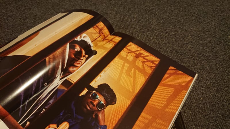
Again, right through the focal point of the image. Only readable at all after I flattened the pages down with a second weighty book.
Such a simple characteristic that pretty much every mainstream book will have in terms of the binding fold separating one page from the next seems to present such a challenge to design around this “problem”. If considered at all, it seems that many designers find themselves weighing up what can be sacrificed to this fold when it comes to double-page spreads, or avoiding what it can offer by having facing pages form diptychs by separating out a sequence into individual pages.
I find it easier to accept the fact that there is going to be some kind of line down the center between two pages, even if working with a flat-lay, and to work it into a “composition” in the same way I would when working a scene to make a photograph. Revering the photograph over the page will mean failing to make compromises that enhance the experience of both.
Instead of presenting only one photograph per page spread, which can feel like just scrolling through a printed social media feed, I prefer to really embrace the physicality of a book and to present two images side-by-side, which complement one another as a diptych.
I will find photographs with a thematic connection and then work to “compose” them together into a result that is greater than the sum of its parts. This spread is from a digest containing work I shot in India in 2019 and has the continuing element of the rope which leads through from one frame to the next.
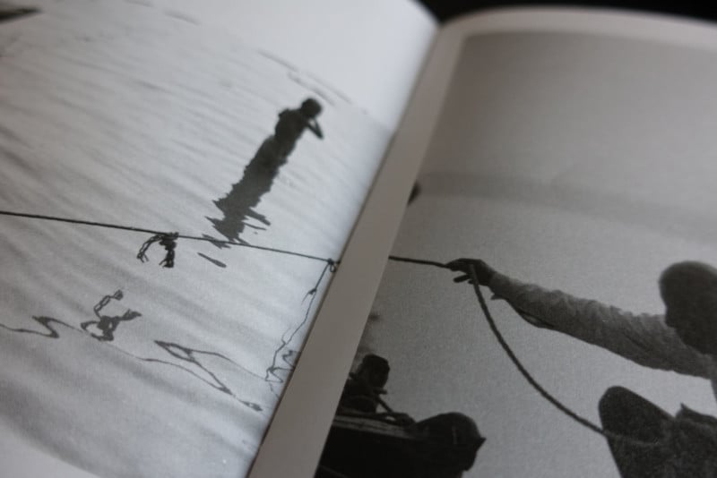
I positioned these deliberately so that there would be continuity between them.
I really enjoy matching up elements so that they continue across the page, really guiding the eye between the two images, prompting the reader to make connections, keeping the energy flowing from one page to the next, and encouraging the next page turn.
Pages from my book Transiting Bulgaria that mesh the lower edge of the windowsill on the page on the left with the row of tungsten lights on the page on the right.
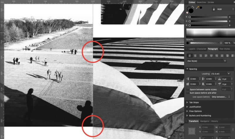
One of my favorite recent applications of this was this from my book D.C. Exclusion Zone, which has a matching element in the lines leading through into the road markings, and the edge of the frame on the left flowing into the frame on the right.
For a double-page spread presentation of a landscape-oriented image, I will adjust it so that no essential element falls into the gutter. Sometimes this is easy if you compose in advance in a way that takes into account the potential for use with a double-page spread.
When composing my photographs, I have become very aware of the potential something will be lost. If I look through my viewfinder and feel that there is potential for this work to be printed as a double-page then I will deliberately tweak my composition to ensure nothing is lost. All of my projects will hopefully live their best life as printed publications so this is something I will always be considering while out in the field.
When I made this image in Margate, I deliberately made use of the possibility for negative space in the middle so that the two main elements could be balanced on the left and right-hand pages of a double spread, with the pattern of the water in the foreground guiding the eye and offering depth:
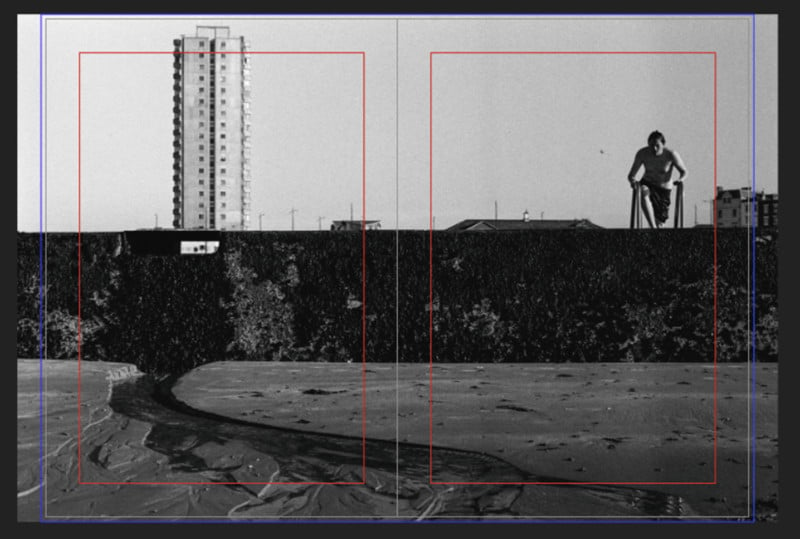
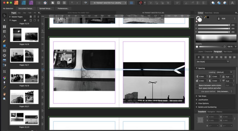
I’ve presented this photograph here in the workspace of Affinity Publisher, which is the software I use to design all of my publications. I rarely work with book formats at 3:2 (the classic 35mm aspect ratio), which means that I’ll often lose parts of the image, and on top of that a 3mm bleed will always remove slight details on the outermost edge of the image.
In the above image, the red lines show the margin area and the outer blue lines represent the end of the bleed. You can see that there is a part of the image extending beyond either side, but this is not essential to the image, and I can afford to lose it for the sake of maintaining the rest of the photograph.
I am often careful in general to not have anything essential in the dead center or extreme edges of my compositions, as they are easily lost on the page – although if I know the image is destined to exist as a single one-off print then I will be more comfortable working within those parameters.
Much harder to work with are photographs like this one which feel well balanced as an individual frame but which become very difficult to present as a double-page spread without making compromises.
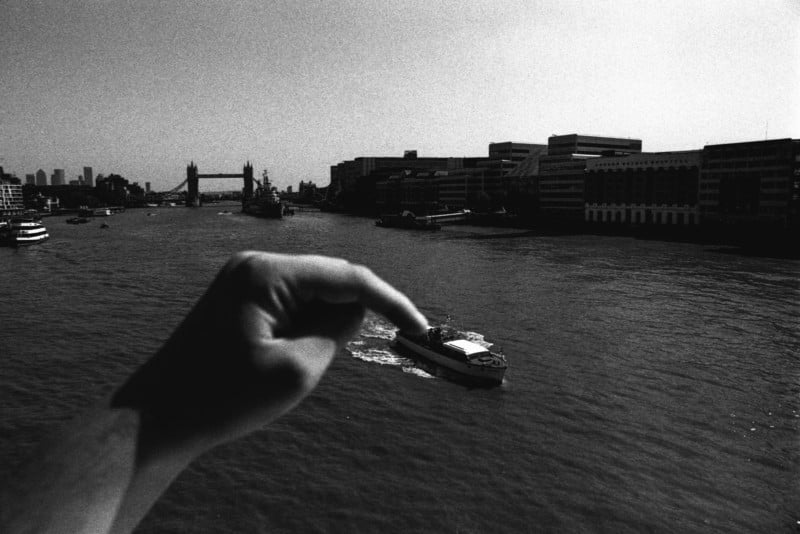
To my eye, this photograph is well balanced with effective negative space on top and to the right, allowing an area for the boat to be dragged into. However, if we try and work this image into a full-page spread using the same ratio pages as above we soon find that we will lose what makes the image work.
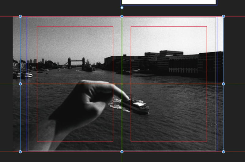
Centered, we will lose the back end of the boat and the tip of my finger, which is where the pivotal interaction is taking place — not ideal.
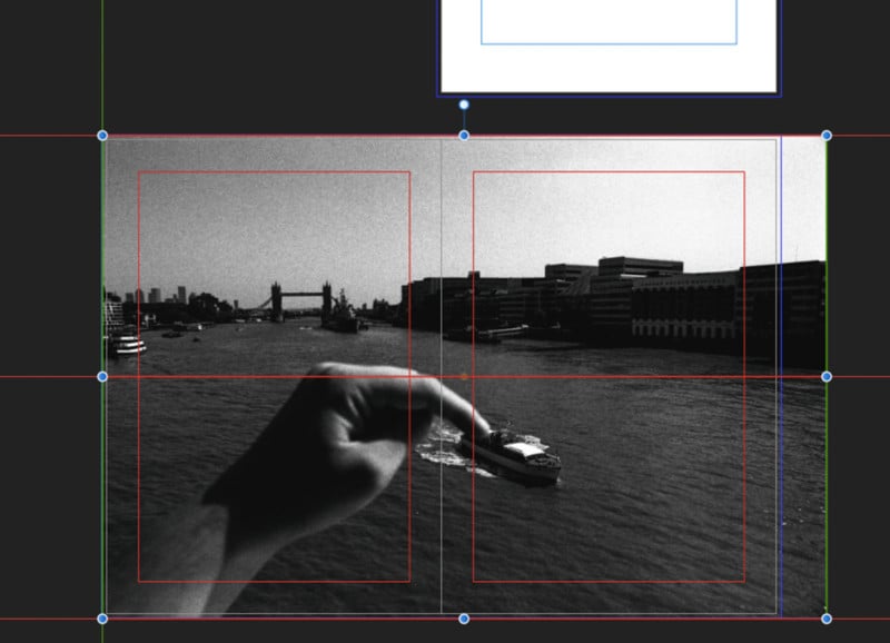
Dragged to the left or right and we still have quite a bit of the essential element that will be either lost in the gutter or curved by the page fold enough that it won’t really be visible.
My solution if I didn’t want to compress the image down and have some kind of border around it or change the aspect ratio of the pages to accommodate, would be to make the image larger, so that the boat was clearly on one page, as below.
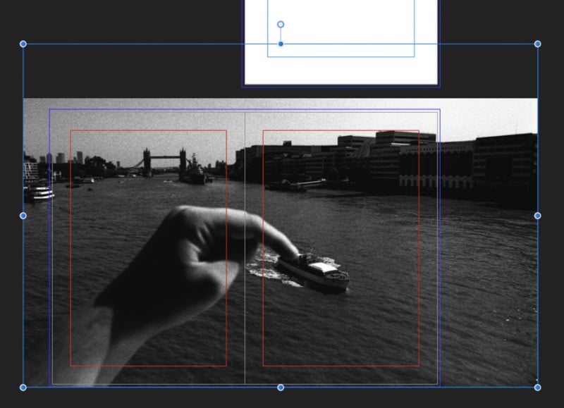
The issue with this compromise is that you lose quite a lot of the rest of the image. Even though it is negative space, it isn’t empty space, and as a result, the image presented on the pages loses its sense of balance. In a real scenario, my answer would be to reduce down and present with a white border rather than having the image edge-to-edge.
I’ve found that some of the best things to study for composing across two pages are comic books and graphic novels. As these are made from scratch on blank pages the physicality is already taken into account, and the flow from page to page, and between panels can offer some really interesting applications to a photo-book.
For my upcoming projects, I will be looking at the ways I can piece together many complex structures on the page made of my individual photographs, and exploring what potential there may be for a unique reading experience based on that construction.
About the author: Simon King is a London-based photographer and photojournalist, currently working on a number of long-term documentary and street photography projects. The opinions expressed in this article are solely those of the author. You can follow his work through his documentary collective, The New Exit Photography Group, and on Instagram.
Continue reading...