Boots


Status
Not open for further replies.

akszaksz

New Member
4315467313_b983264f47_b.jpg


1. in what area is critique to be sought?
composition, techniques and any other factors which i can improve on it.

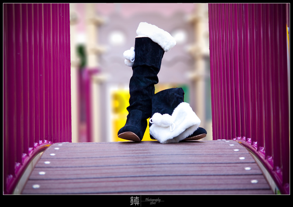
2. what one hopes to achieve with the piece of work?
The boots. An artistic way of presenting the boots.

3. under what circumstance is the picture taken? (physical conditions/emotions)
My wife just bought this pair of boots, so she wanted me to take a photo of it to send to her friends to comment on the boot.
Photo taken on a late afternoon, in the childrens' playground
Taken at 50mm, F2.8, ISO200, Av mode.

4. what the critique seeker personally thinks of the picture
I feel that this is quite a good shot & seems like the boots has it's story behind it. But a pity that i can't made both of the boot stand on it's own. I know surely there are some ways it can be improve. And I want to know how others feel about this photo especially the contrast & saturation.
 

if i were u, i would tilt the photo maybe 1-2 degree clockwise. i would prefer the foreground to be blur as well, using point focus, to really lay emphasis on the boots, and crop away part of the distracting pink stuff on both sides.
 

if i were u, i would tilt the photo maybe 1-2 degree clockwise. i would prefer the foreground to be blur as well, using point focus, to really lay emphasis on the boots, and crop away part of the distracting pink stuff on both sides.

agree to tilt 1 to 2 deg clockwise.
Thanks~!
 

It's two blobs right smack in the centre. The playground is too colourful and distracting. Your heroine loses impact, more so when it's so shapeless and lacking in detail.

I say bring it indoors, where you have more control.
- Go Art Friend, get a coloured/textured backdrop
- get your wife to wear them, have her stand on the (low) table so you can frame just the boots with your tripod. Alternatively, stuff the boots with newspaper or soft tissue and stand them on the table.
- put a light or use sunlight on the bg and a raking (side) light to emphasis the boots' furry/velvet texture

Of course you also need know-how to not overexpose your highlights (whites) while exposing for the velvet; etc etc. Some things can still be further enhanced through photoshop. For product shot, not only is the composition impt but the product should be clearly seen and invoke beauty, a longing to own. Who buys anything that's ugly and unattractive? I know you don't need advertising quality but it can definitely be a lot better!

Good luck!
 

The outdoor setting for shooting this pair of boots which intended to let someone look at it on the monitor and give comment has been a failure.

Reason : It is just like you are posting a picture of a product to be on sale on the net. If you are to look at it from a third person's point of view as someone trying to sell their product with this picture...would it tempt you to buy ?

Technically : This pair of boots, being dominated with dark colour and top with a patch of white is, strictly speaking, very tricky ( refrain from using the word difficult ) to light, even in indoor studio condition. Similar to a job I'd done years ago... beef steak over rice ( menu for Jap rest ) client's brief : rice to be seen in individual grain form and not patchy white, beef to be able to see details of the steak texture top with gravy.

so you can't see neither the details of the boots or the furry top.

Styling or placement of the boots also did not make it, it must be able to show each of the other side of each boot.

Needless to say, out of the whole picture area, your main subject consist only about 20% of it. The rest are occupied by secondary un-important subject..this is failure in composition just as in any product shot.

colour co-ordination wise, it is wrong matching too, pls do some research on colour harmony, read up some books.

overall, there are lots too much weak point need to be improved.
 

Last edited:
i found the boots themselves could be presented "better"? The flopped over boots on the right - was that intended?
 

Actually first thing struck me was the photo is slanted to the left.

And the colour is too strong.

I think both boots should be standing so it can be placed smack in the middle.

And maybe camera can be placed lower to emphasize the height of the boots.

Last thing is how come the colour of the planks are pink. xDDD??

Just my opinion.
 

Status
Not open for further replies.