Bell towers


Status
Not open for further replies.

wunderkind

New Member
Mar 26, 2005
134
0
0
Three bell towers of different heights. I thought that a plain frontal shot would be too conventional, hence this attempt with a side angle view.

Thanks.

459955143_2b96c922eb.jpg
 

Three bell towers of different heights. I thought that a plain frontal shot would be too conventional, hence this attempt with a side angle view.

Thanks.

459955143_2b96c922eb.jpg

this is a magnificent building. But shooting between the foreground building and the tree is not appeal to me. Seems to me, the main object and the foreground are fighting for attention. And the tree is really bothers me when I look at this photo.
I think you will have better shoot from other angle
 

yeah i agreree e its a magnificent building. but wat is the tree doin there?! maybe u can zoom in on the towers a bit more. i like the side lighting. gives the subject a nice 3d quality.
 

was thinking.. why dun u take wif against a bg of lets say.. clouds.. it'll look more majestic. cause right now wat u have is a magnificent building, so to do it justice, u need an equally majestic backdrop. i say..change the angle and put the building in the forground. take it straight on and focus ur attention to the golden top.
and if u have an interesting sky, u can even consider making it b&w.;)
 

i can see a somewhat conscious effort to compose the frame

459955143_2b96c922eb_edit1.jpg


you've divided the frame into three strips however this did not help
you show the building any better as all three parts are too busy in
details. sometimes employing conventional framing does not mean
that the picture will turn out boring.

there're also alot of details in this building, you'll need to take extra
care in your composition. the crosses on the domes are significant
features and visual termination points you'll want to bring out in the
picture, the 'accidental' small obstruction from the tree's canopy is
a major negative point.

459955143_2b96c922eb_edit2.jpg
 

too much unecessary space
a tighter crop and darken the details in the foreground
would make this shot better (i hope)

wunderkind.jpg


but a normal frontal shot would be better
 

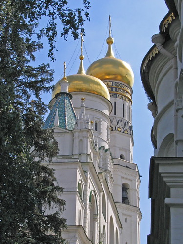
Thanks for the comments. Let me explain why such an unusual composition.

After seeing hundreds of postcards and shots in travel guides that show a frontal view of the three bell towers, I did not want to imitate the same. I do have a frontal shot, but I did not want to post it for critique.

Why such composition? Two reasons really.

First, I was trying to create a feeling of glimpsing at this magnificent building through a narrow opening between trees on the left and another building on the right. Just like when one peeks into a room through a narrow door opening. Or, when walking through a thick forest, one suddenly sees a brightly lit opening straight ahead. The trees are still left and right, but one focuses attention on the bright green opening ahead.

This is the kind of mood I tried to create without manipulating/postprocessing the image much, though I agree darkening the foreground objects could help somewhat.

Second, due to spacial constrains there was not much choice how to take a picture - just a narrow passageway between the building on the right and trees on the left. I could zoom in on the towers, but this would have significantly cut them in height. Another option would have been to raise the camera significantly above ground, but I did not have any tripod with me.

Just some thoughts and considerations.
 

Status
Not open for further replies.