
Ara -
- Thread starter iamseanism
- Start date
You are using an out of date browser. It may not display this or other websites correctly.
You should upgrade or use an alternative browser.
You should upgrade or use an alternative browser.

You are most welcome! With preview like this, I am really looking forward for more!")
I'll only post them after tomorrow! Cheers

As this is my first model shoot,with very minimal basics. I think my compo sucks!
C&C are most welcome.
All shot with a Canon 5D3 & EF70-200 f/2.8L ii (except for #8 & #9 - Sigma 35mm f/1.4 Art)
C&C are most welcome.
All shot with a Canon 5D3 & EF70-200 f/2.8L ii (except for #8 & #9 - Sigma 35mm f/1.4 Art)
nice try, you just need to watch out for things that compete with your subject i.e. backgrounds and how you handle them. you have full control where you move to take the shot; if not, if you ask the organiser/model nicely, I am sure he/she will try to accommodate you....happy shooting.
Last edited:
nice try, you just need to watch out for things that compete with your subject i.e. backgrounds and how you handle them. you have full control where you move to take the shot; if not, if you ask the organiser/model nicely, I am sure he/she will try to accommodate you....happy shooting.
Thank You, I'll take note!
If I might share my opinions on your work...
First off, I hardly think your composition 'sucks' ... and depending on how much time you've been immersed in portrait photography, your composition is actually very decent but what it might lack is a little edge to bring out your model further...If there's somewhere I can offer a suggestion on improvement... it'll probably be to be more aware of portrait lead-lines...
I'll break down it shot by shot to help understanding..
#1. For expressive face shots, I'd personally frame my subjects closer to maximise whatever feelings portrayed. In this case, both the green 'leaf?' can be recolored a soft matching background hue... and also highlights on the chains reduced prevent it from distracting the face.... but probably most 'subtly' drawing viewers away is the two 'highlighted' poles stretching to the top left. Any line on a 4 cornered image going straight for the corners always draws attention away.. so that might be helpful in future compositing.
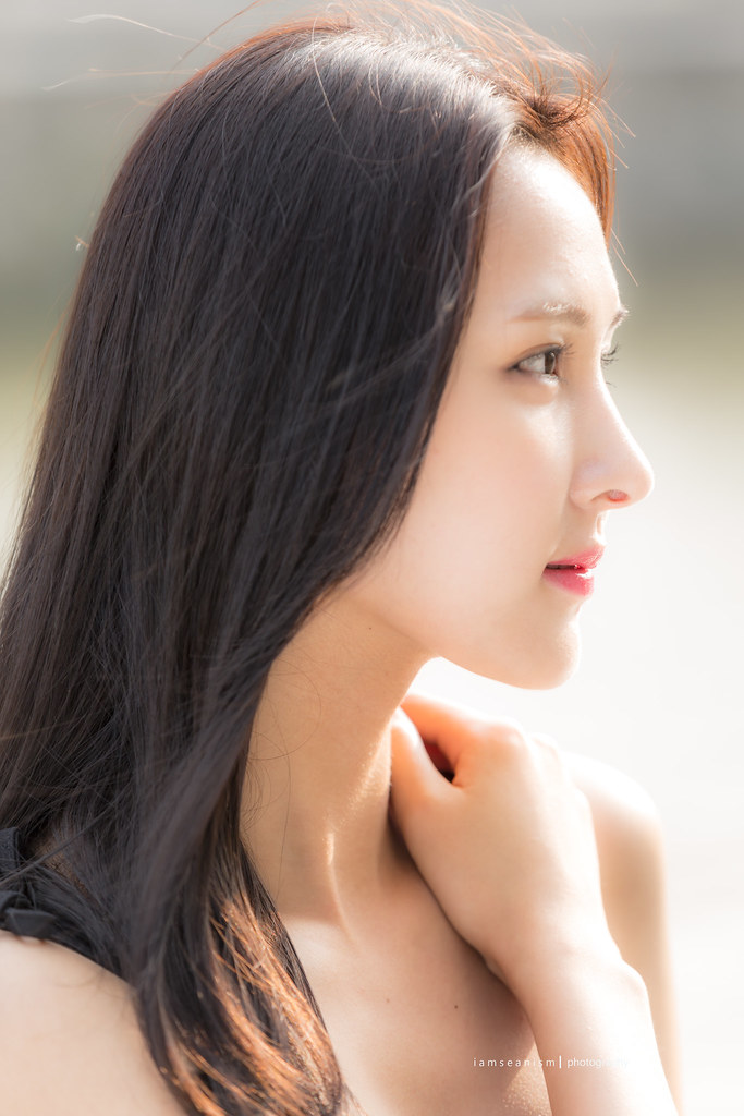
#2. This is actually a good shot, perhaps slightly blemished by a rather bottom heavy composition. The inclusion of the model's hand adds to the bottom weight.. easily fixed shooting just below clavicle and omitting the hands so her profile takes the limelight.
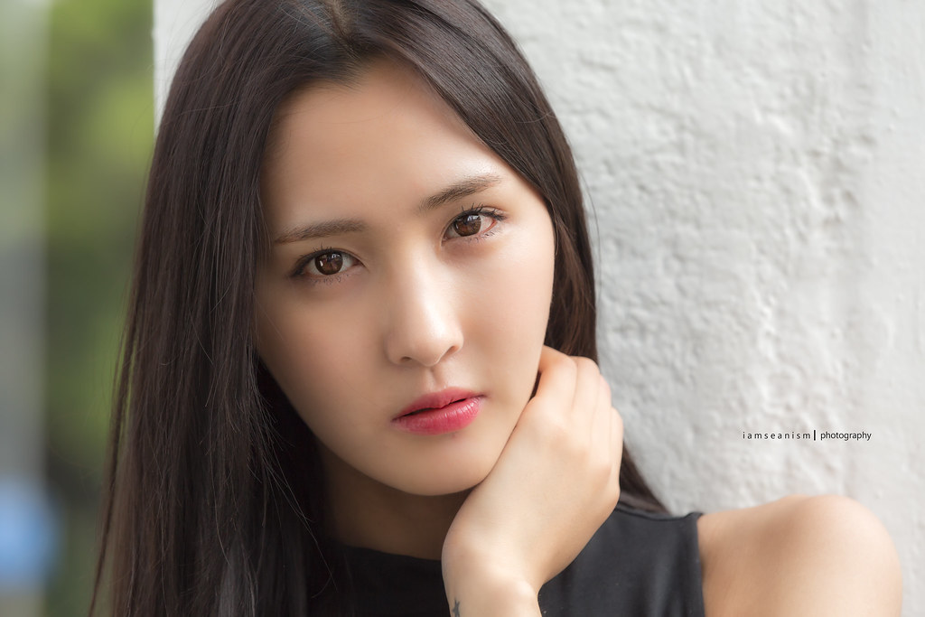
#3. The inclusion of a hand here... is actually fairly commonly seen in portraits... what might be enhanced might be to give more hollowed space (gaps) between hands and chin.... which a) create more 'depth', b) gives her chin better definition without the hand pulling away a prominent visual anchor... and c) prevent the photo looking slightly bottom heavy... Basically good to have some breathing space in between different parts of the body.. my guideline is always to wrap the face without touching... (fashion photographers here on CS will can show hows it's done better since they are experts at face framing with hands)
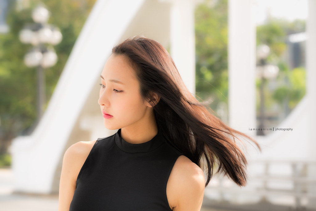
#4. Aside from the highlight distraction.... I find your subject to be best photographed with her hair framing her face... her pixie face (sharp chin, clean jaw, soft features) I think will benefit from being framed by her darker hair... all which helps to accentuate her face even more... You have done this marvellously from #5 onwards...
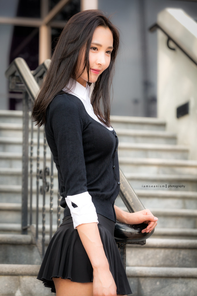
#5. I like this shot... Might be a case of some saying the hands is 'poorly cropped' but perhaps by choice or chance, saved by her short skirt (thighs rather)... which takes away all the attention from the slightly miscomposed hand.
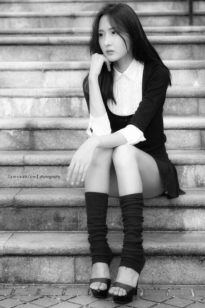
#6. Again, Not sure if the full flat of the hand seen is on purpose to showcase your signature. Usually, this would be a distraction, but if used to bring attention to your signature, it's actually used well. I'd give a lot of commendation that her legs are positioned to give modesty... which otherwise might make the image look more racy than intended.
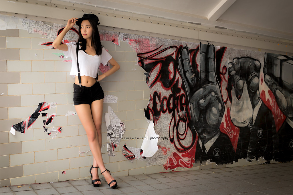
#8. I'm very bad at contextual compositions... and won't give my opinions too much... but placing the model on a "loosely" grafitied background in contrast to the right side's 'fuller' background.... is in my view, compositionally creative.
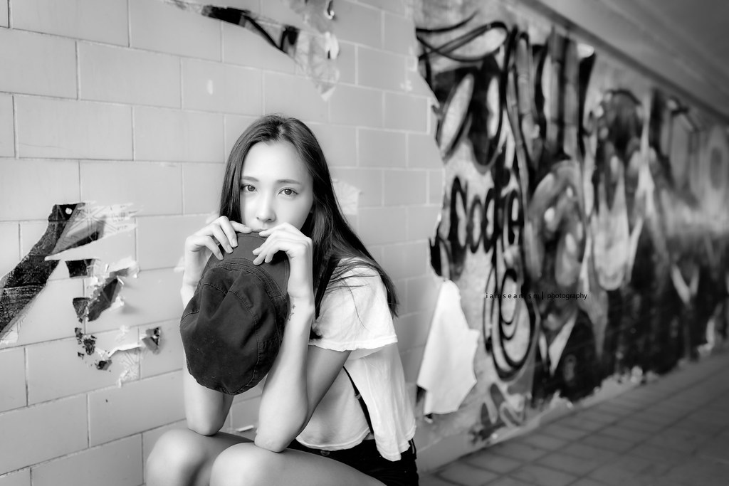
#9. Like this shot a lot
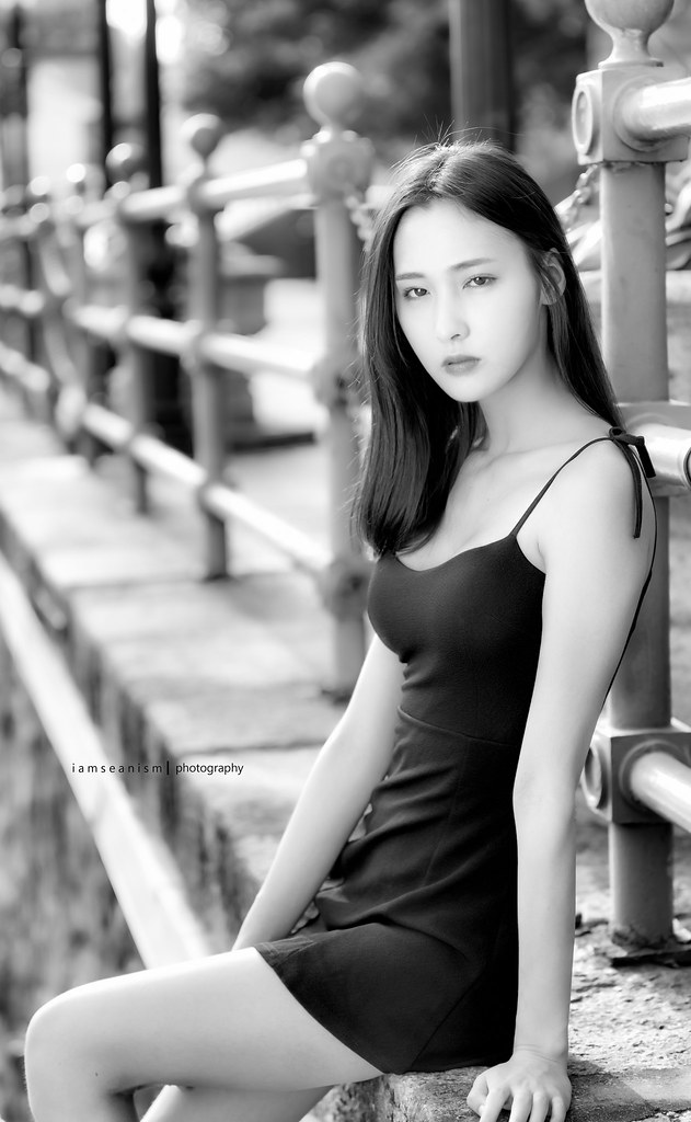
#10. I love this shot too ... a lot of eventual focus to her eyes... which in this case, I might personally liquify to balance her left eye to her right
I guess most importantly... it's great you felt your comp sucks.... as do all learning photographers like me feel.... Never stop to think even the most stable compositions can't be improved... but I guess sometimes when you think u 'nail' a common usable composition, we all tend to take photography for granted and stop trying to try something different.
Hope my comments were helpful in any way...
Cheers!
Ejun
First off, I hardly think your composition 'sucks' ... and depending on how much time you've been immersed in portrait photography, your composition is actually very decent but what it might lack is a little edge to bring out your model further...If there's somewhere I can offer a suggestion on improvement... it'll probably be to be more aware of portrait lead-lines...
I'll break down it shot by shot to help understanding..
#1. For expressive face shots, I'd personally frame my subjects closer to maximise whatever feelings portrayed. In this case, both the green 'leaf?' can be recolored a soft matching background hue... and also highlights on the chains reduced prevent it from distracting the face.... but probably most 'subtly' drawing viewers away is the two 'highlighted' poles stretching to the top left. Any line on a 4 cornered image going straight for the corners always draws attention away.. so that might be helpful in future compositing.
#2. This is actually a good shot, perhaps slightly blemished by a rather bottom heavy composition. The inclusion of the model's hand adds to the bottom weight.. easily fixed shooting just below clavicle and omitting the hands so her profile takes the limelight.
#3. The inclusion of a hand here... is actually fairly commonly seen in portraits... what might be enhanced might be to give more hollowed space (gaps) between hands and chin.... which a) create more 'depth', b) gives her chin better definition without the hand pulling away a prominent visual anchor... and c) prevent the photo looking slightly bottom heavy... Basically good to have some breathing space in between different parts of the body.. my guideline is always to wrap the face without touching... (fashion photographers here on CS will can show hows it's done better since they are experts at face framing with hands)
#4. Aside from the highlight distraction.... I find your subject to be best photographed with her hair framing her face... her pixie face (sharp chin, clean jaw, soft features) I think will benefit from being framed by her darker hair... all which helps to accentuate her face even more... You have done this marvellously from #5 onwards...
#5. I like this shot... Might be a case of some saying the hands is 'poorly cropped' but perhaps by choice or chance, saved by her short skirt (thighs rather)... which takes away all the attention from the slightly miscomposed hand.
#6. Again, Not sure if the full flat of the hand seen is on purpose to showcase your signature. Usually, this would be a distraction, but if used to bring attention to your signature, it's actually used well. I'd give a lot of commendation that her legs are positioned to give modesty... which otherwise might make the image look more racy than intended.
#8. I'm very bad at contextual compositions... and won't give my opinions too much... but placing the model on a "loosely" grafitied background in contrast to the right side's 'fuller' background.... is in my view, compositionally creative.
#9. Like this shot a lot
#10. I love this shot too ... a lot of eventual focus to her eyes... which in this case, I might personally liquify to balance her left eye to her right
I guess most importantly... it's great you felt your comp sucks.... as do all learning photographers like me feel.... Never stop to think even the most stable compositions can't be improved... but I guess sometimes when you think u 'nail' a common usable composition, we all tend to take photography for granted and stop trying to try something different.
Hope my comments were helpful in any way...
Cheers!
Ejun
Thank you so much for the valuable points. As I am still trying to digest them, to be honest. I am visualising them hard for understanding & improvements. Also, shooting along with few other fellow Photogs had me there for a moment as a newbie in portraiture. Again, I truly appreciate your feedbacks. We never stop learning!
Thank You =)
Thank You =)
You are very welcome my friend.. Happy that any of my opinions are considered and of value to anyone...
If I were to add... with your current skill level... post processing can really bring your shots to the next level.... Reason is, going through your flickr... I find a lot of the shots look good while it's at 600 pixels.... but closer inspections start to show a little inexperience in facial processing. So ideally, level your processing backend together while having fun at the front end to gov yourself the most room for improvement...
just my 2 cents
Regards,
Ejun
#1. For expressive face shots, I'd personally frame my subjects closer to maximise whatever feelings portrayed. In this case, both the green 'leaf?' can be recolored a soft matching background hue... and also highlights on the chains reduced prevent it from distracting the face.... but probably most 'subtly' drawing viewers away is the two 'highlighted' poles stretching to the top left. Any line on a 4 cornered image going straight for the corners always draws attention away.. so that might be helpful in future compositing.
#6. Again, Not sure if the full flat of the hand seen is on purpose to showcase your signature. Usually, this would be a distraction, but if used to bring attention to your signature, it's actually used well. I'd give a lot of commendation that her legs are positioned to give modesty... which otherwise might make the image look more racy than intended.
Hope my comments were helpful in any way...
Cheers!
Ejun
Hi Ejun,
I've have read your comments line by line.
How I wish I can even have a nice series like iamseanism for you to critique.I have 2 questions which I would like to ask. for #1, just wondering, at your level, before you shoot, would you have imagined how the green leaf and chain highlights will be distracting? and reposition the model? or would you still proceed knowing you can post process later?
#6 Do you have any suggestion how to place legs for those models who sit on the steps? Usually the leg will look bigger and fatter for other models. Ara seems to have nice long legs, however, in this position, it looks a bit weird proportionately. very thin.
Looking forward to your advice.
Akuma
Hello Akuma,
(i hope i'm not sidetracking from Sean's post)...
But in regards to your questions.... the thought process will usually be 1. Find a clean background... and in cases where we are photographing candidly (in a group or simply someone on the streets)... then I'd rely on post production to lessen any distractions. Honestly put, it's not a complete must to eliminate distractions... the ideal is always a clean uncluttered background (that's why I shoot mainly in my studio).. however... it's the same "distractions" that adds context to photographs when on location... so whether they are distractions or inclusions... it's a matter of personal taste.
As for photographing any models sitting... My usual stand is to photograph from the side which gives legs the proportion they have, rather then frontal which shortens thighs and exaggerates calfs... but in the case of Ara, she's exactly what a model should be... Thin... so even frontal shots didn't seem to cause too much of an issue.. it does make her thighs much larger in comparison however. If you see most of my studio shots... i'd rarely include legs at all... cause most of my clients are seated on a stool... at the most, the higher thigh... to act as a natural resting place for the arms for the typical seated shots.
Let's communicate over on FB should you have more questions... as I'd prefer to keep this tread on the enjoyment of the models images
Happy New Year friend..
EJun
Hi Ejun,
I've have read your comments line by line.
I have 2 questions which I would like to ask. for #1, just wondering, at your level, before you shoot, would you have imagined how the green leaf and chain highlights will be distracting? and reposition the model? or would you still proceed knowing you can post process later?
#6 Do you have any suggestion how to place legs for those models who sit on the steps? Usually the leg will look bigger and fatter for other models. Ara seems to have nice long legs, however, in this position, it looks a bit weird proportionately. very thin.
Looking forward to your advice.
Akuma
Similar threads
- Replies
- 3
- Views
- 269
- Replies
- 0
- Views
- 176
- Replies
- 0
- Views
- 80
- Replies
- 0
- Views
- 94
- Replies
- 0
- Views
- 97