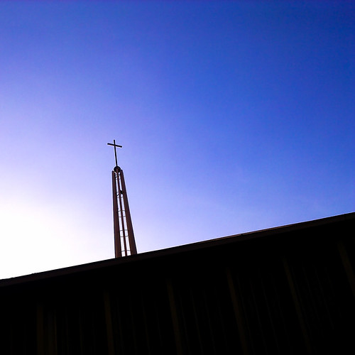
I think its prerry good. The strong diagonal line anchors the composition nicely. The gradient in tones speaks depth. Not the usual architectural work but it works. I would have liked the structure a wee bit bigger(zoom in) though.
Thanks, Kit, for your comments. This was a 5 megapixel image (taken with my phone) and thought that I should not crop too much (but on hindsight, 5mp is good enough for a 4R print so I should have cropped it better).
i might have certain preferences when it comes to photography, so take what i say with a pinch of salt.
1) how does the tilt/diagonal help the picture?
First of all, thank you, night86mare. Well, I was too close to the church (and did not explore backing away from it) and I had to tilt the camera up (which already messed up the verticals). I left the tilt in to create that sense of dynamism rather than rotate it to make the cross and spire vertical.
2) would this be better with less black space? - i know it's not entirely black, but i'm sure you get what i mean
I do know what you mean. It was late afternoon with strong sun and I couldn't control the exposure on my phone so the church was almost already a silhouette. If I return with my DSLR, I might attempt making multiple exposures of it and blend it. Thanks for the thought!
3) the saturation here is a bit too much for me, the sky is turning purple.
Noted on the saturation. I'm trying to remember if I tweaked saturation values in photoshop. But yes, thanks!
Hi,
Converted it to BW in photoshop and think it looks better, as the colour of the sky does not help much in bringing out this photo. The amount of white and black space and the gradient tone makes it really nice in BW.
The tilt would have been handle better, though it does help to bring out the dynamic effect, but not much.
You're right! BW does look quite cool... thanks! Noted on the "tilt" point.
The architecture can be emphasizes more by being bigger.
Yup, Kit mentioned it too. Thanks!
This is rather abstract than architecture.
You're probably right about it being more abstract than architecture. If the blacks weren't so black and if the tilt was straightened, would it make it more architecture?
The square crop works for me.
Thanks!
:thumbsup: love the composition and the color of the sky. if add in some cloud would b nice i think
Thanks! I'm not sure about the clouds. They might distract viewers from the cross, which was my intended focus.