Portait shoot needs comments


Status
Not open for further replies.

photographer20

New Member
Dec 7, 2006
190
0
0
79
Hi all,

need constructive comments on this picture which I took today.


For your info I used a normal point and shoot camera for this picture.

IMG_5639.jpg


Hope it not too badly done or weird.

thanks!:D


Writeup:

Well, thanks for the comments so far. And yeah, here's the writeup:

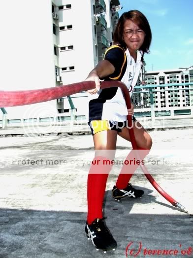
It's a rugby related shoot with this national touch rugby player, and I was trying to show her looking for water source in a punishing environment which is hot and without drinkable water source.

As for the position, i had my back against the wall which the fire hose was perched on. This was the only angle that allowed me to capture the girl and the hose. But yeah, photography was never about what you can or cannot do, but what you can or cannot show.

As for the location, its being shot at a carpark. I thought that it would be interesting to give a contrast to the wear she was in. I mean, bikini means sentosa/beach? Sports means stadium? Jersey means soccer?

But I admit that this photo wasn't shown in it's original light. Literary.

I edited the levels using a non-photoshop software and increased saturation of the colours in the photos which I thought allows huge colour contrast with her surrounding.

Won't give up and will continue to snap photos for practice :)
 

Last edited:
For your info I used a normal point and shoot camera for this picture.

i am going to say that if you know your camera, with such condition here (bright, sunny, contrasty, subject is wholly under your control so no issues with shutter lag).. it doesn't really matter if you use a dslr or a normal p&s.

i cannot help but wonder why you insert that comment there. have some confidence.

note the tilt in the picture, it spoils it because it looks too little to be deliberate, too much to not be a mistake/oversight.

other than that, do you find the background a little too cluttered and clashing? do you think you could have done better by moving around?

also, why give yourself a hard time with limited dynamic range on digital by choosing a portion where the shadows and highlights are stretched to the maximum (shadow's shade versus bright sun)? unless this is a deliberate attempt to make the picture look extremely lossy in detail (and i'm not being anal about it, really - just look at how the whites are blown out to the point of distraction).. i do not see any reason for taking up this position with her leg in the shade and including the shadows.
 

Last edited:
i am going to say that if you know your camera, with such condition here (bright, sunny, contrasty, subject is wholly under your control so no issues with shutter lag).. it doesn't really matter if you use a dslr or a normal p&s.

i cannot help but wonder why you insert that comment there. have some confidence.

note the tilt in the picture, it spoils it because it looks too little to be deliberate, too much to not be a mistake/oversight.

other than that, do you find the background a little too cluttered and clashing? do you think you could have done better by moving around?

also, why give yourself a hard time with limited dynamic range on digital by choosing a portion where the shadows and highlights are stretched to the maximum (shadow's shade versus bright sun)? unless this is a deliberate attempt to make the picture look extremely lossy in detail (and i'm not being anal about it, really - just look at how the whites are blown out to the point of distraction).. i do not see any reason for taking up this position with her leg in the shade and including the shadows.

dun feed, wait for them to write a better writeup before feeding...
 

dun feed, wait for them to write a better writeup before feeding...

:bsmilie:

but later the writeup is..

me and my friend were trying to play soccer on hdb rooftop.. suddenly we saw a hose and she decided to pull it..

THEN HOW? :bsmilie:
 

:bsmilie:

but later the writeup is..

me and my friend were trying to play soccer on hdb rooftop.. suddenly we saw a hose and she decided to pull it..

THEN HOW? :bsmilie:

delete lor, you guys should save your effort for ppl who is worth the time to write long critiques...

i'm trying to push this section to the next level... :devil:
 

luv her expression!

however i feel the sense of PULLING and straining every ounce of her energy could be given more impact in the photo.

so, suggest getting closer, wider, lower....and filling the frame!

e.g.
IMG_5639c.jpg
 

luv her expression!

however i feel the sense of PULLING and straining every ounce of her energy could be given more impact in the photo.

so, suggest getting closer, wider, lower....and filling the frame!

e.g.
IMG_5639c.jpg

dunno y, yours over exaggerated... did u notice the 'stretch'? :think:
 

................................

IMG_5639.jpg


.................................... looking for water source in a punishing environment which is hot and without drinkable water source. ...............................
by just looking at the photo, we don't understand what you trying to tell your viewers....

your photo does not show this is a punishing environment
does not show how thirsty she is,

you have to try harder.
 

I kinda like the stretch, Zaren. :bsmilie:

IMG_5639c.jpg

Looks more powerful, maybe the photographer can try & take the picture from a lower angle.
 

I cannot get the message you are trying to bring across if I did not see what you wrote. To me this is a case of mismatch of attire and theme.

Also, the watermark could be a little better. It looks quite dodgy now.
 

dunno y, yours over exaggerated... did u notice the 'stretch'? :think:

was using perspective correction (no way to redo the shoot, no?) in gimp to illustrate the point about going closer, lower and wider. so yes, the image does look overly "stretched" here. :)

but i'm glad u r getting a feeling of "stretching" and "pulling" from the image!
 

Last edited:
The theme of this shot is a little weird. Soccer attire doing tuck-a-war with a fire hose on the car park rooftop. Hope the hose was not damage and restored to the original condition after the shot. Though I am no expert, this is my feel and comments, it looks over exposed and the composition of the shot can be improved if you have a open background like no HDB blocks but put more sky in background.
 

My thoughts on this is, on what you are trying to shoot. She should be in a really bad dried condition field(dried mud/sandy etc)(many around singapore) from there it's how ur imagination goes. Make her crawl or something to some water sources related in a stadium/field. Stretch the imagination.

Gd try, at least theres some different creativity shown . Cheers
 

Last edited:
For a moment, i thought it was a tug of war challenge... Many said that the highlights were blown and i'm going to agree fully on this. Reason being, looking at her face. There are certain areas which looks way overblown. Imagine someone having sun burn and the part of the burnt area skin is starting to peel off, and that colour is shown all over her face. In my mind, I'm still thinking why had you chosen such a time of the day to take such a pic.
 

Status
Not open for further replies.