Hi jeffhiew!
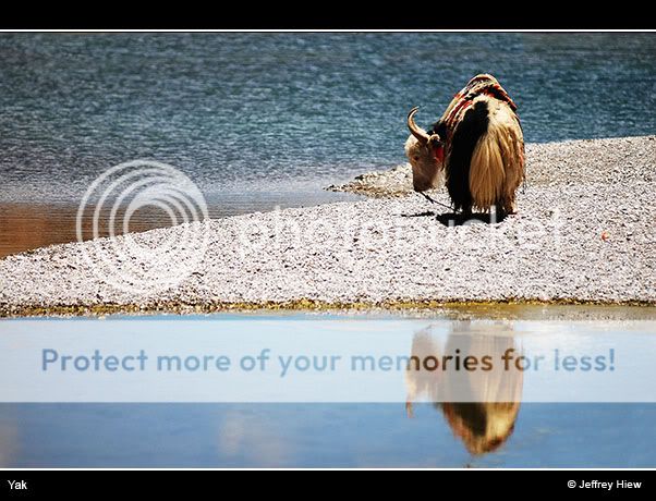
#1 is a stunning picture, but I'm sure you already know that. Absolutely fabulous piece of art, and the colours really compliment each other! What made this picture exciting for me was the texture of the background as well as the rocky floor, which made the subject stand out more. Great catch!
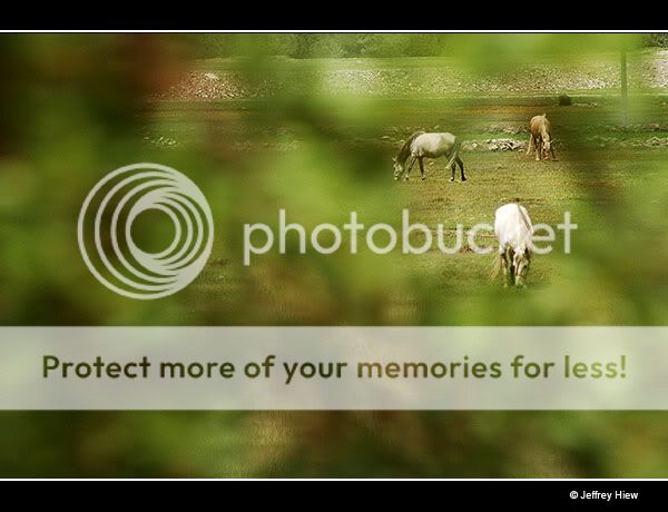
#2 seems to be an attempt at framing the subject. Perhaps the picture can be further improved by finding at larger 'hole' to shoot out from? The horses are too close to the edge of the secondary frame to garner much visual interest, so what we see are unnecessary clutter.
I like your style of the clever use of negative spaces. This is where the rule of thirds truly excel in!