Would you?


Heyya bros/sis,

Its been a long time since i kpo kpo here in our critique corner. So maybe i just add one of my recent shot available.

As per guidelines.

1. In which area is critique or feedback to be given?
2. What were you hoping to achieve with this image?
3. Under what circumstance was the picture taken? (physical conditions/emotions)
4. Thread-starter's personal thoughts about the image.

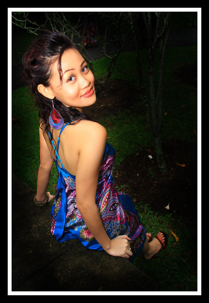
1. Please give comments on the lightings, whether it is enough, etc overexpose, underexpose, etc. And i would like to get feedbacks whether on your screen, are the contrast good enough? This is due to the fact that i'm also trying to re-callibrate my LCD. And lastly, i'm sure you guys would have noticed that i have actually used the dodge tool in PS to darken the surrounding. My question is, is it overly done? Thank you.
2 My motive of taking this picture is to captivate the audience. As in, once you look, you would look at her again. Is the pose okay for that?
4. As above, i would like to capture the audience with her half smile and with the darken surrounding, i would want the audience to zoom in straight into her face.

Do comment. ;) thank youu
4629320940_69bbb2b585_b.jpg
 

did you soften her face or izzit oof? her dress looks much sharper than her face/eyes...
 

Last edited:
did you soften her face or izzit oof? her dress looks much sharper than her face/eyes...

yes i did soften her face, on my screen, it looks fine, but i think maybe on other people's screen, it might be overly done.

Will take note. Oh yes, do comment on the lighting and stuff. Thank you.
 

the face is OOF, the "X" on the dress looks sharper...
 

Hmm, before i do any calibration, does the colour and contrast looks okay on your screen?:)

If yes, i think its time for me to recalibrate. hehh

Anyway, thank you for your feedback brothers ;)
 

Last edited:
Hi rocfreaks,

certain things i will highlight based on personal opinion:

- You may want to consider asking the model to turn her torso instead of her neck, she has to strain her neck + her eyeballs to look at your camera. Not a very comfortable pose if you tried doing that yourself. The x-strap isnt that exciting either but then again, her back is nice, clean and flattering.

- her earring looks heavy and imbalance, but maybe that's just me.

- The streak of hair that is falling down...would it be better if it's tidied? At that point you could shoot another take to give yourself options, some things can be solved on ground and leave it less during pp.

- This is micro detail but see the bangles on her wrists. The hand that's closer to cam is abit empty? This a very individual perception, it may be okie for you after all.

Otherwise i would say that the lighting is nice and soft, colours are well balanced and vibrant. Vignetting to emphasize your subject is how you want your style to be so no comments but i do see someone on top haha. Since you are going to PS might as well clean up the dead leaves on the ground. They might be small and insignificant but still eyesore nevertheless.

That's my 2 dollars worth of comments. Hope we can take it constructively ya :sweat:

yaww! thanks for the comments bro! Will take note of them all. :)
 

lighting - i cant figure out whether it is taken during the day or night.
 

I think your purpose of burning is to allow viewer to focus on your model..however, the burning is too tight for me...would prefer vignetting juz to narrow the space...probably can try and use CS Lasso Tool to create a vignette that narrows the view is enough..and...the plants are rather distracting, probably tt's why you are burning it so tightly..:dunno:

a better background would be somewhere with all grass...lighting on the model seems fine..anyway,if you prefer the model to look back at you this way, I wud suggest the model to sit on the ledge so that you don't show her feet...tt wud look more elegant...:)

the softening part...it's really overdone...look at her ear...
 

Last edited:
IMHO, the angle of which you choose to take the shot made the model's face look longish... that distortion on her face doesn't look nice for me. lighting wise, it's good. composition is so so, other than that, i do agree with the rest of the pack... the face is OOF... i presume you know the rule when taking portrait shots of people or even animals... keep the eyes sharp! you missed on that for this shot.

good effort though, i do hope this helps... keep shooting!:)


P.S. this is solely MY opinion.;)
 

The darkening at the edge is a bit too much, i feel. The lighting on her face seems too glaring? If it's like her right shoulder, a subtle glow, would be nicer...(or is it because her face is a tad oily?) Can't comment on the exposure...can't make out any.
Maybe can try using slightly darker tone make-up on her eye shadows with long eyelashes to make her eyes stand out more and of course, focus on her eyes.
Maybe she can wear a nicer heeled footwear and paint her nails to complement what she's wearing?
Her pose makes her head seem larger than normal when compared with her body, is that what you want to achieve?
Her facial expression and her lips show a smile, not a half-smile...when you say half-smile, i'm thinking mona-lisa, not very obvious kind of smile, can barely see it. For your picture, it's quite obvious she's smiling.
Keep shooting! :)