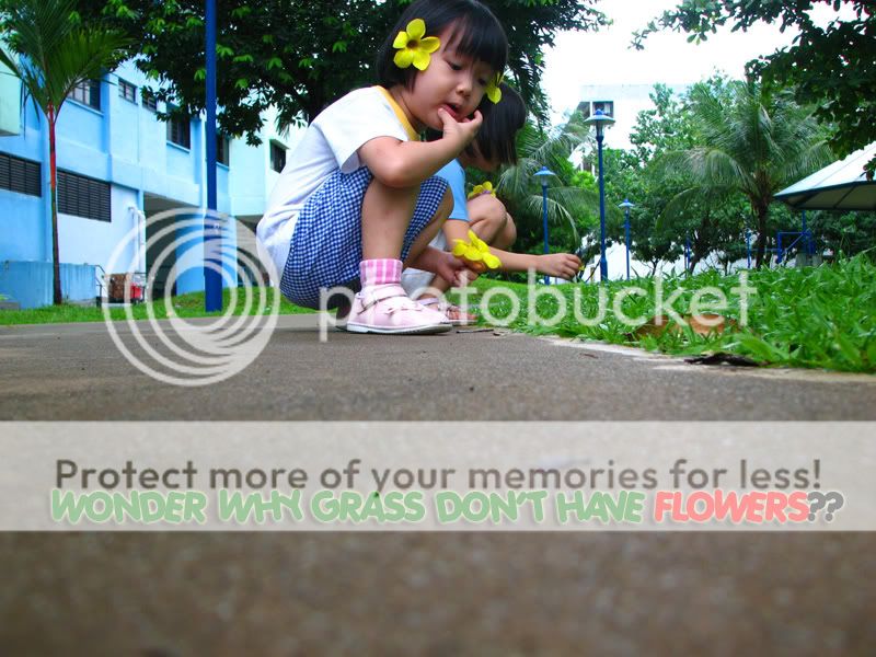
I like the title & idea behind the picture. The saturated colours adds to the effect. Cute girl! Would have been better if you had not cropped out the top of her head.
nope the cropping is not effective - does not lead the eye to the face of the gal which is what thi spic is about - redo the crop and see if you can lead and hold the viewer's attention
Adding the frame to get a better overall effects after adding the text.
cerebrus said:
I like the title & idea behind the picture. The saturated colours adds to the effect. Cute girl! Would have been better if you had not cropped out the top of her head.
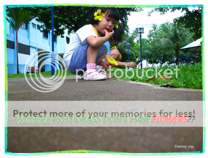
This photo was not perfect originally because the top part of her head was not captured. Add frame to enhance it. Original look like below:
espion said:
nope the cropping is not effective - does not lead the eye to the face of the gal which is what thi spic is about - redo the crop and see if you can lead and hold the viewer's attention
1) crop right untill the blue lamp post. (the rubbish cart not nice)
2) than crop away the shelter on the left. (the roof is distracting)
3) last crop some of the foreground. (foreground does nothing here)

")