Today, with digital, this is a real question: when does one decide if a picture is better in b&w?
Do you really mean "when", or do you mean "how"?
In the latter case, it may be ultimately a matter of taste. But I think there are some rationales:
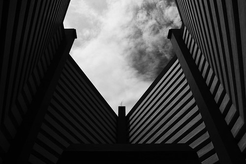
Aesthetic reasons: One example is to simplify/reduce a picture. A painter adds what is needed to the picture; in photography the difficult part is leaving out what is not needed/wanted. Conversion to a monochrome picture is a very easy way to "leave out" something. E.g., in your first picture, one could focus on the graphical pattern of the building, and consider the colour of the lamps a distraction. Conversely, one could have the other extreme like a graphical pattern of colours which becomes more effective if luminance (brightness) variations are removed.
Technical reasons: It is much easier to deal with high-contrast images if they're monochrome. The colour gamut of typical reproduction devices (screen or print) is extremely limited in the bright (and to a lesser degree the dark) regions. For non-abstracts, it simply may not be possible to get natural or at least "nice" colours with a picture that doesn't look either flat or darker than than the usual snapshot .
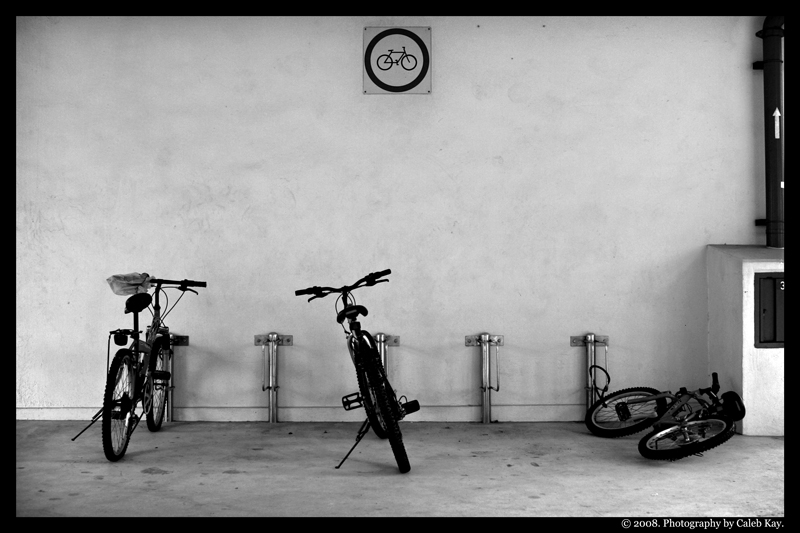
Another reason may be unsatisfactory colour reproduction due to poor lighting (e.g. low-CRI fluorescent lamps), or inconsistent colours due to a varying mix of light sources across the scene (as in your second picture - daylight, filtered by possibly different types of glass panels, and fluorescent tubes that create a nasty green cast). Conversion to monochrome is an easy way around the problem.
Snobbery: It doesn't take much to realize that monochrome photos are seen as chic and more "artistic" by some. Showing off monochrome pictures may change the perception of this audience and elevate your standing among them, especially if you use outdated or obscure processes to produce them (ideally with a pinhole camera). (A similar thing exists in colour too, where crap shots become works of art for the sole reason they were taken with Lomos or toy plastic cameras.)
Equipment limitations: if you have access to good monochrome reproduction equipment, but not colour equipment, your chances of producing a good picture may be higher if you stay with monochrome.
Intended usage: If you're taking photos to be printed in a b/w only newspaper, colour doesn't make much sense.
Non-standard visual perception: If you're sense of vision doesn't conform to the common tri-stimulus model (e.g. genetic variations such as tetrachromats), you may not be able to create colour images that satisfy you with normal equipment.
Others: ... I'm sure there are many more.