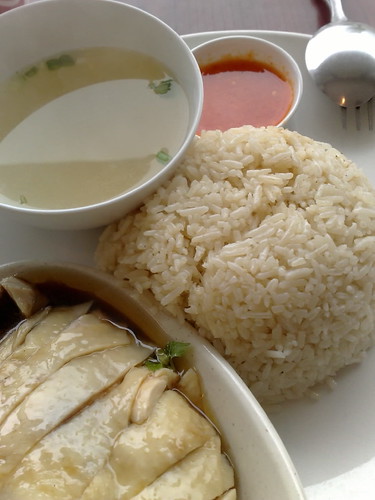
light on the rice and chicken is good - conveys the oiliness in them, and u can almost smell the fragrance.
but crop is too tight, the elements are unbalanced and too squished, mainly lopsided on the left, and the tiny space below the rice on the right begs to be filled. also the light/shadow reflections on the soup is disconcerting as with the metallic spoon
it may yet be suitable though for some purposes, eg as a background image for you to place text as in a magazine cover. if "correctly" placed - it will balance the image, but this wont correct for the lighting "flaws"

")