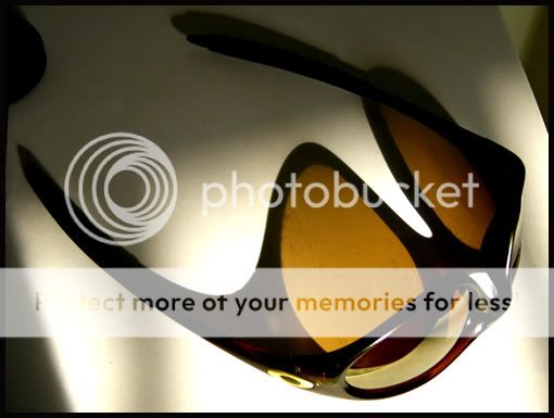
I think your concept is interesting, but something is not quite right so it doesn't strike me.
I can't put my thumb on it exactly but try a cleaner background for starters. There also needs to be more shadow detail I feel.
I don't know if you intended it but the opposing triangles at the top right and bottom left are interesting but don't stand out enough. Try 1 white triangle 1 black? Or maybe black BG white triangles.
Darn! I hate it when I don't know why I don't like it. Try reshooting with this concept though(the light coming through the sunglass lens). Oh invert the sunglass too maybe?

")