Walk a mile in my shoes


Status
Not open for further replies.

prodigal roommate

New Member
Sep 28, 2009
22
0
0
4042308581_2c65519d10_b.jpg


1. in what area is critique to be sought?

I am a beginner seeking comments on how to make a photo more impactful and compelling. I also want to improve in B&W photography. Let me know how I can be better.

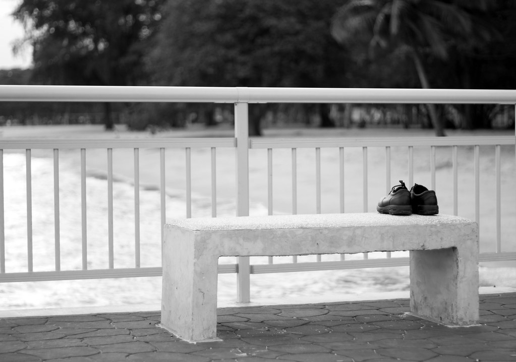
2. what one hopes to achieve with the piece of work?
I want to bring viewers to the question of "who, what, when and how". A pair of shoes neatly arranged on a bench facing the waters suggests a number of possibilities.

3. under what circumstance is the picture taken? (physical conditions/emotions)
this was a random shot taken at Bedok Jetty. I don't think the lighting was fantastic then.

4. what the critique seeker personally thinks of the picture
I felt that i may have composed the pict ok. But i feel the pict is flat and not as dramatic as i wanted it to be. Maybe some comments on what can shift the pict in that direction will help me here.
 

Hi I am newbie here. Just giving my beginner's view.

I just felt that the left side of the picture is kinda empty so cropping it tighter should help. I am not sure whether are you trying to accentuate the lines of the fence as well?

If I am going to make the shoes the subject, I would move in closer and blurred out the fence as the vertical lines of the fence is directly on the shoes.

Just my 2 cents :) I am still learning....

Thanks Burnings for your valuable comments. :)

Ok, i note your observation of the empty left side and the suggestion to move closer and blurr out the fence.

I'm thinking back now and wondering how i can achieve this without sacrificing details of the surrounding that will hint to viewers that this is facing the waters etc.

Hope to hear more from you, every comment means a lot to me, bouquet or brickbat regardless
 

Try cropping the part above the fence.
I was scrolling down to read the comments and it looked better without the top part.
Have you tried adjusting levels in photoshop to make it more darker?

My humble opinion.
:)
 

Hi TS,

I'm no pro, but i think the title doesn't quite gel in with the picture.

When i clicked on the thread i had a mental image of a torn shoe(s) on rugged, muddy terrain. This pic reminds me of someone having lots of trouble with life and decided to do the unthinkable...

But, that's just me. Maybe you had something else in mind..

B & W is good, but like others say, up the contrast a little.. and yes, crop more to the right.. a little too much space on the left.. might wanna read up on the rule of thirds..

keep shooting bro!
 

Last edited:
Hi Startrails!

thanks for your valuable comments. Will certainly try to work on the contrast and cropping as suggested.

title wise, any suggestions on a good title? :) ur right on the suggestion of the unthinkable, probably close to what i wanted to convey too
 

The picture gave me a sad feeling that the person is deeply sad and something has ended. Shoes are not logically to be on the bench alone. Sad perception are often view from the back.

The b/w was flat bec it was too bright IMO.

Perhaps if a person was sitting on the bench with the running shoes (not black shoe) on the side of the bench will do better. Titled my shoes need a rest too.
 

Somehow this picture just did not work.

It might be the darker walkway that cuts a diagonal line across the frame. It might be the distracting trees at the back, or the railing, or the combination of the railing and the trees. It just did not work.

I disagree that the left is empty and it was too bright. Actually, I thought the entire picture was too busy with unrelated details that distracted me from the POI (the shoes). I would hoped it was more empty giving that empty sad feeling, and maybe then, the shoes will stand out.
 

maybe change the title to "goodbye cruel world". I personally do not see the link between the message and picture. Or perhaps a picture of a really worn out pair of shoes..to illustrate the weariness that the title suggests.

When you mentioned that the lighting condition wasn't the best, but as a photographer, we should not let that hinder us from making the picture we have in mind. Reflectors, flash, etc.. keep experimenting.

Just my two cents.
 

goodbye cruel world..hehe.

Shud put more focus on the shoes, i think..
 

Hi Startrails!

thanks for your valuable comments. Will certainly try to work on the contrast and cropping as suggested.

title wise, any suggestions on a good title? :) ur right on the suggestion of the unthinkable, probably close to what i wanted to convey too

I don't know.. maybe "I couldn't take it anymore?"

Then again, maybe your intentions were that this guy has seen and walked a long mile in life and cannot take life's struggles and decided to end his.. that's what i can think of..
 

u should have crop out the fences and the background behind it .. showing just the bench and shoe. :) then add some color to the shoe to give it a positive look instead of a dull gloomy bnw picture.
 

in my opinion, i think that with black and white shots, one can afford to make the whole shot a lot darker to and be alot more daring with contrasts. so i guess in this case that's what i would do. i agree with crop suggestions cause the subject matter in the shot's kinda too small or not taking up enough space in the shot to make it the real subject matter.
 

imo, focus more on the shoe and make it bigger
right now the show feels too small among the space in the photo
cheers!;)
 

i dont get it. how has the shoes walked a mile? i would find a beat up pair of shoes and zoom in on the wear and tear.
 

I like the way the black shoes stand out from the lighter tones from the benches, rails and ground. My qualms with this picture is that I feel that the "acting" is too fake, seems like someone placed the shoes there just for the sake of placing the shoes there.
Perhaps you can try placing the shoes less neatly, or try a different viewpoint, just an opinion.
 

Picture is flat. No contrast.
 

Does anyone else have any comments?


Picture is a bit flat, and not very interesting. Shoe also looks plain. Sorry. Perhaps try to make it more contrasty - black darker, white lighter.....

btw - it should be "walked" a mile in my shoes, right?
 

Status
Not open for further replies.