View from the Helix Bridge


NormanSelvaraju

Senior Member
Dec 12, 2012
894
9
18
Singapore
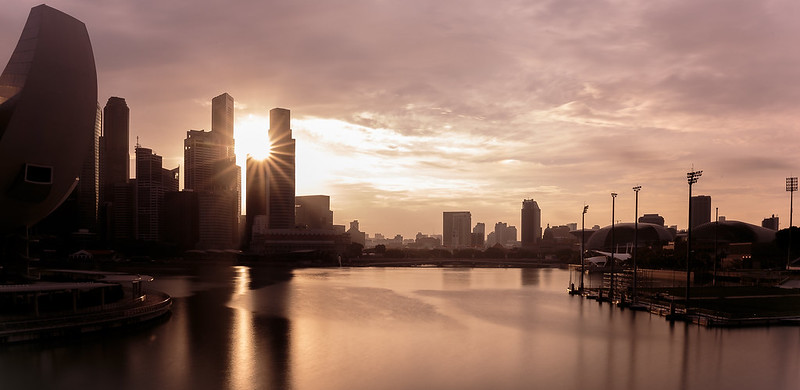
From Helix Bridge by Norman Selvaraju, on Flickr

1. In which area is critique or feedback to be given?

Composition, Processing and the whole works.

2. What were you hoping to achieve with this image?

I've shot some portraiture out here before and had felt that the view was pretty fetching. Hence, I decided to pick a spot here one evening with a bunch of like minded photographer buddies and we were having fun snapping away. What I was trying to achieve... A picturesque scene of the CBD from the angle.

3. Under what circumstance was the picture taken? (physical conditions/emotions)

Evening. Golden hour. I certainly did some processing to give it a certain chromish tint. I think it complements the scene well. Used a long exposure of 30s (iirc) with an ND8 filter. And added a little selective sharpening on the edges of the buildings in the background. The dynamic range of the scene was too much for my camera to handle so I had to choose to sacrifice something. Hence the slight washout of the area with the sun. Though I tried to darken it during post, it wasn't perfect.


4. Thread-starter's personal thoughts about the image.

Didn't get much nice clouds or dragging. But I really liked this one shot where the sun underwent a starburst effect. And I loved the position of the setting suc. Niceley in between the two buildings. If you notice, it looks like the sun has taken a bite out of one corner of one tower.

The water could have been smoother. But I couldnt get a decent shot that had no disturbance from a passing boat. Even with a ND 8 filter and draggeing the shuttier, I could make it pefectly smooth. Lack the skill to pp it to be silky smooth.


Do share your thoughts. Thanks in advance!
 

1. Building on the left needs some space on top.
2. Sun burst effect is well done.
3. Not quite sure where my eyes are suppose to look at. Needs something that draws peoples attention. Something in the foreground. When unsure fall back to the usual composition rules. Rule of thirds leading lines shapes diagonals etc....
 

Hi Norman,

That's a great view of the skyline. It looks underexposed to me such that some of the foreground details are lost. My personal preference would be to give it a bit more saturation to bring out the golden hour, as well as recovering some of the shadow details.
e.g.
25244615184_0b84f59d1c_o_b.jpg
[/IMG]

Cheers,
z.
 

1. Building on the left needs some space on top. 2. Sun burst effect is well done. 3. Not quite sure where my eyes are suppose to look at. Needs something that draws peoples attention. Something in the foreground. When unsure fall back to the usual composition rules. Rule of thirds leading lines shapes diagonals etc....

Thanks for the tips mrgray. Duly noted!

Composition is always a challenge for me. Especially when it comes to framing and using those concepts for landscapes.

Will keep them in mind for the next time around. Cheers!
 

Hi Norman, That's a great view of the skyline. It looks underexposed to me such that some of the foreground details are lost. My personal preference would be to give it a bit more saturation to bring out the golden hour, as well as recovering some of the shadow details. e.g. [/IMG] Cheers, z.

Hi Zaren!

Glad to hear from you! I was trying to keep it underexposed cos I figured it'll be a cleaner image. Just the general outline of the buildings without too much distraction from the many lines that would be apparent should the shadows be recovered.

But I do see where you are coming from with your suggestion and there is value in recovering more details.

Make it more saturated? You are right. It does look a little washed out. I was worried it looked a little too unrealistic, and that's thy I toned it down a notch. But I guess there is still a bit more room for tweaking!

Thanks for dropping in with your comments. Always appreciate your thoughts!
 

I would suggest thinking about why would you want to include the floating platform but choosing to cut off art science museum. I think in this case, there is nothing wrong with including the art science museum, but cutting off the left makes the composition rather awkward and in two pieces.