Urban clutter


portunderground

New Member
Jan 27, 2012
7
0
0
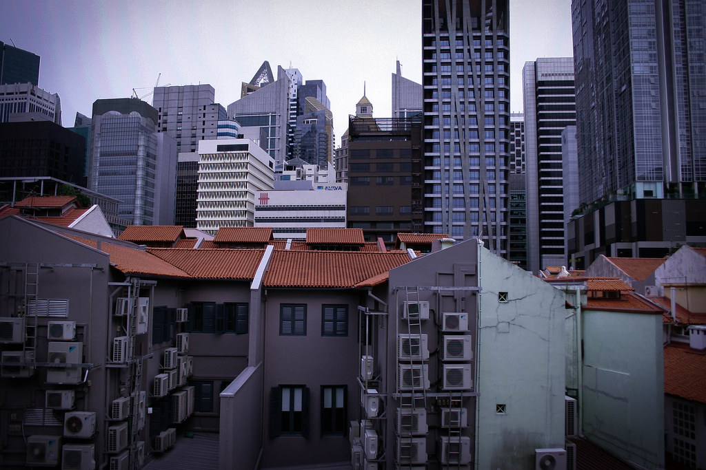
Hi there. This is one of my shots from my first photo outing. Would really appreciate the critique to get better.

Thanks!

1. in what area is critique to be sought?
Composition and color balancing

2. what one hopes to achieve with the piece of work?
I want to show how cluttered with buildings one area can be. I tried to find a higher point so more can be covered, but spot is the highest I could find.

3. under what circumstance is the picture taken? (physical conditions/emotions)
It was really hot and overcast. I was walking around Chinatown area and notice a quiet spot near Ang Siang Hill, away from the noise and bustle. Thought it was a nice spot to take a pic.

4. what the critique seeker personally thinks of the picture
It was a week end and this area was really quiet. The buildings were like sleeping giants, about to wake up on the weekdays. I was try to show the messy-ness, albeit the calmness of the area with the slightly bluish tint.

Any critique absolutely welcomed.
6784156577_c14704cb99_b.jpg
 

Hi,

Just my personal thoughts, hope it helps.

1. The horizon has to be straightened for these shots.

2. Compostition-wise, you still need a subject of interest for it to work. Maybe crop in onto the messy air-cons and arranging them in the scene such that compostition-wise, its pleasing. Or you can use a wider focal length for something like a landscape shot. Despite the clutter you are portraying, i feel that some sense of balance and geometry has to be there too. You cant see that in your picture. Maybe you can take a look at Cartier-Bresson's works on streets. He has a fine sense of geometry even with the different points of interest in his pictures.

3. The colour balancing does not work for me too. Maybe if the sky is overcast or totally washed out, try to go at a better time or frame it such that the sky is not included in your picture.

Shoot more. ;)
 

It really isn't messy or even haphazard. The buildings are still in straight rows and columns after all. Most man-made objects will not be "messy", urban development will not be messy. Messy is when you have objects of different shape, make, colour and purpose strewn about, think of a time when your bedroom wasn't spring cleaned for the Lunar New Year etc. Work on your terminology and photography concept.

Putting aside "messy", I don't understand why you need both shophouses and skyscrapers in frame. It sounds to me your emphasis is on "sleeping giants", so maybe the former is there for scale comparison. But putting it prominently in the foreground suggests a greater importance than the latter. So composition requires some work.

And finally, it's not a blue tint. It's a magenta cast. IRL, White should look white and grey should look grey. A blue tint means white will look bluish. Going into photography you have to be better attuned to colours and hues. Magenta and greenish casts are things to avoid, not embrace.
 

Last edited:
Alrighty... Thank you very much... Do appreciate all the comments, will shoot more...
 

Last edited:
I like the picture - It resembles blocks of buildings with different patterns being packed together haphazardly which brings out the feeling of "clutterness". For me, even without the title your picture already speaks for itself, but there's some room to explore.

1) Watch the horizontals
2) There's some distortion. I would prefer if the buildings are corrected and absolutely parallel to the edges of the frame. It would then give an additional sense of rigidness
3) Remove the crane on the upper left hand side. I find it very distracting, always sticks out like a sore thumb in urban landscapes.
4) If possible, personally, I would try to shoot further away and experiment to get a square framing which would emphasize the rigidity and blockiness of the structures, if that's what you aim for.
5) The overall presentation feels a bit depressing, especially with the cracked wall in front, if that's the feel you are trying to achieve. It's like not only are the buildings being crammed together haphazardly by giant hands, it's done without care resulting the cracks in the block.

If I were you, I would go back another day and try out different variations.
:)
 

Hi there. This is one of my shots from my first photo outing. Would really appreciate the critique to get better.

Thanks!

1. in what area is critique to be sought?
Composition and color balancing

2. what one hopes to achieve with the piece of work?
I want to show how cluttered with buildings one area can be. I tried to find a higher point so more can be covered, but spot is the highest I could find.

3. under what circumstance is the picture taken? (physical conditions/emotions)
It was really hot and overcast. I was walking around Chinatown area and notice a quiet spot near Ang Siang Hill, away from the noise and bustle. Thought it was a nice spot to take a pic.

4. what the critique seeker personally thinks of the picture
It was a week end and this area was really quiet. The buildings were like sleeping giants, about to wake up on the weekdays. I was try to show the messy-ness, albeit the calmness of the area with the slightly bluish tint.

Any critique absolutely welcomed.

I actually its was absolutely necessary to include the shop houses in the foreground because they add depth to the composition. That's what the built environment is made up of..... a variety of structures.

The colour/tonal range -
The photo appears flat and bland and in a way, it kinda neutralised the depth you have created by having a variety of buildings in the composition. These buildings have different orientation, different height, different design so they will react to the ambient light differently at any fiven time. I'd suggest you make use of this and take the photo in "better" light.

The tilting vertical lines -
These are details which you should look out for. If not, the entire composition will look sloppy. If you want to tilt it, then tilt it nicely.

The composition -
Its feels a little off balanced because the right side if filled with buildings while the other end has relatively more free space. If its that "tightness" you want to portray; use a longer focal length, loose the sky altogether.
 

Alright thank you very much u guys.

Learn a lot... It looked alright to ny friend, but I guess there's a pot to improve...

Ang siang hill really nice to shoot at I must say.
 

One thing I would say is that you had the right idea in the first place..... and shot something different . There are are few things that can be improved as mentioned above but the idea is what will make your photos interesting in the long term .

The other point i would make is the strange banding in the sky ...dont know quite what caused it
 

Last edited: