Toy: Patlabor GRIFFON


Status
Not open for further replies.

mybearbrick

New Member
Nov 16, 2004
680
0
0
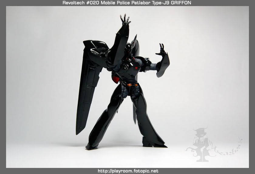
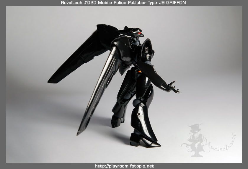
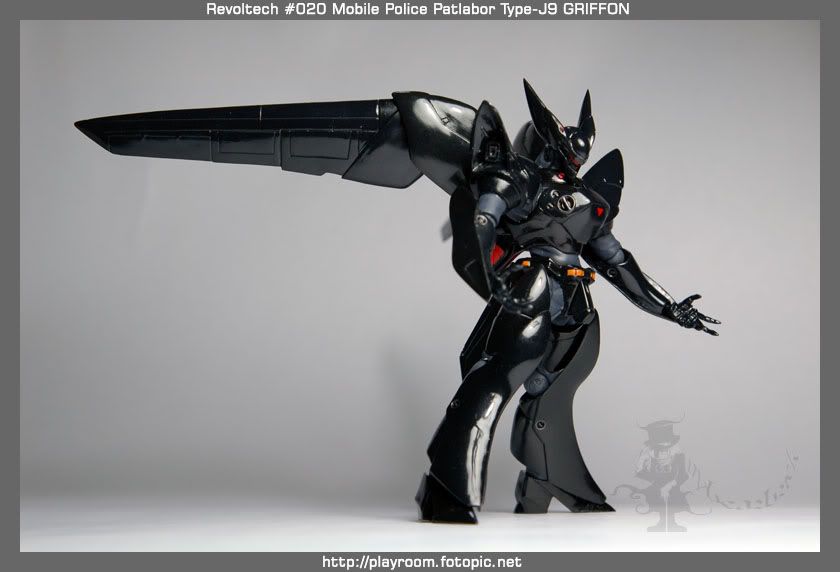
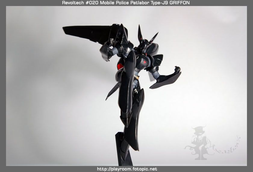
My latest addition to my collection is Revoltech No.020 Patlabor Type J-9 GRIFFON.
Your comments and criticisms are welcome.

I was suspended by fotopic due to my breach of TOS. Hence, please ignore http://playroom.fotopic.net. I am looking at migrating to Blogger as the new playroom, meanwhile please enjoy the pictures.


more pictures available here.
©mybearbrick 2007​
 

Photography:
The picture looks a little blur, and is under-exposed. Try to get the whole model in focus, since would-be buyers would want to see the details on the whole model. The main pose doesn't attract my attention.


Graphics Design:
The font doesn't fit. Go for San serif fonts. If you're adventurous enough, go for more techy looking fonts, but don't overdo it.

Scale down the text part, so that the focus is towards the model, and not the text itself. Try other font colours besides white. Grey maybe.

I don't know what's that logo in the middle doing there, but it doesn't fit.. unless it's a watermark.

Nothing fancy bout the graphics design.

thanks for the comments.
me still amateur with my equipment, so will keep that in mind.
I thought Sans Serif looked rather ordinary, but maybe I'll try it the next time round.
do you watch Patlabor?
yes, logo is watermark, i know it doesn't fit, but still put in for the sake of putting.

anyway, dude, your Jeans is a nice work.
Really like advertisement.
I'm not worthy! LOL

It's not the equipment, but the thoughts that goes into the photo. If I know I took an unsatisfactory photo after viewing it, I'll go take it again. Until I'm satisfied with it. :)
On the choice of fonts, you need to choose an appropriate one. Serifs are used in more serious subjects (newspaper) and olden times (fantasy themes). Even in serif/san serif fonts, there are alot more categories, for eg, fonts to depict the classy look, fonts to depict the cool look, fonts to depict the comical look..etc. Since you've integrated graphics design into your work, I'm just giving you some tips. :)

Go out and have a look at the boxes of toys (Patlaor, Gundams..etc) and notice how they use fonts, play with graphical elements, and the action poses used of the model.

I don't watch Patlabor, but I watch Gundams ;)

Lol. Since it's a watermark, I've no qualms bout it.

I'm just a hobbist.. still have lots to learn.. no one is unworthy of photography.. it's just a matter of learning and practice. :)
 

It's not the equipment, but the thoughts that goes into the photo. If I know I took an unsatisfactory photo after viewing it, I'll go take it again. Until I'm satisfied with it.
On the choice of fonts, you need to choose an appropriate one. Serifs are used in more serious subjects (newspaper) and olden times (fantasy themes). Even in serif/san serif fonts, there are alot more categories, for eg, fonts to depict the classy look, fonts to depict the cool look, fonts to depict the comical look..etc. Since you've integrated graphics design into your work, I'm just giving you some tips.

Go out and have a look at the boxes of toys (Patlaor, Gundams..etc) and notice how they use fonts, play with graphical elements, and the action poses used of the model.

I don't watch Patlabor, but I watch Gundams

Lol. Since it's a watermark, I've no qualms bout it.

I'm just a hobbist.. still have lots to learn.. no one is unworthy of photography.. it's just a matter of learning and practice.


Replying this in Sans Serif, hah. The Revoltech box art uses white fonts too...hmmm...:think:
Seems like my 100 over boxes of Gundam is not doing me any good at all. :bsmilie:
Nevertheless, Gundam box art are much better than Revoltech that's for sure,
personally preferring Katoki Hajime's artwork over the rest.
Actually this was my second shoot, first shoot was a disaster.
I only decided to setup for a second shoot after a can of beer. :bsmilie:

a bit on technique.
you can probably see that I am using f/8 at 40-50mm, ISO400 for most shots,
If I use any larger aperture, I get nonsensical bokeh.
If I use any smaller aperture, I get blurry pics from my unstable hands.
I didnt want to use ISO800 too.
My cheapo 55W table lamp isn't illuminating my setup well enough to allow me to shoot stably without a tripod.
I didnt want to use a tripod as it hinders the angles that I can take, since my room rather cramped, due to too many boxes to masak.
Any suggestions how I can improve?

Thanks for the tips! ;)

any new works lately?

Haha. I'm graphics design trained, so I'm just imparting what I know. Of course, like photography, you can break rules, but clearly, the break in rule doesn't work here. On colour of font, it's not neccessary to change the colour, but I personally would do it, just so that the focus is less on the text. The good thing about still life shots like this is that you can set as long a shutter speed as you want, since you can set down a tripod, mount the camera on, adjust the angle/distance, and then shoot. Set the ISO to the lowest possible, set the appropriate aperture (f8, f11) and shoot. You won't have to worry bout handshakes from long shutter speeds, cuz the cam isn't being held at all. (It's on the tripod)

If your room is really cramped for a tripod, consider alternatives like using those boxes in your room to act as a base instead. Else, try to find another suitable location for the shoot.

Nope, no new works lately.. been busy with other stuff. Haha.
 

Hi mybearbrick, here's my opinion as a toy collector. :)

When I see a toy photo, I should be saying "this toy is cool!" Not so much of "the photography technique is great" or "the design layout and fonts are good".

What I mean is put more effort into the subject (ie. toy) and not sweat the small stuff. Revoltech toys are very articulated and poseable, right? Show more of those dynamic poses! ;)
 

Nice. I thought the fonts were great. Sans Serif / Arial would have been too boring. Most Jap Anime tend not to follow too strictly to rules and results in interesting compositions. The "Griffon" fonts looks good. I can understand the layout you are trying to do. For me, I might reduce the text and place it under the wing portion. Tone down to gray if you wanna focus on the model. But since you are displaying technical data about the mecha, white is fine. Even military hardware brochures emphasize the specs with the machine in the background, followed by some full page shots of the machine in action. Nice touch to add in the 6 screws which easily identifies the Patlabor series.;)

As for the shot, the lighting does make it look a little plastic. I also see that you tried to have the CGI light flare from the eye go behind the shoulder armour. In reality, since light flare occurs in camera, the flare should go in front of the shoulder armour. A little sharper will also help. Good pose on the Griffon-23 and GRIFFON-33-1 too. Looks like you are having fun with the Revoltech toys. Got them online??:)
 

Haha. I'm graphics design trained, so I'm just imparting what I know. Of course, like photography, you can break rules, but clearly, the break in rule doesn't work here. On colour of font, it's not neccessary to change the colour, but I personally would do it, just so that the focus is less on the text. The good thing about still life shots like this is that you can set as long a shutter speed as you want, since you can set down a tripod, mount the camera on, adjust the angle/distance, and then shoot. Set the ISO to the lowest possible, set the appropriate aperture (f8, f11) and shoot. You won't have to worry bout handshakes from long shutter speeds, cuz the cam isn't being held at all. (It's on the tripod)

If your room is really cramped for a tripod, consider alternatives like using those boxes in your room to act as a base instead. Else, try to find another suitable location for the shoot.

Nope, no new works lately.. been busy with other stuff. Haha.

No lah, cannot use my dear toys as stacking, dun wanna risk damaging the fragile boxes. :bsmilie:
I will do my next shoot with a tripod so that I can shoot at f/11 and longer shutter speeds. then my table lighting should suffice. I will also diffuse it with some mahjong paper to minimize the shadows.
:thumbsup:
 

Hi mybearbrick, here's my opinion as a toy collector. :)

When I see a toy photo, I should be saying "this toy is cool!" Not so much of "the photography technique is great" or "the design layout and fonts are good".

What I mean is put more effort into the subject (ie. toy) and not sweat the small stuff. Revoltech toys are very articulated and poseable, right? Show more of those dynamic poses! ;)

Yes, thats what I am trying to portray, the articulation.
They can match MICROMAN series by TAKARA in terms of articulation.
Nevertheless, Revoltechs are PVC figurines, and there is always the problem of hardening and warping of PVC, which results in lembek limbs.
that sux and affects the figurine holding its challenging poses.
 

Nice. I thought the fonts were great. Sans Serif / Arial would have been too boring. Most Jap Anime tend not to follow too strictly to rules and results in interesting compositions. The "Griffon" fonts looks good. I can understand the layout you are trying to do. For me, I might reduce the text and place it under the wing portion. Tone down to gray if you wanna focus on the model. But since you are displaying technical data about the mecha, white is fine. Even military hardware brochures emphasize the specs with the machine in the background, followed by some full page shots of the machine in action. Nice touch to add in the 6 screws which easily identifies the Patlabor series.;)

As for the shot, the lighting does make it look a little plastic. I also see that you tried to have the CGI light flare from the eye go behind the shoulder armour. In reality, since light flare occurs in camera, the flare should go in front of the shoulder armour. A little sharper will also help. Good pose on the Griffon-23 and GRIFFON-33-1 too. Looks like you are having fun with the Revoltech toys. Got them online??:)

Dude, thanks that you appreciated the effort I've placed in here. I'm glad you saw my intended point of view. I guess product shots have various approaches to take and much to learn I have. I must make sure that I apply the right style onto the right subject.
:thumbsup:

Yeah, I probably should diffuse the light with some mahjong paper over my table lamp, but as mentioned earlier, I will probably need to set a tripod and remote to compensate the longer shutter speed that I will be using due to low light. Haha, I dropped my pure Physics in Secondary skool for biology, so I can never grasp the physics of light. Will keep the reality of light effects in mind (thought its rather cool to add the flare or trial of light).
What do you mean 'online'? You meant 'bought'?
I bought them from shops and never expected to pay more than $30 for each. Yahoo auctions also randomly have people throwing out the latest Revoltechs at reasonable market rates.
;)
 

Status
Not open for further replies.