The Stretch Ends Here


Status
Not open for further replies.

cheguthamrin

Senior Member
Jul 14, 2007
1,292
0
36
600060
...or does it start from here?

2795939499_f6f47bee39.jpg


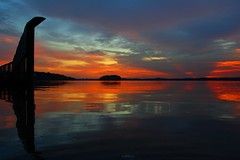
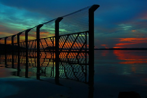
Location: Jalan Bahtera, Singapore
Exposure: 0.067 sec (1/15)
Aperture: f/8
Focal Length: 18 mm
ISO Speed: 200

Its been cloudy days and rainy evenings, gloomy mood surely. I tried my luck at a new spot to get this shot; and I thought I would be disappointed. Not much room to roam about, and the fence was at first seen as such an obstacle / distraction. Tried several shots, and posted this one up in flickr and got many positive response.

Whats the factor that you think has made the shot work for you, or has it been just another shot? I thought that the patterns on the fence and its reflection could be favourable, some said so.

I've increased the saturation by a bit, to get the rich colours more vibrant, has it been overdone?

Should I have shot it from another angle?

Other comments will be greatly appreciated.
 

I don't know why no one else has commented, but this is ABSOLUTELY GORGEOUS!!!!!

I wouldn't do it ANY differently! It's beautiful the way it is ...
 

this is quite a good job, but at first sight it is quite prominent that it is a little.. underexposed. half a stop more would render more vibrant colors, here it *is* looking a bit murky to me. that said, i'm not favourable to the color palette rendered.. greenish skies never my cup of tea.. can adjust this using color balance but that's really personal preference. also prefer more space at the top and bottom for the ending point.
 

i love it especially the reflections. on the contrary, green skies are my cup of tea haha :)
so its passable by my standards. but something seems amiss.

theres this chunk of black object on the bottom right? meant to be there?
if there was more of the right side and less of the rails maybe its better?
 

I don't know why no one else has commented, but this is ABSOLUTELY GORGEOUS!!!!!

I wouldn't do it ANY differently! It's beautiful the way it is ...
Thank you!

this is quite a good job, but at first sight it is quite prominent that it is a little.. underexposed. half a stop more would render more vibrant colors, here it *is* looking a bit murky to me. that said, i'm not favourable to the color palette rendered.. greenish skies never my cup of tea.. can adjust this using color balance but that's really personal preference. also prefer more space at the top and bottom for the ending point.
Underexposed; yes I agree, my initial thoughts actually. Thats why I wonder what had actually captured their eyes; has it been the compo, or the colours?

i love it especially the reflections. on the contrary, green skies are my cup of tea haha :)
so its passable by my standards. but something seems amiss.

theres this chunk of black object on the bottom right? meant to be there?
if there was more of the right side and less of the rails maybe its better?

More of the right side:

2795938573_a36bcdf927_m.jpg

More in the set can be found here
 

I like this picture you took.

The fence adds a very interesting sihouette to the picture and does lead the eye to the top left of the picture.

Beautiful colors too.
 

Underexposed; yes I agree, my initial thoughts actually. Thats why I wonder what had actually captured their eyes; has it been the compo, or the colours?

i would think the colors actually. it's not really the compo's fault, rather the sky doesn't go hand-in-hand with your idea that well, since the details to the left are literally clashing with the fence structure.

in any case, i tried my hand at editing, i hope you don't mind, if you do please let me know. brightening up the picture reveals a few extra details that isn't really seen in the first , like a rock to the bottom right, and one more around the bottom middle. cloned them away.

2809323073_fff995cea7_o.jpg


preferred color palette (switched with color balance)

2810171994_9e04d76bf8_o.jpg
 

Thank you moby!

Hey night86mare man, I thank you for that, in fact I had that colour palette that you had edited, but had chosen the above instead.
As you mentioned, it all comes down to personal preference, eventually. Not every picture is perfect in all aspects.
Have a great weekend!
 

Nice composition and mood. Did you turn up the saturation by quite a bit or was it really that orange on that day?
 

wow JALAN BAHTERA!?

that place brings back lots of camp memories for me. You actually drove all the way in i guess?

The colours are gorgeous and composition wise, cant really find any fault :thumbsup:
 

Status
Not open for further replies.