
The Red Door
- Thread starter Swatch
- Start date
You are using an out of date browser. It may not display this or other websites correctly.
You should upgrade or use an alternative browser.
You should upgrade or use an alternative browser.
- Status
- Not open for further replies.
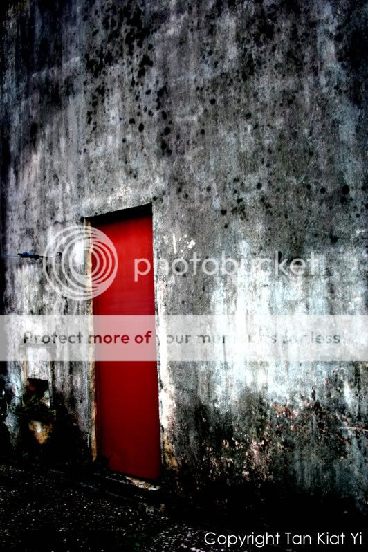
To keep or not to keep, is entirely up to you. Most often, a picture that doesn't stand out immediately, doesn't necessarily means that it's a bad picture, and ought to be trashed. In most occasions, perception to beauty will change with time (accompanied usually with your own change in maturity, awareness, environment, education etc. etc.). Hence, a picture taken quite sometime ago, may suddenly just appear to you in another light.
Anyway, I'd been pondering on the picture for a very long time. Heck! I'd probably visited this thread for more than 10 times, and yet can't rightly word out my thoughts every single time. On the technical aspects, the shot has interesting tonality and a bright, attention-grabbing subject (the door). Yet, the whole composition makes me wonder what is it that the photographer wanted to really portray. Did the photographer desire to give an alternate take on a mostly uninteresting door or did the photographer desire to show the oldness of the place (and hence the tonality)? Or is it something else that the photographer wanted to do?
Ultimately, I think it's a case where photographer wanted to say too much, and miss on every single aspect. If the door is really the subject, the tones shouldn't be there to fight for the attraction. If the tones is the subject, then the whole look shouldn't be so nicely coloured or "new". If the whole photograph is on another theme, then perhaps the fault ain't even on the processing, but the whole composition.
Swatch said:Please comment on this shot,Need comments!
like the mood:thumbsup: but if could straighten the whole image would that be better?:think:
soma said:like the mood:thumbsup: but if could straighten the whole image would that be better?:think:
Agree, is tilted. Otherwise, I kind of like the mood.
actually, although the door is tilted or some of u guys might say "there's nothing in this pic", i found a lot of interesting things about this pic though. Its definitely a keeper's photo to me.
1) the colour and tones on the wall is very good, and it led to some sort of a melancholy atmosphere.
2) And as for the door, the red really contrasted well with the background and stood out from it. Beneath the tattered walls, you have a smooth looking perfect door, isnt tat a nice contrast?
3) the tilt and slant of the image leads ur eyes to the door and make u wanna explore wats behind the door.
The_Cheat said:To keep or not to keep, is entirely up to you. Most often, a picture that doesn't stand out immediately, doesn't necessarily means that it's a bad picture, and ought to be trashed. In most occasions, perception to beauty will change with time (accompanied usually with your own change in maturity, awareness, environment, education etc. etc.). Hence, a picture taken quite sometime ago, may suddenly just appear to you in another light.
Anyway, I'd been pondering on the picture for a very long time. Heck! I'd probably visited this thread for more than 10 times, and yet can't rightly word out my thoughts every single time. On the technical aspects, the shot has interesting tonality and a bright, attention-grabbing subject (the door). Yet, the whole composition makes me wonder what is it that the photographer wanted to really portray. Did the photographer desire to give an alternate take on a mostly uninteresting door or did the photographer desire to show the oldness of the place (and hence the tonality)? Or is it something else that the photographer wanted to do?
Ultimately, I think it's a case where photographer wanted to say too much, and miss on every single aspect. If the door is really the subject, the tones shouldn't be there to fight for the attraction. If the tones is the subject, then the whole look shouldn't be so nicely coloured or "new". If the whole photograph is on another theme, then perhaps the fault ain't even on the processing, but the whole composition.
How a photograph is perceived by people varies widely (as seen in this thread). Yet, somehow I agree very much with The_Cheat when he says about what is the intention of the photgrapher in capturing a shot. If the photographer wants to bring out a sense of 'compare and contrast,' then a red door against a black and white wall works to the effect, but it is not really unique or captivating enough to be a keeper.
So I'd say probably a caption or title to a photo, to better reflect the photographer's intentions and give the viewers a general direction on how to best perceive the photo.
the door is taking up too much of the frame with the kind of colour contrast. it overwhelms without being subtle and makes the picture totally meaningless.
stand further back, include more walls, fill the picture up with the degraded wall texture and leave the door as a small red piece. leave the viewer with room to imagine about the subject, don't just show the subject")
stand further back, include more walls, fill the picture up with the degraded wall texture and leave the door as a small red piece. leave the viewer with room to imagine about the subject, don't just show the subject
Yet, the whole composition makes me wonder what is it that the photographer wanted to really portray. Did the photographer desire to give an alternate take on a mostly uninteresting door or did the photographer desire to show the oldness of the place (and hence the tonality)? Or is it something else that the photographer wanted to do?
Ultimately, I think it's a case where photographer wanted to say too much, and miss on every single aspect. If the door is really the subject, the tones shouldn't be there to fight for the attraction. If the tones is the subject, then the whole look shouldn't be so nicely coloured or "new". If the whole photograph is on another theme, then perhaps the fault ain't even on the processing, but the whole composition.
I will ponder on this,must read a few times more to understand:sweat:
Soma & clicknick , I will remember that next time if i pass that place again.
actually, although the door is tilted or some of u guys might say "there's nothing in this pic", i found a lot of interesting things about this pic though. Its definitely a keeper's photo to me.
1) the colour and tones on the wall is very good, and it led to some sort of a melancholy atmosphere.
2) And as for the door, the red really contrasted well with the background and stood out from it. Beneath the tattered walls, you have a smooth looking perfect door, isnt tat a nice contrast?
3) the tilt and slant of the image leads ur eyes to the door and make u wanna explore wats behind the door.
Thank you.
If the photographer wants to bring out a sense of 'compare and contrast,' then a red door against a black and white wall works to the effect, but it is not really unique or captivating enough to be a keeper.
So I'd say probably a caption or title to a photo, to better reflect the photographer's intentions and give the viewers a general direction on how to best perceive the photo.
Thank you for your comments,will remember that and put caption/title in future photos.
the door is taking up too much of the frame with the kind of colour contrast. it overwhelms without being subtle and makes the picture totally meaningless.
stand further back, include more walls, fill the picture up with the degraded wall texture and leave the door as a small red piece. leave the viewer with room to imagine about the subject, don't just show the subject
Thanks for your tips!:thumbsup:
---------------------------------------------------------------------------
Thank you to everyone for your comments and tips. Even with different comments,I argee with everyone of you here,because everyone looks at things in their own special way.I admit that I have not thoughtfully examined this photo and thought about the mood and what i wanted to show in this photo...I was just "shoot shoot shoot" . So now, before each photo I take, I will stop and think about all these things. If I have written anything wrong here, please point it out because I am not really sure in the direction im going at.
I agree with the less door more wall thing. What I would also like to do is to see the shot taken from an angle perpendicular to the wall. The tilted composition, though providing depth, does not work for me here as the idea is very "graphic" and I would like to see a "flatter" composition. Just my thoughts.
Swatch said:I will ponder on this,must read a few times more to understand:sweat:
Sincere apology on making to profound a remark. Just wanted to emphasis (probably a bit too much) that the point of view of the photographer is as, if not more important than the critics.
Anyway, do spend some time to surf through the web, or read some magazine, to see how good photographs of similar subjects are taken. There will bound to be some good ones that focus more on the door than the wall, while some are more concern with the overall abandoned building look.
I feel that this photo has potential to be a very good one. IMO there is enough in this photo to already create the mood that you might be trying to achieve. As i've learnt from another fellow photographer, any and every photo has potential in being a good one. But it is in the way that you present it that brings out the "specialness" of the photo. Perhaps for this particular photo, you could try to darken it a lil, add a slight bit of noise and to top it off, PS a vignette in it such that the attention solely falls on the door. Maybe add a nice border around it and you shuld find a huge difference in it. Overall i like this shot. :thumbsup: well done.
Just my two tiny cents worth. :bsmilie:
Overall i like this shot. :thumbsup: well done. Just my two tiny cents worth. :bsmilie:
- Status
- Not open for further replies.
Similar threads
- Replies
- 0
- Views
- 129
- Replies
- 0
- Views
- 219
- Replies
- 0
- Views
- 161
- Replies
- 0
- Views
- 154
- Replies
- 0
- Views
- 192