The Peak


Status
Not open for further replies.

scrappy

New Member
Sep 3, 2007
206
0
0
40
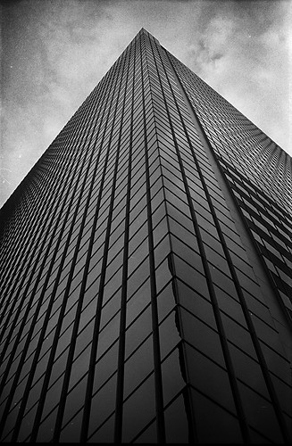
I shot this one day when I was in Shenton Way, and figured it was pretty appropriate since in the corporate world so many people fight tooth and nail to make their way to the top, to get that office on the highest floor - to reach the peak of the corporate ladder.

Now, the critique I'm looking for is mostly on one aspect - the composition.

Much as I like the photo, I can't bear to look at it because I really intended for it to be symmetrical, yet when the scans came back to me it turned out far from.

I would just like to know if for the most of you, does this current composition, tilted line and all, work for you. Of course, any other comments are more than welcome.

IIRC, this was shot on an Olympus OM-1, Fujifilm Neopan Acros 100, 50mm F8 1/125s.

Cheers.
 

ur feeling uncomfortable to look at ur own scanned pic? thts a good sign;) if ur pic is an abstract? then u can get away easily with ur unusual compostion:think: but if its a building shot,like a architecture pic, then u need to to pull back ur framing atleast a mile back;)or even more .........:)
 

Oh, it's perfectly fine the way it is. You were looking for a 'corporate race to the top' kinda thing and capturing it as a building fits it well.

I would have preferred the building to have something interesting at the top, seems a bit incomplete/lacking somewhat.

Personally I hate it when people 'prefer' a composition to be symmetrical just because it can be symmetrical. Do it for a good reason, and not because 'it would be really much cooler if it was!'. Maybe you can tell by my tone that this has happened to me before, so I'll tell you, have a strong idea of what your vision is, and do not succumb to the wishes of others who have a stronger love of geometric shapes.
 

Thanks for the comments guys-

newlife : Heh I worked with the equipment I could, 50mm on my OM1, taken from ground level. Well it wasn't meant to capture the whole building, but I just had the idea of a symmetrical peak in my mind as I took the shot.

foxtwo : I understand what you mean! But thing is, as I was composing the shot the image I had in my mind was a strongly symmetrical one - and my problem is that what I intending was precisely what didn't come out! Which is probably why I get irked everytime I look at this shot. Everything else about the picture, I kinda like - the texture on the clouds, the tapering windows, etc. It's just that the lines get to me, so I wanted to see if it was really just me being irrational.

Cheers guys
 

fully symmetrical would have been great.. i can imagine the windows tapering into a black spot at the edges.. and the top of the building really becoming a "peak".. but as it is it's not bad too.. got the feel you are trying to bring out..

p.s. i think i am more inclined towards geometric symmetry btw.. lol~
 

Hmm, so wait. Are you saying you didn't look through the viewfinder before pressing the shutter thus unknowingly getting this result but liking it somewhat anyway, or do you mean that before pressing the shutter you had a sudden change of heart and tilted the composition instead, but somewhat regret doing so?
 

ssping83: yup, agreed!

foxtwo: I did compose through the viewfinder before I shot, but obviously I didn't pay enough attention to the bottom of the frame! On hindsight I think it was more to do with my standing position relative to the building rather than a tilted camera though.

What I was trying to say is that I got this result, don't quite like it, wonder if it works for others so I can hate it a bit less... heh easier to understand? The mis-composition is entirely due to my inadequacies in composing, rather than intent.
 

double post
 

Oh, ok. Well like I said I do like it. Sorry to point out the obvious but your photographs are supposed to satisfy you foremost. So if it bothers you, go back out and reshoot. Why would hearing strangers say they like it assure you, heh. We'll be gone from your life the moment we log out, while that picture will stay with you and no matter what we said, it'll always bug you a little. As if 10 years down the road, you'll remember 'oh at least one person liked it, so it's alright after all'...
 

Heh yah true, thanks so much for taking the time to reply and all. Guess I was just looking for reassurance and all. I guess it's one of the joys and pitfalls at the same time of shooting with film.

I'll definitely have my camera(s) slung along when I start working there in the future, so maybe I'll be able to get a similarly cloudy sky one day, then I can finally compare results, heh.

Meanwhile, anyone else is more than welcome to comment on any other aspect of the picture - e.g. too much burning?!
 

I think your composition is ok with regards to the message that you want to portray.
Why? this shows that it is not always "symmetrical or fair" when people fight their way to the top.
Some will take a short cut while the other will just take the normal route which is the longer way. Isn't it that's the reality? So, for me, no need to retake the shot as it is ok already. ;)
 

composition wise it isn't too bad

but the lines here are too abrupt, they literally slash across the frame, as opposed to a wider view

so the problem is perspective
 

cthep2: Thanks for the comments! :) Interesting interpretation, too...

night86mare: thanks man, can always count on you for critique. I'm not sure I really understand what you mean by the lines being too abrupt though - how should they end such that they aren't "abrupt"? Also, be prepared for my excuse of only having a 50mm on me :p

yar, i understand, sometimes it is equipment.. in general 50mm would be better for isolating detail.

here, this is a wider view of something similar, but not quite similar, much less abrupt

daniel cheong on flickr also has a good isolated building shot here. maybe it could be a personal preference but i do think it is always good to leave a little space (not so tight composition) when it comes to one building - when you have more, somehow it isn't so bad because they would usually converge towards one point in the middle - i.e. leading you INTO the photograph. leading lines usually work better when they lead you into, not out of. when you place the line diagonally, you end up leading the viewer's eye in, and then leading it out just as quickly.
 

Status
Not open for further replies.