The bridge and the waves


Status
Not open for further replies.

JCYRHS

New Member
Mar 3, 2005
392
0
0
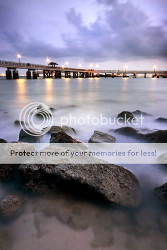
Hi all, I have one photo which doesn't seem right with me at all, yet I am so reluctant to trash it. Could someone help point out the rooms for improvement? (somethings within my control, i seek for better time and light too. ;))

Some technical details about the shot:

Aperture: f16
Shutter: 30s
Metering: Centre Weighted
ISO rating: 200
Focal length: 30mm (35mm equiv)
Filter: GND 3 stops
Post process: Remove blue cast slightly with curves and sharpening to the foreground rock.

_DSC3351.jpg
 

The horizon, it doesn't look straight to me. That is probably one of the reasons why it nags at you. Personally, I'd prefer it a tad more underexposed.
 

I give the image a try. From some books, it was written that near objects should be warm and the further ones should be colder ( just some text book advice ). I have tried to do that... and with a little more touching up ( burn and dorge ) here and there expecially at the corner areas ... so that the picture looks more "complete". I feel that if without the corner or edges darken, then the bridge will look like never ending and leading to nowhere...

I am also learning, please advice if it works. Or have I merely increased the saturation only :sweat:

_DSC3351-copy.jpg
 

Hi,

Your picture display good control of exposure/aperture settings.
However, I believe your picture does not display a prominent subject. Is it the big stone at the bottom? or the bridge? You titled it bridge and wave, but wave is not obvious in your picture too.

Personally, without your title I would have assume(identify) the bridge and stone as your subjects. But both does not lead in/out to each other. Your bridge just run across your photo, while your stone (the big one) just sits at the bottom, surrounded with other stones randomly around it.

Guess it will be better if you have something in your picture that leads in to your subject. In your case, if you said its bridge and waves, than have the waves more obvious and let it lead towards the bridge. Or change your angle of view for the bridge to lead in to the waves.

Just my point of view. =)
 

Calebk: The horizon is probably straight but the bridge is slightly slanted as it takes a bend at the end. Always have this problem with bridges. A tad underexpose might be good. Tks.

Ikkang: I have never heard about the warm foreground cool background theory but will give it a shot someday. Thanks for the heads up!

JaPhotos: I guess you are right about the absence of leading lines. The waves come now and then, not a regular feature of our beach. Only when ships or boats go pass the shore that we have some kind of action going on. Changing the angle might probably be the best solution here. Thanks! btw, I am really bad with titles and hopefully can improve on that too. ;)
 

After reading JaPhotos' critique, I also concur; both subjects, while in the same scene, do not seem in harmony with each other. There is no connection to bridge both (pun not intended). Essentially, what you get are two separate subjects that will fight for a viewer's attention.
 

i do not like the choice of color palette here, seems weak. if you wish to remove the colors garned , might as well change it into b&w.. right now it is a little "not here not there".

like others have mentioned i do think that the framing here for the background is a little letdownish. labrador park always seems to work better when the jetty is in entirety - and this almost always requires landscape framing.

i also feel that the composition is a little too symmetrical, literally space cloud/jetty space rock space. perhaps cropping off the bottom, since the space there doesn't seem to work and make a ratio tending more towards the squarish side might improve this marginally.

cheers!
 

night86mare: The photo seems weak in black and white too, without real tonal range and strong composition. I do not quite get the symmetrical composition thing but will try out the crop to see if it works. However, you are right about the cutting of the jetty which might be the case of 'leading lines go wrong' as the viewer gets directed right out of the photo. Thanks!

I'm amazed at the kind of feedback I got. Thanks for those who have commented. ;) Will continue to learn from you all in future.
 

hmm. the composition is a bit weird. maybe you can try taking the photo at a different time of the day? i feel that at this time, the color is not really nice.
 

one of my favourite spots!

i think u'd do better if u took it landscape. were u there a bit early before sunset?

i took a shot there once during sunset, or after actually as it was quite dark.. turns out quite ok.. u can have a look Here. very similar position, only taken in landscape.
 

Status
Not open for further replies.