The arrival


intikhab76

Member
Mar 22, 2010
230
2
18
Tampines
www.flickr.com
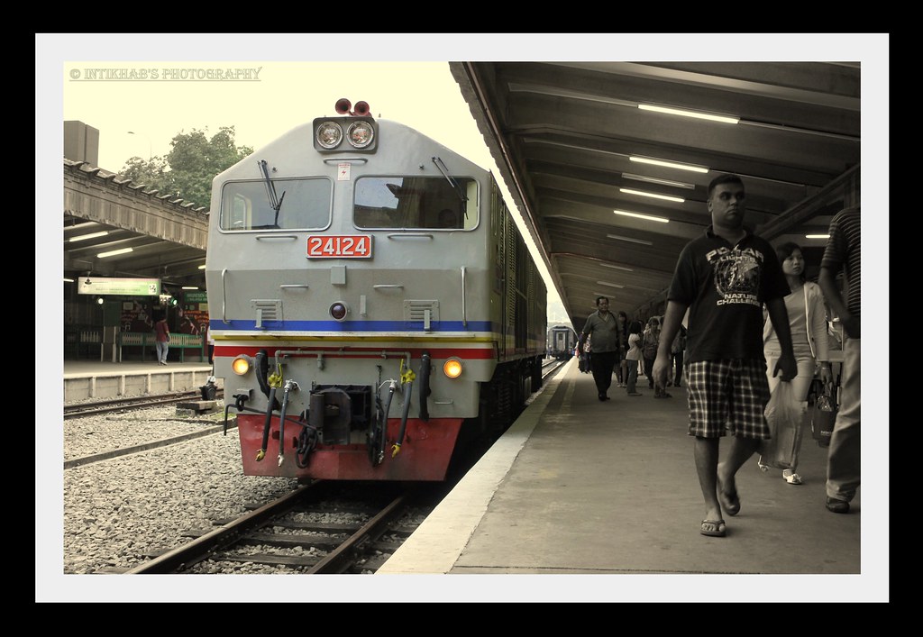
I was at KTM train station with family, lucky to be equiped with cam and chanced upon the arrival of a train. Did some editing in focal B&W mode to give it an old touch.

1. in what area is critique to be sought?
I wonder if this sort of PP is applicable to this pic in terms of focal colour on B&W image.

2. what one hopes to achieve with the piece of work?
To bring out the old touch in this effect.

3. under what circumstance is the picture taken? (physical conditions/emotions)
On a sunny late afternoon and with the train's arrival displaying the passengers carrying
loads of bags.

4. what the critique seeker personally thinks of the picture
I personally find it a little monotonous and would seek opinions as how would a pic be
better taken under this circumstances and location.

C&C's are greatly appreciated. Thanks.

4817041947_3a6fa7233d_b.jpg
 

To make a picture feels monotonous, try black and white and filter away the colors except for the train?

Composition looks quite fine with me.

Cheers :D
 

Personally, I am quite fond of such color treatment, whereby you accentuate the colors of certain subject(s) while the rest of the frame in monochrome. However, it is a tricky business to get it right.

Allow me to share my humble thoughts:
1. The reason why you find the treated picture monotonous is because, the isolated colors do not stand in strong contrast to the background sepia. The gray tone at the front of the loco tends to blend into the sepia, causing an uneasy neither-here-nor-there feel to the color distinction. In addition, you might wanna consider increasing the vibrancy of the blues, yellows and reds to enhance the color contrast.

2. The choice of which subject for color isolation is also critical. For this frame, I would choose the entire loco, and not just its front. I will also probably accentuate the yellow line on the platform, as it serves to partition off the accentuated subject (loco) from the buzz (crowd). I would leave the activities of the opposite platform (left-side), including the tree, in sepia though, unlike your treatment.

Hope this helps.

Thanks for the comment, noted on increasing the vibrancy & colours in monochrome effects to enhance the effects. Valuable feedbacks are welcomed.