that water thing people feel compelled to do at some point


Status
Not open for further replies.

agentmonkey

New Member
Jul 10, 2004
508
0
0
www.flickr.com
hey guys

partly inspired by sulhan (thanks for your advice! found it useful), partly due to boredom, this pre-enlistee decided to try doing this today. wasn't too successful in being able to get the same thing as everyone else though so tried something slightly different. what do you think?

cool-water-web.jpg


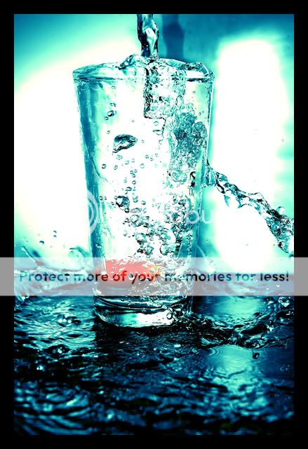
*friend was complaining that the above is abit too centric...kinda agree but was having problem trying to crop it..wanted to keep the splash by the sides...so this is another version with cropping
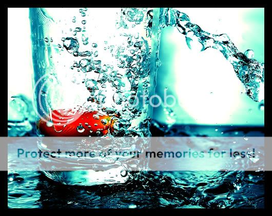
cool-water-v2-web.jpg
 

hey cliffy, thanks! didn't expect anyone to reply on a sunday (judging from past experience) had a similar set up to sulhan..helped quite abit..hope he doesn't mind if i link his thread here : http://forums.clubsnap.org/showthread.php?t=191708

also i did some dodge and burning in photoshop for the water..mainly burning though..found that it helps to make it easier for the water to be seen
 

hello...no comments? that bad huh? maybe next time i'll drop in a gundam, pinky or doraemon..hur hur.. either that or move it to the critique forum..
 

hmm for some reason, i like the first one the most.. not sure why.. maybe cuz there's more water and the movement of it.. but tts just me :angel:

nice work man.. like the colours :)
 

Looks like you made a mess...but it was worth it! This photo is phenomenal and quite unique. I love every aspect of it. I prefer the first one also because there really is more movement. Although, the second cropping is very well done, and you can really see the detail of the liquid (I assume its water...) Everyone usually thinks water is smooth, but I dissagree...I never realized how rough it is...Brilliant job on this...what lens did you use? I think I am in love...this is spectacular.
 

:thumbsup: the brightness look abit galring but tats my personal opinion thou. Its time to get glass n some water.... nice work
 

well, I think the 2nd one works for me. This is what it seemed to me: "an experiment awfully gone wrong", but done in gd taste. =)
 

how did u actually did it? i want to learn too.. heh:sweat:
 

hi all,
first of all, i appreciate the mods who helped move my thread here, thanks guys :)

also thanks for the kind words and opinions! was pretty happy with this shot.....haven't really been able to shoot anything decent for a long while. it was pretty messy and had water cascading off the table...good think my mom didn't see it..but fun all the same.

paxluv said:
Looks like you made a mess...but it was worth it! This photo is phenomenal and quite unique. I love every aspect of it. I prefer the first one also because there really is more movement. Although, the second cropping is very well done, and you can really see the detail of the liquid (I assume its water...) Everyone usually thinks water is smooth, but I dissagree...I never realized how rough it is...Brilliant job on this...what lens did you use? I think I am in love...this is spectacular.

hi paxluv, was using the 18-70mm kit lens for the d70. do you think it's abit too centric though, for the first one picture? would appreciate your opinion :)

zachmus said:
the brightness look abit galring but tats my personal opinion thou. Its time to get glass n some water.... nice work

hi zachmus, yup...think i might have upped the contrast abit too much..will try to re-edit it and see if can reduce it

boen said:
how did u actually did it? i want to learn too.. heh

hi boen, i used the same set up as sulhan...his link is above. took me quite awhile to get the right shot, but what i did was to pour water into the glass just before the shutter went off. actually this shot was sort of a mistake, moved my hand by accident and some of the water poured onto the table surface instead..that's how i got the splash on both sides of the glass...

i also did some dodge and burning in photoshop for the water to make it more defined. played with the colour balance to get the blue hue :)
 

Prefer the second. The first has no impact for me. Good choice of a red focal point in contrast with the overall blue. Nicely chosen colours in PPing as well.
 

thanks stoned :) seems it's divided between the first and second..some like it cropped and some not..hmm
 

what's that in the middle? :)
nothing wrong with subjects in center as long as it's compositionally viable for what you are trying to show... but with the shadow from the flash it does detract from what you are attempting to portray, so the crops are better in a certain extent^^
 

Hey, know how it feels to get no or few comments so here goes:

I like the second pic out of the 3. It doesn't show the source of the water so it keeps the viewer guessing, but i felt it would be better if the fruit was clearer.

I luv the effect on the pic, the look of the water on the table the the somewhat over-exposed light at the rear. What editing did u do to the pic?
 

IMO - no2 is my choice, but i prefer to remove the red thing. is a kind of distraction.

is a good try from you and refreshing idea for me.... thank you for sharing..
 

hey guys, thanks for the feedback :) 2 it is then, probably get that bugger printed.

that red thing is a cherry tomato..kinda dumb reason why it's inside...wanted to try out that thing where you drop an object into the water and attempt to get a shot of it just as it hits the water surface.needless to say it didn't work for me....partly because the cherry tomato wasn't heavy enough to give me the splash i wanted..just a sad pathethic "ploop"...and it doesn't help my timing sucks too..haha..

but kinda felt that the red helps to break up the pic abit, in that in won't be just blue all the way
 

phusis said:
Hey, know how it feels to get no or few comments so here goes:

I like the second pic out of the 3. It doesn't show the source of the water so it keeps the viewer guessing, but i felt it would be better if the fruit was clearer.

I luv the effect on the pic, the look of the water on the table the the somewhat over-exposed light at the rear. What editing did u do to the pic?

Hi phusis,

i can't remember the exact settings but the editting i did involved playing around with the contrast and colour balance. did some dodging and burning (actually more like burning la..didn't really use dodging) for the water itself to make it more distinct

i got the rear light using my wireless flash...set it up somewhere towards the left of the glass :) set up was similar to Sulhan's
 

thought the red thing was a Gold Fish!!! ain't that nice?

well, the cherry did create some contrast etc. overall nicely done! can add more props in future.

care to share the set-up / settings?
 

di0nysus said:
thought the red thing was a Gold Fish!!! ain't that nice?

well, the cherry did create some contrast etc. overall nicely done! can add more props in future.

care to share the set-up / settings?

hello di0nysus,

lol..my friend thought it was squashed gold fish... anyway, for the set up, i referred to Sulhan's thread: http://forums.clubsnap.org/showthread.php?t=191708...i just added a white board directly behind the glass

my settings were as such -focal length: 50mm, exposure : 1/400, aperture: f7.1 and iso 800
 

Status
Not open for further replies.