Teteris in Portable Studio


Status
Not open for further replies.

satpalravi

New Member
Oct 18, 2008
21
0
0
36
well i have clicked this in my portable studio..made with white paper..and i puted the lamp above this object..
plz let me know how can i improve more..what do u think about this image
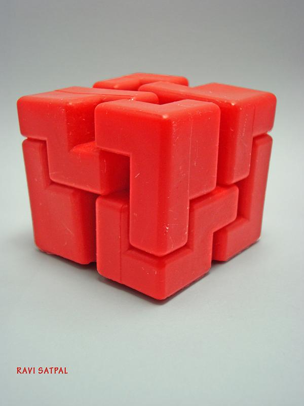
3081981001_970c4bb496_o.jpg


sorry for using outer link to upload image..i really dont know how to here...
 

Last edited:
seriously, it's too small...
 

1. Read the stickies in the Newbies section to learn how to post images here.

2. Read the critique corner guidelines for posting.
 

i have uploaded on flickr now..plz check now..
 

I would start by using photoshop to smoothen out all the blemishes on the surface.
 

I'm sorry, what am I supposed to comment about it?

Composition is.. not there.
I can't even figure out what it serves as actually, if not for your title.
And yes, the scars are unsightly. They shouldn't belong to the picture if they serve no purpose in any explanation of your subject.

If you ask me what I think about this image, I actually think not much of it.
Please do a proper writeup.
 

You should add a small writeup. But I am guessing this is a random test shot.

Composition is there, you just need to shift the target slightly towards the center more.

The subject has very nice harsh shadow, I am not sure it is done on purpose or by sheer luck. You might want to try a harsher shadow to make the texture stand out.

You just need a back fill light to make the background a "true white".

Get a few more light source and fix the lighting, you will get a welldone stock photo.

3/10
thx a lot..i hv intentionally placed the light source abv this so that it can give a shadow..and the background too was intentionally left dark..
i will surely improve more..
 

this is a 3D object, but you shoot it all three sides have same shade, no highlight area, no shadow area, and all in mid tone, it looks so 2D.

secondly, try to use a longer focal length lens, the perspective distortion looks so bad here.
 

Didnt see any contrast between each surface. All 3 sides seems monotonous. Can try doing overexposed and underexposed between each side for more contrast...
 

what were you trying to achieve with this shot? as a still-life, it doesn't look terribly exciting as the lighting looks flat. as an abstract, you could experiment with the post-processing to give it a more surreal glow against a black backdrop, for example by inverting and swapping colours.

e.g.
3081981001_970c4bb496_o_rev.jpg


thx man...well i am very amateur in photography...wll surely improve more in lighting..
 

Status
Not open for further replies.