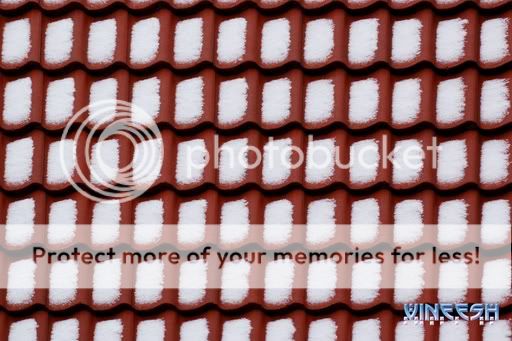
The picture reminds me of home, so maybe that's why I like it.
There's one trivial thing that would vastly improve the picture: leave that ugly signature out
")
.
The translational symmetry is nice, but maybe it is almost too perfect - if the tiles look all exactly alike, there's no particular spot that would invite the eye to rest. So maybe including an imperfect tile would not be a bad idea. On the other hand, it is hard to tell from a small image - it could be that in the full-resolution image, the details of the snow patches suffice to distinguish the individual tiles.
One last nitpick: the top border of the photo runs through a region without snow, creating the illusion of an irregularity at the very top, which on closer inspection of course isn't there. That also constributes to me feeling a bit restless when looking at the image.
Edit: corrected some garbled text.