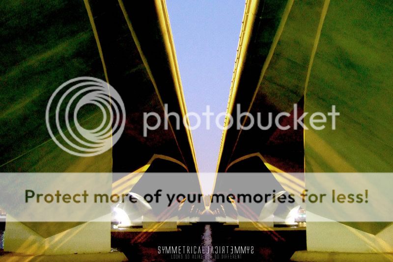
#1
crop away some of the left side if symmetry is what you want. interesting colours, if graphic design is what you intended it looks not bad, if a photograph is what you intended the colours are overwhelmingly overdone.
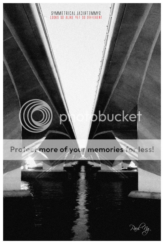
#2
imo doesn't make the mark. the line of symmetry is off. the tones look clumsy.

")