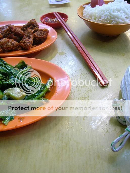
S sigg Senior Member May 4, 2005 863 0 16 May 6, 2006 #2 too many distraction...the pouch...the money...not enuff DOF
D danlin New Member Feb 17, 2006 278 0 0 May 6, 2006 #3 ya i agree.the e colours r not strong enuff, or attractive enuff to sustain our attention
R rEv09 New Member Feb 4, 2006 415 0 0 May 6, 2006 #4 got you. will do better if table was another contrasting colour, wallet and cash not included?
S stupidbear Senior Member Oct 9, 2005 861 0 16 Paya Lebar May 6, 2006 #6 Personally, other than the distractions, it's alrite.. What's with the DOF if the pic is taken top down? A "cut" spoon? Not very nice =D Juz my humble opinion.
Personally, other than the distractions, it's alrite.. What's with the DOF if the pic is taken top down? A "cut" spoon? Not very nice =D Juz my humble opinion.
C Cliffy New Member Apr 16, 2006 377 0 0 36 Singapore, Ang Mo Kio www.clifftan.com May 7, 2006 #9 depth of phield anyways, the bag shoudn't be there
Pablo Senior Member Sep 1, 2004 1,854 0 0 Blue/Green Planet May 7, 2006 #10 Hi, Colour wise seems ok but, The table needs a better clean wipe, the bag doesn't do well, the money is out of place here, the edges of the plate need a clean. Maybe also a tighter grouping of items ? Just a thought, put into words
Hi, Colour wise seems ok but, The table needs a better clean wipe, the bag doesn't do well, the money is out of place here, the edges of the plate need a clean. Maybe also a tighter grouping of items ? Just a thought, put into words
R rEv09 New Member Feb 4, 2006 415 0 0 May 7, 2006 #11 okie thx everyone! will take to note during my next supper!