Hi all,
first post in this sub forum hence a newbie.
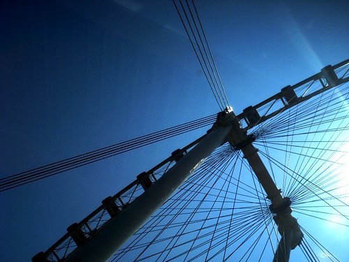
wanted to capture the majestic feel of the flyer's silhouette against the reddish tint of the setting sun
C&C on composition, exposure, anything welcomed
thanks")

first post in this sub forum hence a newbie.
wanted to capture the majestic feel of the flyer's silhouette against the reddish tint of the setting sun
C&C on composition, exposure, anything welcomed
thanks