Spending Time


zapper10

New Member
Jan 7, 2010
134
0
0
Hi Guys,

It is my first time posting in this CC thread. Please feel free to comment :)

4400484163_828c7c7e71.jpg


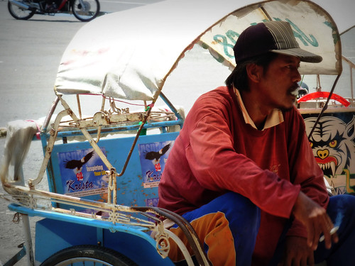
1. In what area is critique to be sought?
Composition, Exposure and Color Balance of this shot.

2. What one hopes to achieve with the piece of work?
Not so sure of this one. Hehehe

3. Under what circumstance is the picture taken? (physical conditions/emotions)
I took the picture of rickshaw rider while waiting for customer.

4. What the critique seeker personally thinks of the picture.
I am not sure. I still feel there is something still lacking.
 

Hello zapper10,

Please let me offer my opinions based on your points. Of course there is no right or wrong, and all these are but my very own views. it would be good to hear from all other experienced photographers too:

1.Composition, Exposure and Color Balance of this shot.
Composition-wise, I noticed the rider sitting relaxed and holding a cigarette in his right hand. This in itself is a great story line. I think we should re-compose the frame to focus more to the right side to show more of the rider and crop off the distracting motorbike wheels on the upper left hand corner. Certainly, include parts of the rickshaw to demonstrate the surrounding. But give more space on the right side of the frame so that the rider can 'look' further out towards there, i.e. let his gaze be drawn further right.
Exposure. Face of the rider is under-exposed. You may like to meter on the rider's face because right now the rickshaw is correctly exposed instead of your main story-line, the rider.
Colour-balance. I gather you meant hue/saturation. Well, once you expose the rider's face correctly, then you will most likely find that your subject's darker skin tone will contrast strongly with his brighter surrounding. I think we can leave the skin tone thus without further saturation (nor should we do so), as long as from your memory, the photo closely resembles his actual skin tone. But I would personally try to selectively saturate the blue of the seat and the red of his sweater a little.

2. What one hopes to achieve with the piece of work?

As stated above, give this photo of yours a good main theme, and half your work is done.


As usual, my humble opinions.
 

Last edited:
Hello zapper10,

Please let me offer my opinions based on your points. Of course there is no right or wrong, and all these are but my very own views. it would be good to hear from all other experienced photographers too:

1.Composition, Exposure and Color Balance of this shot.
Composition-wise, I noticed the rider sitting relaxed and holding a cigarette in his right hand. This in itself is a great story line. I think we should re-compose the frame to focus more to the right side to show more of the rider and crop off the distracting motorbike wheels on the upper left hand corner. Certainly, include parts of the rickshaw to demonstrate the surrounding. But give more space on the right side of the frame so that the rider can 'look' further out towards there, i.e. let his gaze be drawn further right.
Exposure. Face of the rider is under-exposed. You may like to meter on the rider's face because right now the rickshaw is correctly exposed instead of your main story-line, the rider.
Colour-balance. I gather you meant hue/saturation. Well, once you expose the rider's face correctly, then you will most likely find that your subject's darker skin tone will contrast strongly with his brighter surrounding. I think we can leave the skin tone thus without further saturation (nor should we do so), as long as from your memory, the photo closely resembles his actual skin tone. But I would personally try to selectively saturate the blue of the seat and the red of his sweater a little.

2. What one hopes to achieve with the piece of work?

As stated above, give this photo of yours a good main theme, and half your work is done.


As usual, my humble opinions.

totally second that. nice work :thumbsup:
 

Hello zapper10,

Please let me offer my opinions based on your points. Of course there is no right or wrong, and all these are but my very own views. it would be good to hear from all other experienced photographers too:

1.Composition, Exposure and Color Balance of this shot.
Composition-wise, I noticed the rider sitting relaxed and holding a cigarette in his right hand. This in itself is a great story line. I think we should re-compose the frame to focus more to the right side to show more of the rider and crop off the distracting motorbike wheels on the upper left hand corner. Certainly, include parts of the rickshaw to demonstrate the surrounding. But give more space on the right side of the frame so that the rider can 'look' further out towards there, i.e. let his gaze be drawn further right.
Exposure. Face of the rider is under-exposed. You may like to meter on the rider's face because right now the rickshaw is correctly exposed instead of your main story-line, the rider.
Colour-balance. I gather you meant hue/saturation. Well, once you expose the rider's face correctly, then you will most likely find that your subject's darker skin tone will contrast strongly with his brighter surrounding. I think we can leave the skin tone thus without further saturation (nor should we do so), as long as from your memory, the photo closely resembles his actual skin tone. But I would personally try to selectively saturate the blue of the seat and the red of his sweater a little.

2. What one hopes to achieve with the piece of work?

As stated above, give this photo of yours a good main theme, and half your work is done.


As usual, my humble opinions.

Hi limhow,

Thanks for your opinion. I think "re-compose the frame to focus more to the right side to show more of the rider" might improve my photo. This is something that I might be lacking.
Btw if I meter the person, I might get my surrounding overexpose rite? Except if I use HDR... Hehehe... Correct me if I am wrong...

Hi bullseyez,

Thanks for your compliment
 

the smoke at his mouth is so thick it looks as if he's foaming by the mouth, i lol-ed but it's really not your fault ;p

i also agree that more space should be given especially in the direction he's looking..
 

the smoke at his mouth is so thick it looks as if he's foaming by the mouth, i lol-ed but it's really not your fault ;p

i also agree that more space should be given especially in the direction he's looking..

Thick smoke .... :)
 

Hi limhow,

Thanks for your opinion. I think "re-compose the frame to focus more to the right side to show more of the rider" might improve my photo. This is something that I might be lacking.
Btw if I meter the person, I might get my surrounding overexpose rite? Except if I use HDR... Hehehe... Correct me if I am wrong...

Zapper10, your rider is under shade, and with a dark skin tone like this, I am quite sure your background (much further out of the rickshaw and its canvas top) would be blown a little. So you have got to decide how much of that blown background you want to capture.
 

Composition - The bicycle wheels on the top right are a bit distracting. Other than that, I don't see too many composition issues.

Exposure - The man, which is the main focus, seems underexposed by the other areas are properly exposed. So at this point, you have to decide what is more important: the person or the rickshaw, which in my opinion, should be the man so you should've exposed him properly instead... unless you use fill flash on him to get both properly exposed.

Color Balance - i don't notice too much about it.
 

Hello zapper10,

Please let me offer my opinions based on your points. Of course there is no right or wrong, and all these are but my very own views. it would be good to hear from all other experienced photographers too:

1.Composition, Exposure and Color Balance of this shot.
Composition-wise, I noticed the rider sitting relaxed and holding a cigarette in his right hand. This in itself is a great story line. I think we should re-compose the frame to focus more to the right side to show more of the rider and crop off the distracting motorbike wheels on the upper left hand corner. Certainly, include parts of the rickshaw to demonstrate the surrounding. But give more space on the right side of the frame so that the rider can 'look' further out towards there, i.e. let his gaze be drawn further right.
Exposure. Face of the rider is under-exposed. You may like to meter on the rider's face because right now the rickshaw is correctly exposed instead of your main story-line, the rider.
yes, moving the frame right is good, because you also end up not including utterly pointless elements like that stray motorbike appearing at the top left.

also, a way of thinking about it is that if the subject is looking OUT of the frame, viewers will look out too, and interest is lost quickly.
 

Hi Liangshi, night86mare,

Thanks for the feedback. I will take note to give enough space next time. Nice point. :)