Some purple flowers


Status
Not open for further replies.

chewraisins

New Member
Dec 28, 2006
170
0
0
Hi guys..
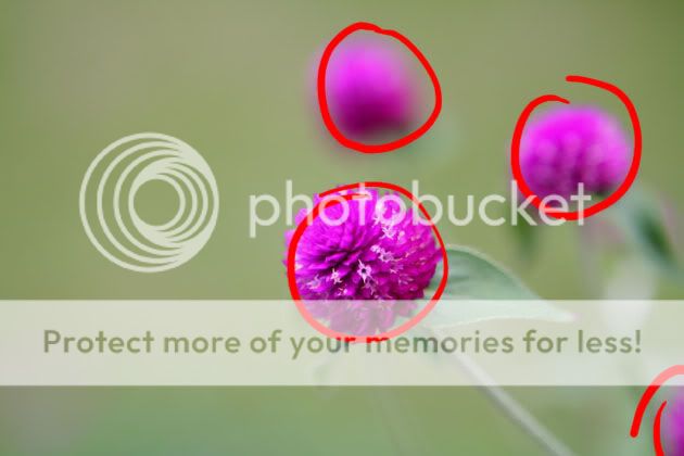
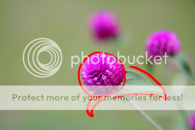
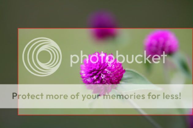
Spotted this pot of small purple flowers planted by my gran.. so decided to take a couple pics of it.. somehow can't get much detail from the top part of the flower that's in focus.. what settings (lighting / camera settings / shading / PP) would probably bring out the most details from the flower?

I did darken the picture a tad bit, if not the top would look like a blob of purple.

PurpleFlower2.jpg


Thanks for any C&C. :)

Cheers,
Andrew
 

Probably you need to share your settings when you took this pictures. It will give more ideas for bros/sis here to response.
 

Here're the settings..

Canon EOS 350D DIGITAL
1/250"
F2.8
Aperture priority
100
+0.67EV
Pattern
Flash did not fire
59mm

Erm.. looking at the exif i just realised that I set it to +0.67EV.. That could be the reason why I needed to darken the picture in PP..:embrass:
 

negative space dont work - unbalances the pic; focus is good, but can be deeper, but nothing can be done there in PP; over saturated, lost textures and details in the pink, can possibly be recovered with curves; bluish tint, eg the leaves are a strange green, possibly overcast skies when shot, need WB correction; and finally perhaps a square format.
 

negative space dont work - unbalances the pic; focus is good, but can be deeper, but nothing can be done there in PP; over saturated, lost textures and details in the pink, can possibly be recovered with curves; bluish tint, eg the leaves are a strange green, possibly overcast skies when shot, need WB correction; and finally perhaps a square format.

Hi espion, thanks for your comments.
What do you mean about focus can be deeper? Is it DOF can be deeper, focus point can be deeper or you meant composition wise?

I did abit of PP on the picture (desaturated + adjustment of red & blue curve). What do you think of the following pic?

PurpleFlower2-edited2.jpg
 

details in pink better, still bluish on my screen - and there are more precise ways of correcting WB, than agar-agar.

but compositionally I dunno how to tell you how to place the objects, but as it, is worst then previously - u must have sense of "balance", now it is unbalanced yet.

You still need the negative space on left, to balance the three blobs of pink but not as much as previously. Where is this aesthetic optimum, and their proportions, square or otherwise, you must have the eye for it, and there are more ways than one, but this way is not. one guide is the rule of thirds ...

deeper DOF means more of the entire flower in focus and not just the frontal surface, maybe up to 2/3 into the flower, in this particular case.
 

thank you for sharing this picture here chewraisins,
i think it provides opportunities to demonstrate a
couple of points about composition.

first of all you need to identify what's 'useful' elements
inside the frame, which obviously are the purple flowers.

PurpleFlower2_edit01.jpg


as shown above, the purple flower at the bottom right edge
seems like an offending element that upsets the balance of
the picture. as such, an initial consideration will be to remove
it 1. via cloning tool or 2. via cropping

PurpleFlower2_edit03.jpg


with such an empty frame, it's convenient to place your subject
at the centre at times, like above. however the composition is
still lopsided due to the fact that the left side is simply too empty.
as mentioned by espion a square crop may suit the subjects. it
is easier to balance the visual weight of the elements in this frame
in a square crop because it effectively increase the
object:space proportion here

PurpleFlower2_edit04.jpg


cutting into the out of focus flowers effectively reduce their visual
weight as well.

looking back at the picture, there are actually more ways to treat
the picture. personally i would like to express the flower in focus
together with the leaves.

PurpleFlower2_edit02.jpg


and i might want to make use of a panoramic frame to emphasis that abit

PurpleFlower2_edit05.jpg


the long frame will take advantage of the space on the left as extended space
of the subject's environment. pressing down on the top and bottom of the frame
together with the central placement of the main subject pushes viewer's first
impression onto the main subject itself before visually wandering off to the sides.

there are many ways to compose this, do try out and have fun.
 

Eikin, a gd n enriching reply there. Will try tat out too. Having some problems with having gd compositions. mayb you can point some out on my post too. Thank you. :)
 

Hi espion, thanks for your comments & advice. :thumbsup:
I'll look up the net for more info regarding composition & rule of thirds. Noted regarding DOF.
By the way, how do we adjust white balance on a picture without any "pure" grey/white objects?

Hi eikin, thanks a million on the informative post.. it helps alot for a noob like me..:) :thumbsup: :thumbsup: I'll certainly try out the different ways to compose this picture. :D

Cheers,
Andrew
 

Just to add to eikin's cropping possibilities, you can also rotate the frame, and that compound the compositional solutions.

As to WB correction, in this case you have a bit of white in the stamen/pistil of some the florets. They can be used.

And where you have no white/grey reference at all, you either use custom WB at the time of shot - just carry a white card with you - or use another reference colour if you have to do it post-imaging.

Here the reference could be the "green" in the leaves. Select a reference point and tweaked its RGB, eg 2.5:1:1 for G:R:B or some other ratio, until it looks OK to your eye on the screen. But in reality "green" is not pure G, but has some differing proportions of R and B, and as such the eye - and the screen calibration - is key. This is of course the most agar agar of methods, as tentative as agar agar itself.

But at the end of the day, unless your photo is used for scientific purposes, eg analysis of the star images from the Hubble telescope - and even there Photoshop is used as an analysis tool - it is the aesthetics that makes the final call, ie it is not whether it is right or wrong, but whether it looks good or bad. And how to get this eye to see good or bad, again I don't know.
 

sorry to ot but eikin, your explanation is superb!
 

Status
Not open for further replies.