Snapshot: Crossing of culture


Status
Not open for further replies.

kloozo

New Member
Jul 22, 2005
45
0
0
Hi all, this is my first posting in the critique corner and I promise that I will "not take offence at any negative comments/critique even if the comments are as brutal as simon cowell's.

Pointers/feedback on post-processing, composition or anything that bugs you will be much appreciated.

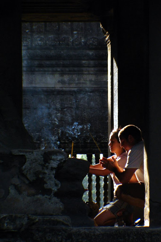
Taken at a temple on a recent trip. A sudden scene captured in haste, the couple stood up and left a second after my shot.

IMG_1767.JPG
 

A snapshot as you mentioned it...

The surroundings is too dark to get any details of it being a temple other than the smoke from the joss sticks. This shot would have been better if there were some light to illuminate the interior either from a reflector or a flash. Just my 2 cts
 

a bit of cropping to tighten the pic and lead the viewer to your main cubject would be nice.
 

a bit of cropping to tighten the pic and lead the viewer to your main cubject would be nice.
thanks for the reply..
hmm.. how about this then? couldn't seem get the cropping right previously, but yeah, this looks a bit better i think.

IMG_1767.JPG
 

I like this, I think you can still pull some details out from the foreground posts/columns using shadow/highlight...

Maybe a horizontal 3:2 crop is sufficient... Nice timing on the light.
 

nice framing...a bit more detail on couple is appreciated. agreed with Kit, you don't need anything else, joss stick and posture is enough. Can't be helped with arm seems to have been cut off at joint. I like it though
 

I like this, I think you can still pull some details out from the foreground posts/columns using shadow/highlight...

Maybe a horizontal 3:2 crop is sufficient... Nice timing on the light.

thanks for the comments..
i tried again as suggested, new pic on the next post :)
 

after more attempts to pull out the details..
I changed the cropping as well, hoping to show the age of the temple a bit more.
hopefully all for the better. is it?

IMG_1767%20copy%202.jpg
 

yup thanks for the feedback..
 

Given the little time you have to frame this, it is a nice capture as you have little control over the environment.
Like others mentioned, lack of details especially the interior, if you have captured the statue or the "subject" of their prayer/offering, think you would have a keeper.
 

The first image (ie orginal) works well for me, whereas the rest doesn't.

1. I feel there is no need to have details of the dark areas. As having the details does not serve any purpose nor enhance the pic at all. In fact it makes it worst. The dark and contrasty nature of the first image gives a sense of mystery and mood that is relevant to the subject. The dark areas actually frame the subjects and lend focus to it.

2. There are two things in this images that stands up. a. the lights and b. the 2 persons action. Hence as far as composition is concern take the cue from them.The lights falling from the top left to the bottom right at the subject. As such the original cropping is good ie. vertical, no need to make it square, in fact why make it square? as suggested? Let the light from the top lead the view eyes down to the 2 subjects.

My 2 cents. And Well done :thumbsup: I like the image and I am sure that is what catches your eyes and thats what you would like to portray.

I agree. the original evoked a sense of negative space and the contrast was handled quite well. Personally though, I would have liked to see a higher quality version of this picture, for it seemed to me that the picture was a little OOF (which isn't). Composition is enhanced through the repetition of lines and shape into the framing of the subject.
 

thanks for the very insightful comments
as you mentioned in your first point, I do prefer the mood set by the darkness. but after the various comments about lack of details, i just can't help but whether i was really missing something there.
 

I agree. the original evoked a sense of negative space and the contrast was handled quite well. Personally though, I would have liked to see a higher quality version of this picture, for it seemed to me that the picture was a little OOF (which isn't). Composition is enhanced through the repetition of lines and shape into the framing of the subject.

trust me, i would like to see a higher quality version of all my pics too, haha.
anyway it's affected by this not too good wide-angle lens that i borrowed from my friend, fixed atop my Canon S2 IS.. so quality is somewhat restrained here.

and thanks for the feedback, they matter. :)
 

Status
Not open for further replies.