
Hi Guys,
Just want to share my favorite shot when I went to Marina Barrage.
1. in what area is critique to be sought?
The whole composition.
2. what one hopes to achieve with the piece of work?
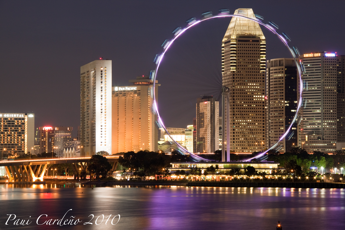
Singapore Flyer at night and city lights.
3. under what circumstance is the picture taken? (physical conditions/emotions)
Taken from Marina Barrage around early evening. 90mm Focal length, F/11, 30 secs.
4. what the critique seeker personally thinks of the picture
Personally, I like the composition and the reflect of the purple light of the flyer on the water. I guess the pic is also a bit soft. I did not sharpen it thru photoshop.
Best Regards,
Paui Cardeno
Just want to share my favorite shot when I went to Marina Barrage.
1. in what area is critique to be sought?
The whole composition.
2. what one hopes to achieve with the piece of work?
Singapore Flyer at night and city lights.
3. under what circumstance is the picture taken? (physical conditions/emotions)
Taken from Marina Barrage around early evening. 90mm Focal length, F/11, 30 secs.
4. what the critique seeker personally thinks of the picture
Personally, I like the composition and the reflect of the purple light of the flyer on the water. I guess the pic is also a bit soft. I did not sharpen it thru photoshop.
Best Regards,
Paui Cardeno
")