Singapore Flyer (in Vintage)


Status
Not open for further replies.

Marmite

New Member
Jul 27, 2008
326
0
0
35
On the Purple Line
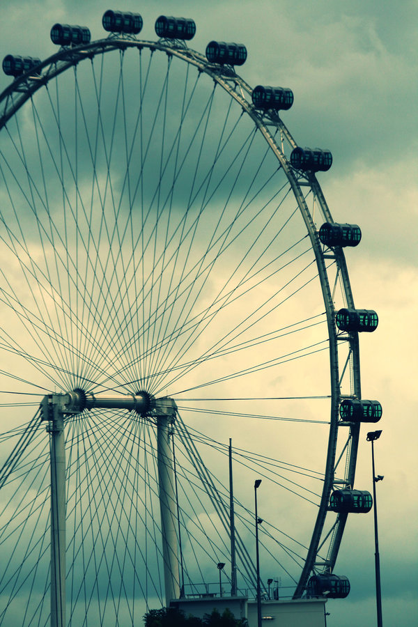
My first photography session with some CS-ers.And I would like to get feedback base on composition,lighting and contrast. I want to depict a vintage feel of this Singapore flyer and I hope i did not ruin the image of it.In fact, these are my first batch of Singapore Flyer shots.This picture was taken at the rooftop at the Esplanade.

Details :

Canon EOS 350D DIGITAL
Shutter Speed: 1/2000 second
F Number: F/7.1
Focal Length: 146 mm
ISO Speed: 200


3168313657_6d75ede42e_o.jpg
 

basic of all landscape shots, get the perspective right. otherwise, work on the abstract.

This is clearly a landscape shot. but it fails, cos the orientation is tilted. look at the building and 2 supporting beams.

vintage feel, color, maybe alittle more yellow, just a little more, then a little more overall blurring & burning, will probably put it into perspective.

composition wise, vintage look, ppl dun take such shots... people in the past are 1 shot 1 kill type, film are expensive, processing and printing too. so people will not take at such weird angle, so mostly are safety shot.

Don't shoot and go home and give a feel to a picture, instead, think of how you want the shot to feel like and take the shot.
 

the foreground building (NDP structure) very distracting. suggest u find better angle.

or shoot the top / quater of the flyer only?
 

I feel that the vintage treatment is not coherent with the Flyer. Why not? Because the flyer is a rather modern structure (and it looks rather futuristic too).

I think I understand where you get the motivation for the vintage treatment from: photos of traditional ferris wheels. In those cases, it works, because those wheels are traditional and nostalgic in construction, look and overall aesthetic.
 

i thinks the lamp post on the bottom right is kinda distracting...
like the colors, even though as someone mentioned before, they arent quite "vintage".
 

i quite like this pic...it somehow give me a classic feeling. perhaps 50 years down the road we would enjoy this more.
oh well i like it!
 

basic of all landscape shots, get the perspective right. otherwise, work on the abstract.

This is clearly a landscape shot. but it fails, cos the orientation is tilted. look at the building and 2 supporting beams.

vintage feel, color, maybe alittle more yellow, just a little more, then a little more overall blurring & burning, will probably put it into perspective.

composition wise, vintage look, ppl dun take such shots... people in the past are 1 shot 1 kill type, film are expensive, processing and printing too. so people will not take at such weird angle, so mostly are safety shot.

Don't shoot and go home and give a feel to a picture, instead, think of how you want the shot to feel like and take the shot.

what do u mean by "orientation is tilted" ? other than that will take note of all advices.

thanks all :)
 

what do u mean by "orientation is tilted" ? other than that will take note of all advices.

thanks all :)

look at the flyer's central support, or even the lampposts on the rigth side.

they are all tilting left.
 

The posts are rather distracting and i did notice the tilting of the shot. We must also consider the position he may be in during the shoot, he may not have enough space to move around and get the right angles to the flyer. Anyways, i would say that its kinda 6 out of 10 with regards to the title.
 

Is there a purpose to make it "vintage"(lol, i love this word)?

Desaturating colors does not make a photo a instant art, aka holga, lomo and fisheye faggotary.

Singapore Flyer is not some hundred years old monument, so for making the photo look old, I would very much like to know the reason why you make it so.
 

Don't shoot and go home and give a feel to a picture, instead, think of how you want the shot to feel like and take the shot.
Sorry for a bit of OT.
I think this statement sums up for most of us posting in here; that we might just be trying too hard to save/rescue that shot we took with explanations. As some may have put it, pictures already tells a 1000 words, make yours a million! Not the other way round. Hehe

...and I thank you for reminding us, again :)
 

Funny... I thought I like it in vintage too..
2442800577_5ed35e41be_o.jpg


My first photography session with some CS-ers.And I would like to get feedback base on composition,lighting and contrast. I want to depict a vintage feel of this Singapore flyer and I hope i did not ruin the image of it.In fact, these are my first batch of Singapore Flyer shots.This picture was taken at the rooftop at the Esplanade.

Details :

Canon EOS 350D DIGITAL
Shutter Speed: 1/2000 second
F Number: F/7.1
Focal Length: 146 mm
ISO Speed: 200


3168313657_6d75ede42e_o.jpg
 

Oopps! just got excited by the coincident of marmite's shot/view... didn't realised it's a critique corner post...
hi waycool, pls observe the R&R on critique corner. thanks.
 

To be fair to TS, i believe that the whole flyer is tilted already. So, if he were to correct the tilt of the subject, it will make the whole picture look tilted also (because of the trees and spotlights)

Cant really understand why the Flyer was built this way. =S
 

To be fair to TS, i believe that the whole flyer is tilted already. So, if he were to correct the tilt of the subject, it will make the whole picture look tilted also (because of the trees and spotlights)

Cant really understand why the Flyer was built this way. =S

For a moving (revolving )structure of that scale being tilted ? You must be kidding !
 

basic of all landscape shots, get the perspective right. otherwise, work on the abstract.

This is clearly a landscape shot. but it fails, cos the orientation is tilted. look at the building and 2 supporting beams.

vintage feel, color, maybe alittle more yellow, just a little more, then a little more overall blurring & burning, will probably put it into perspective.

composition wise, vintage look, ppl dun take such shots... people in the past are 1 shot 1 kill type, film are expensive, processing and printing too. so people will not take at such weird angle, so mostly are safety shot.

Don't shoot and go home and give a feel to a picture, instead, think of how you want the shot to feel like and take the shot.

and if/when all viewers share the same "feel" as you do, when looking at your work, that will be perfect.
 

To be fair to TS, i believe that the whole flyer is tilted already. So, if he were to correct the tilt of the subject, it will make the whole picture look tilted also (because of the trees and spotlights)

Cant really understand why the Flyer was built this way. =S

Are you kidding?! All the verticals in the image are slanted to similar degrees. Have a closer look.
 

Status
Not open for further replies.